Editorial Fonts
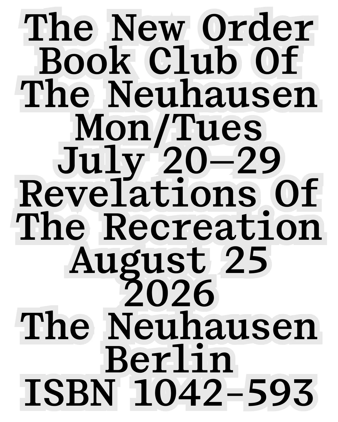
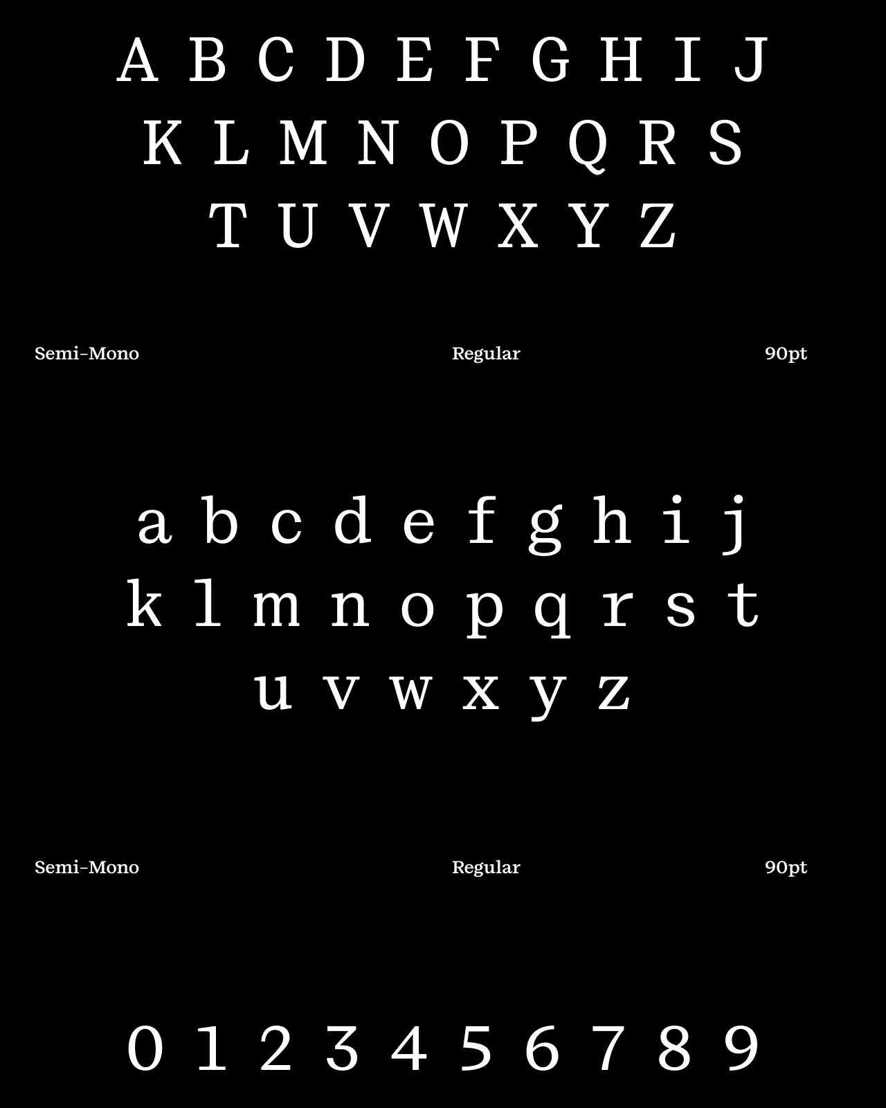
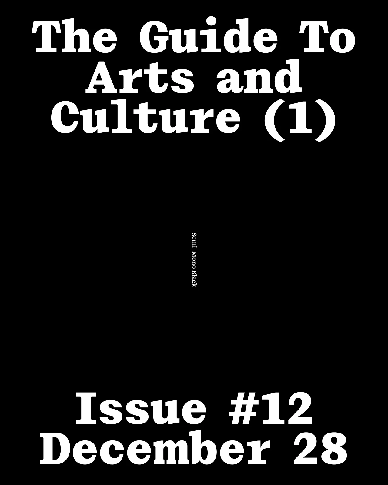
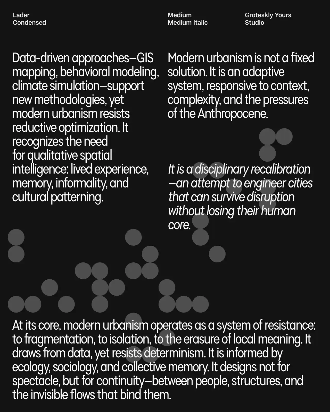
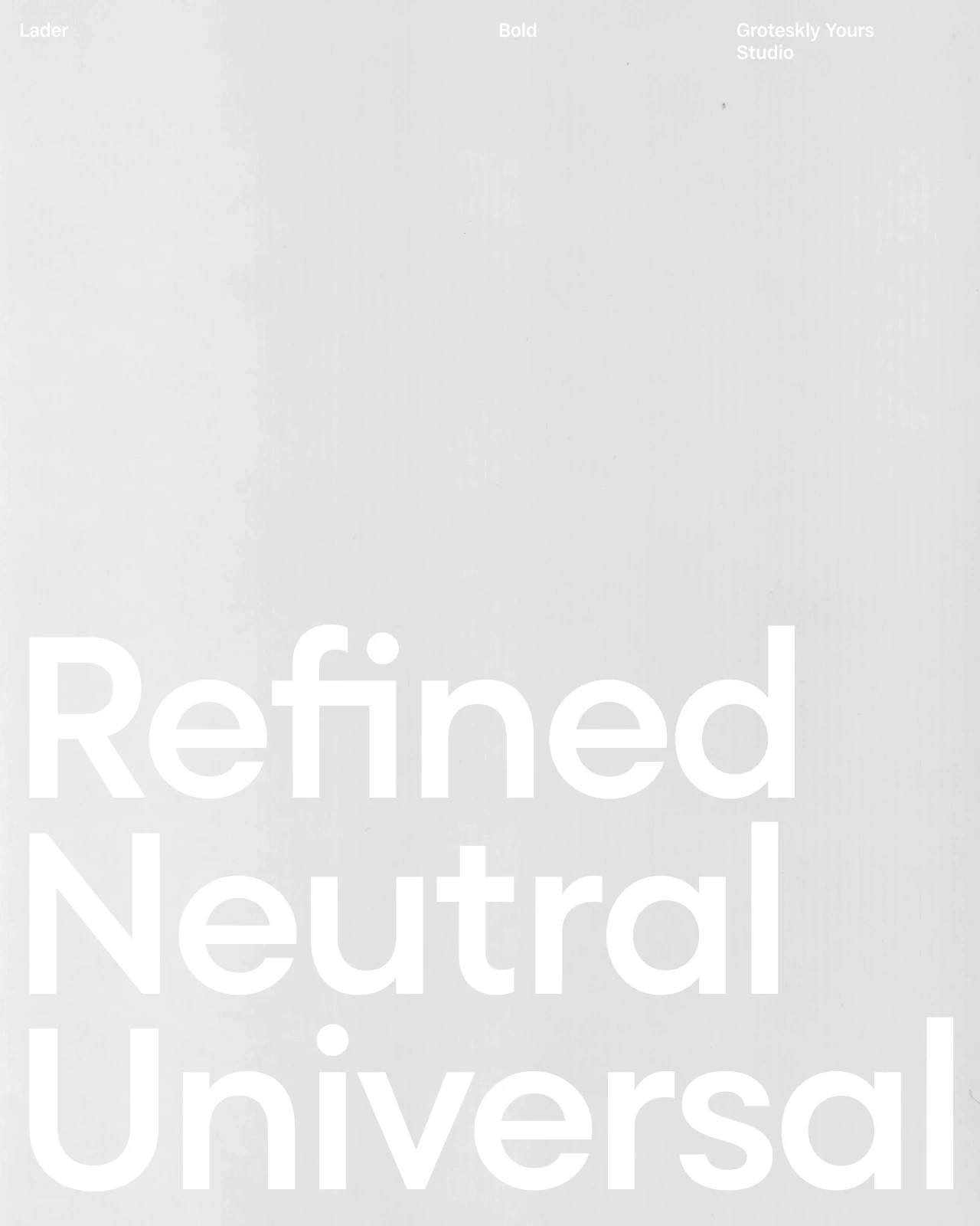
Editorial fonts are designed for structured long-form reading across pages, columns, and screens. They balance legibility, rhythm, contrast, and hierarchy so text remains comfortable in body copy while headlines and subheads retain a clear visual voice. Editorial typefaces are useful for magazines, books, newspapers, websites, reports, and other content-led projects.
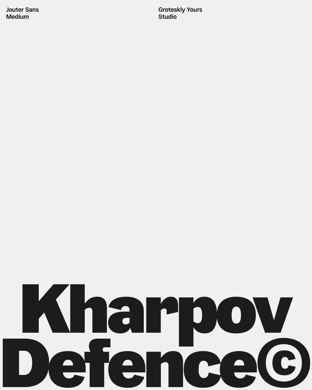
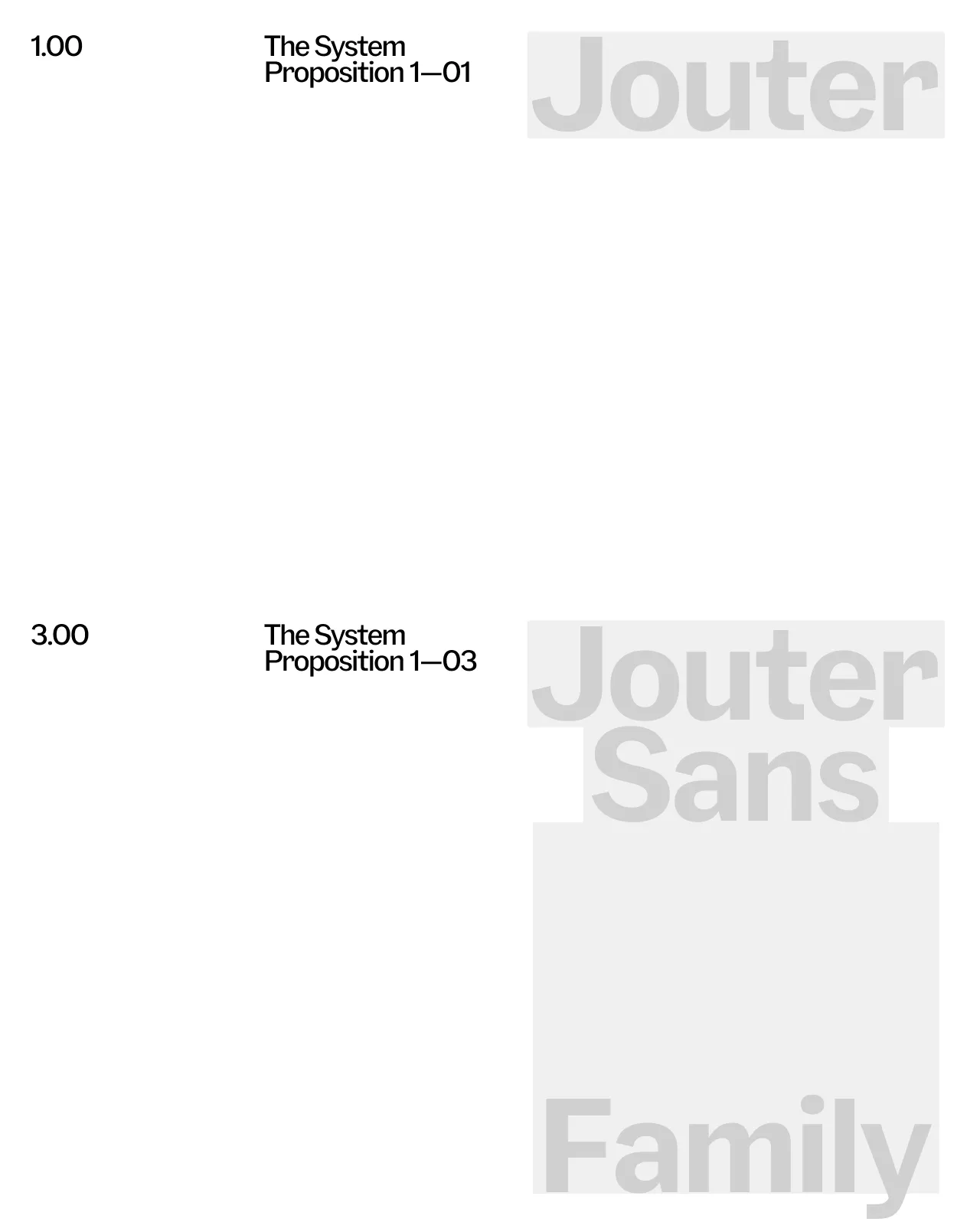
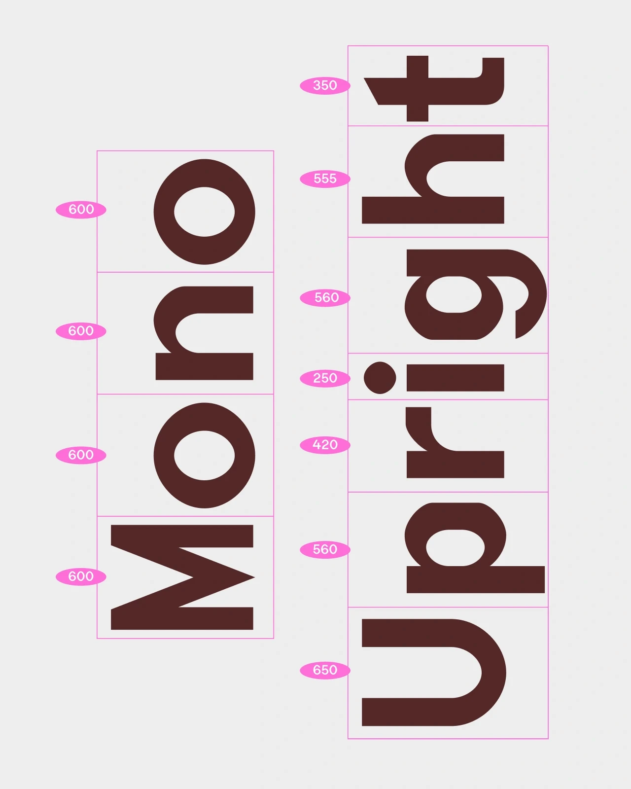
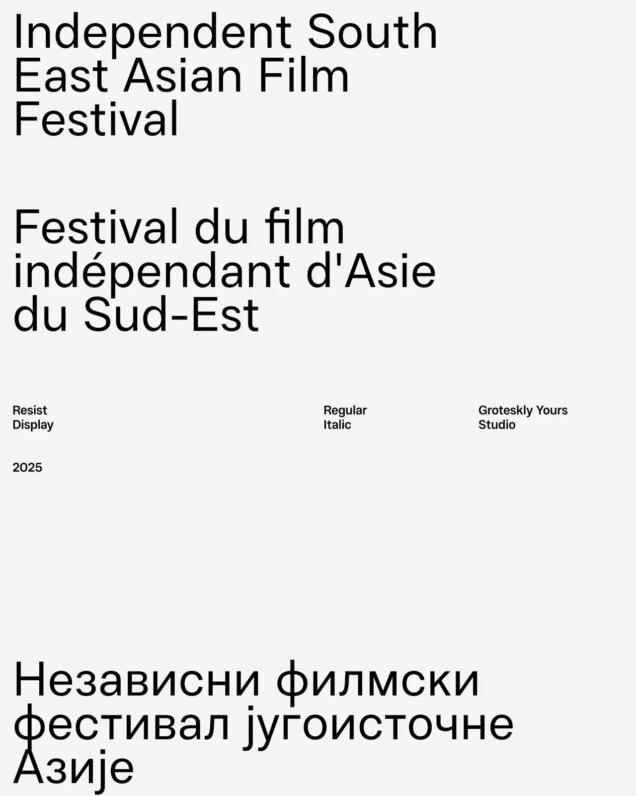
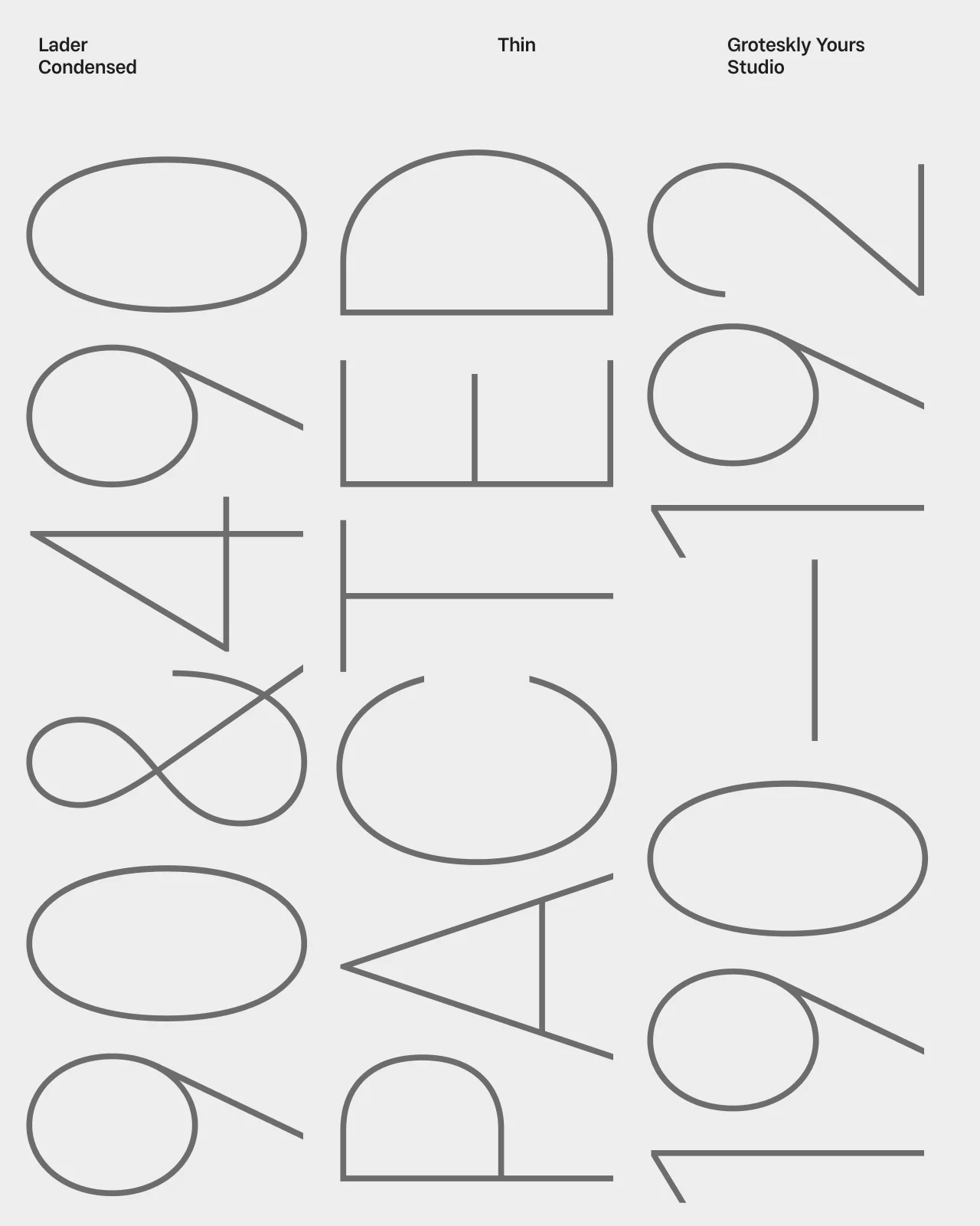
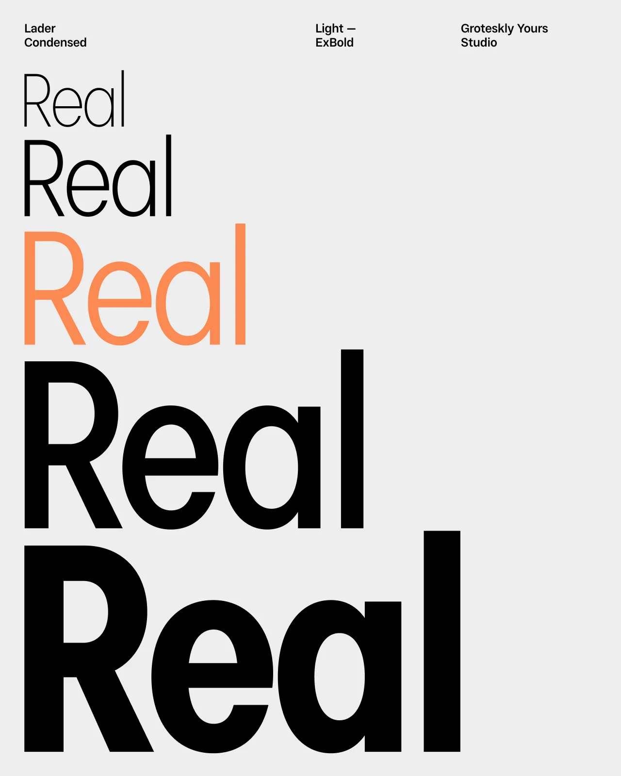
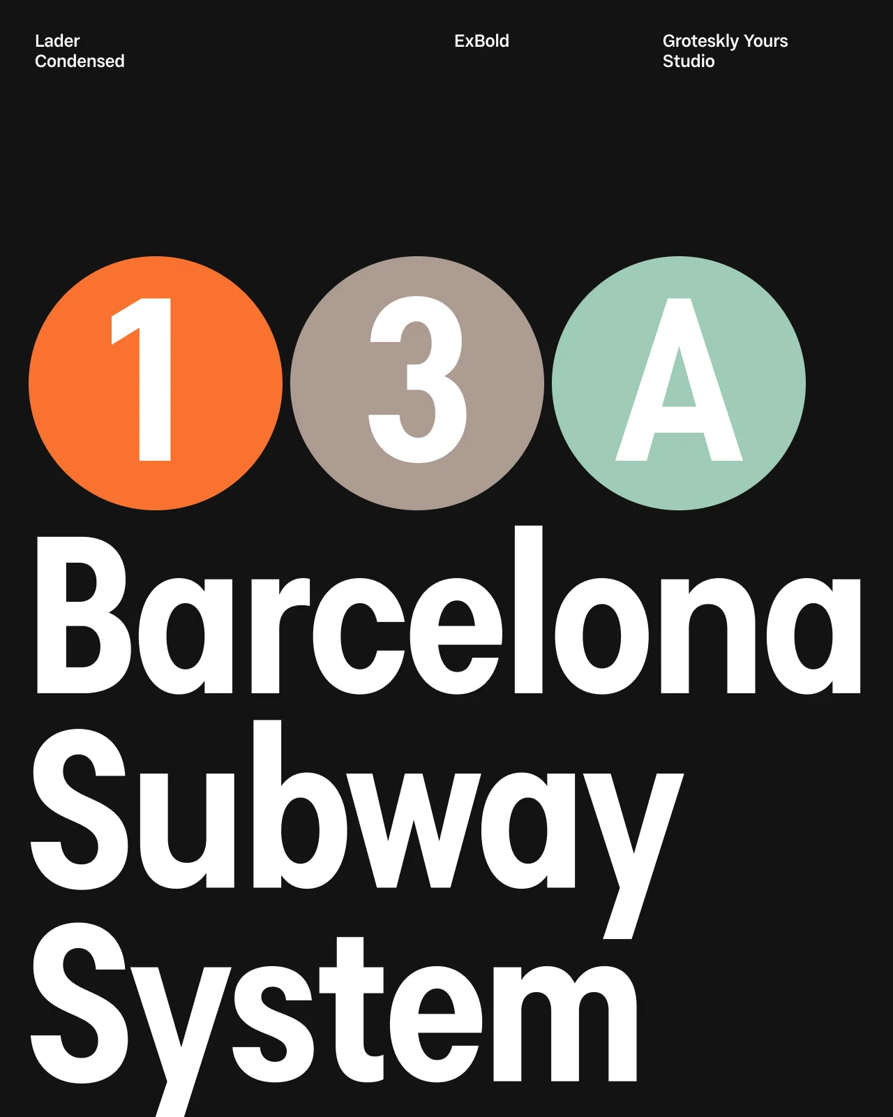
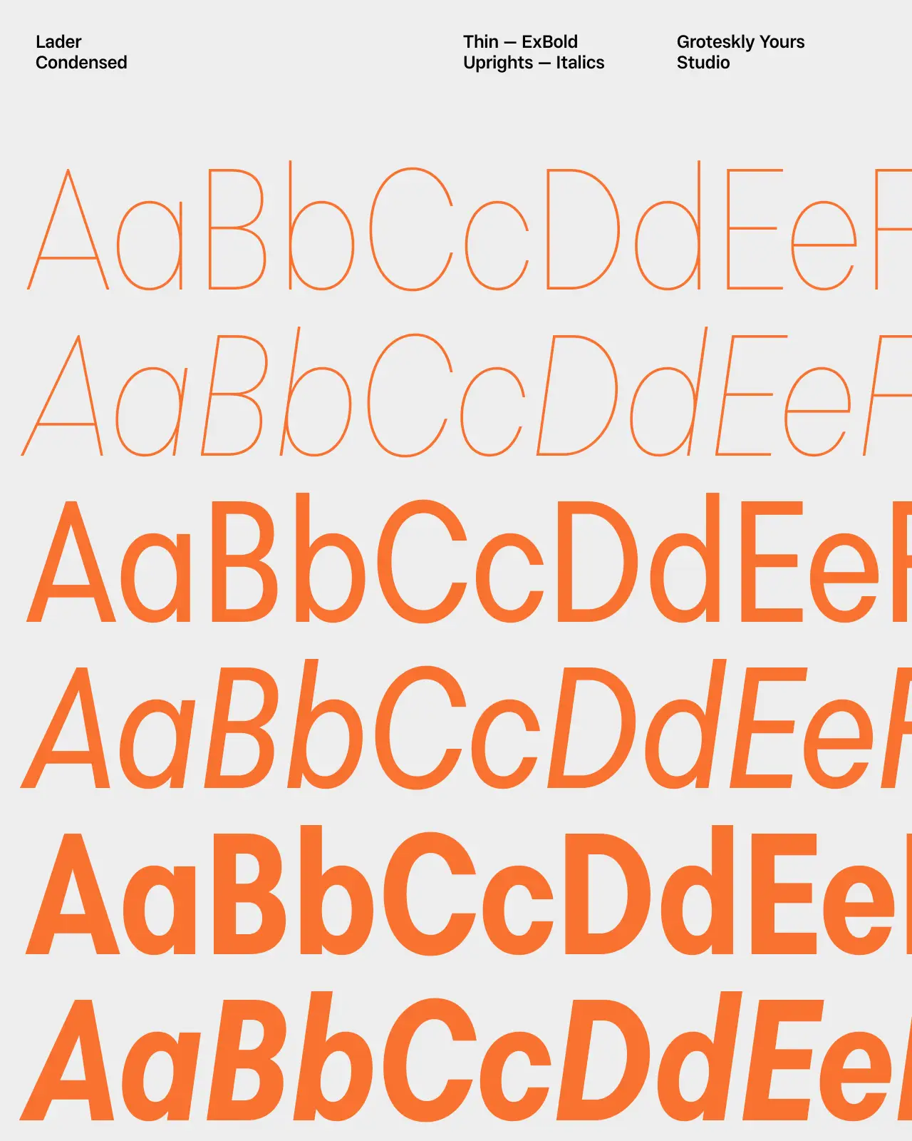
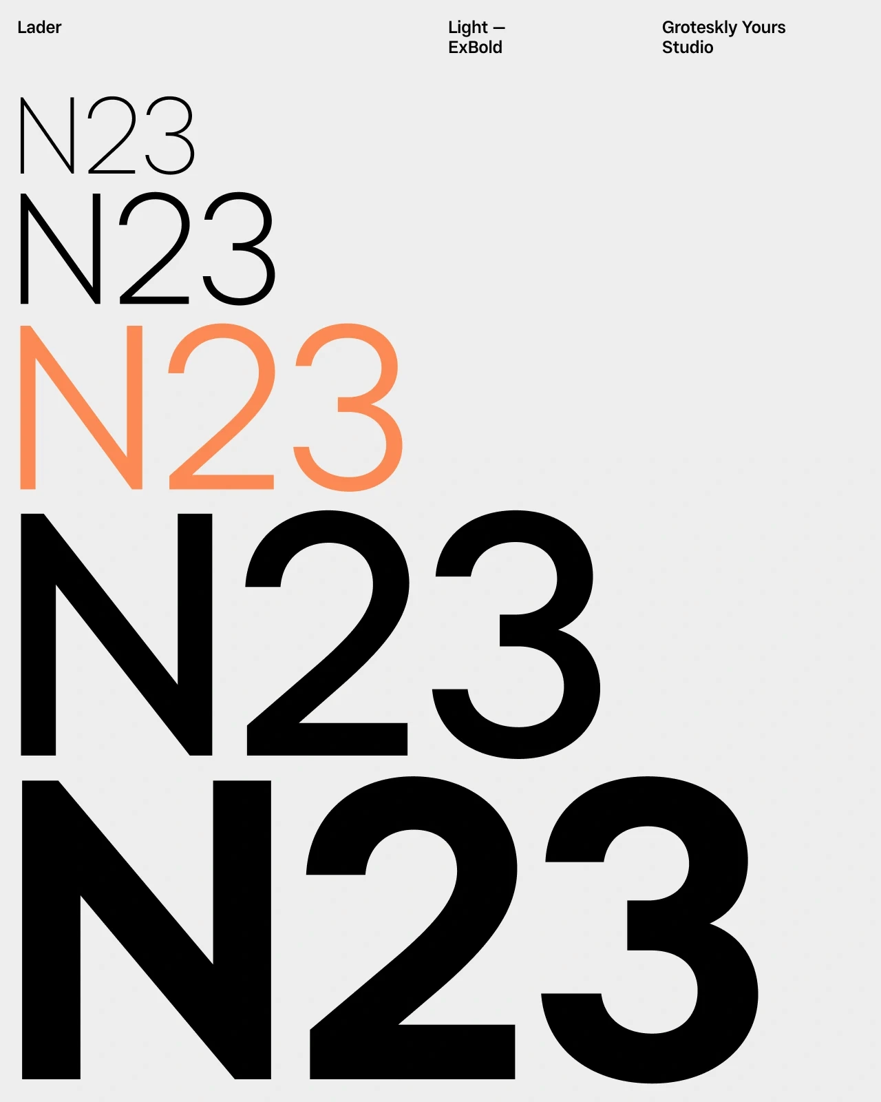
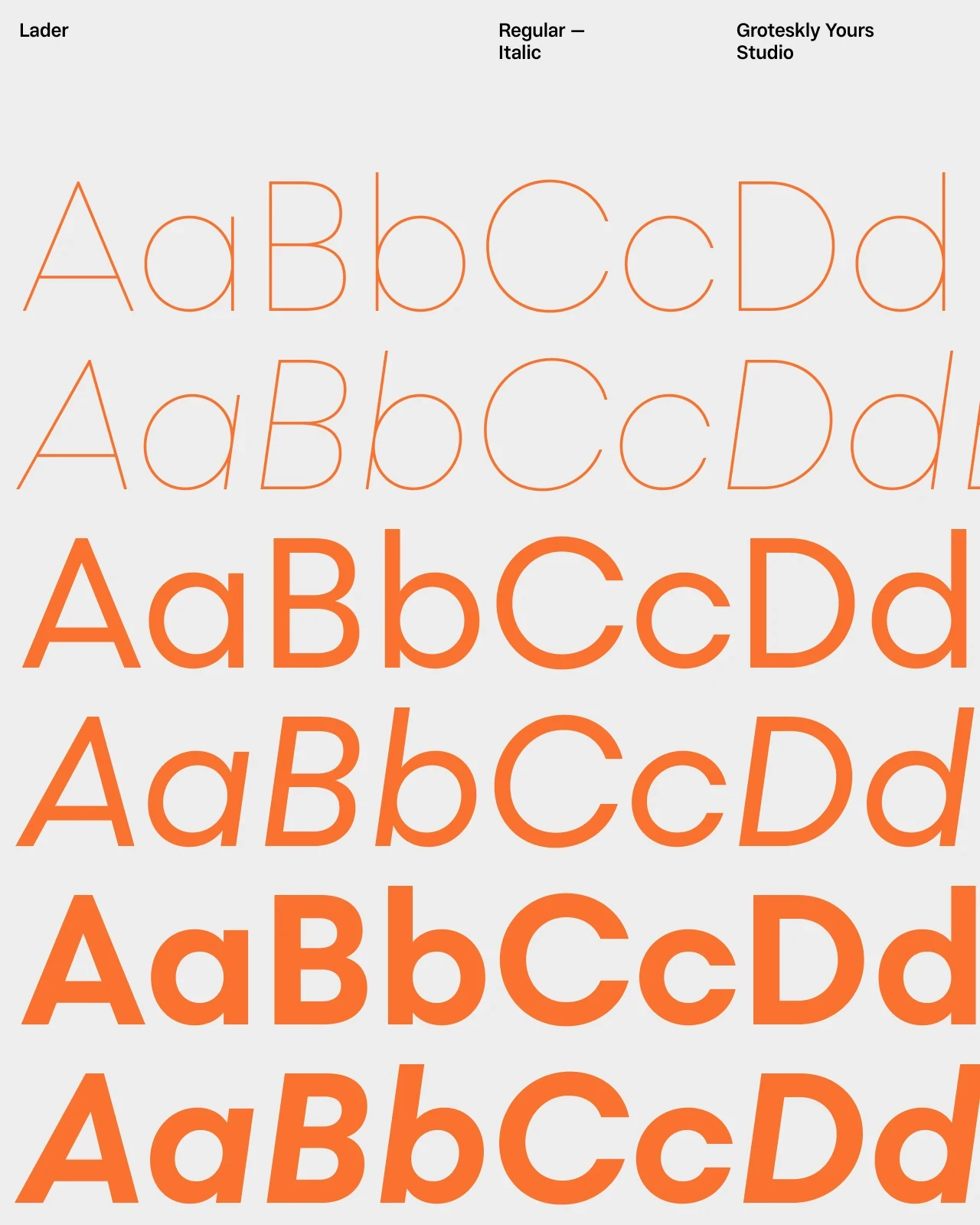
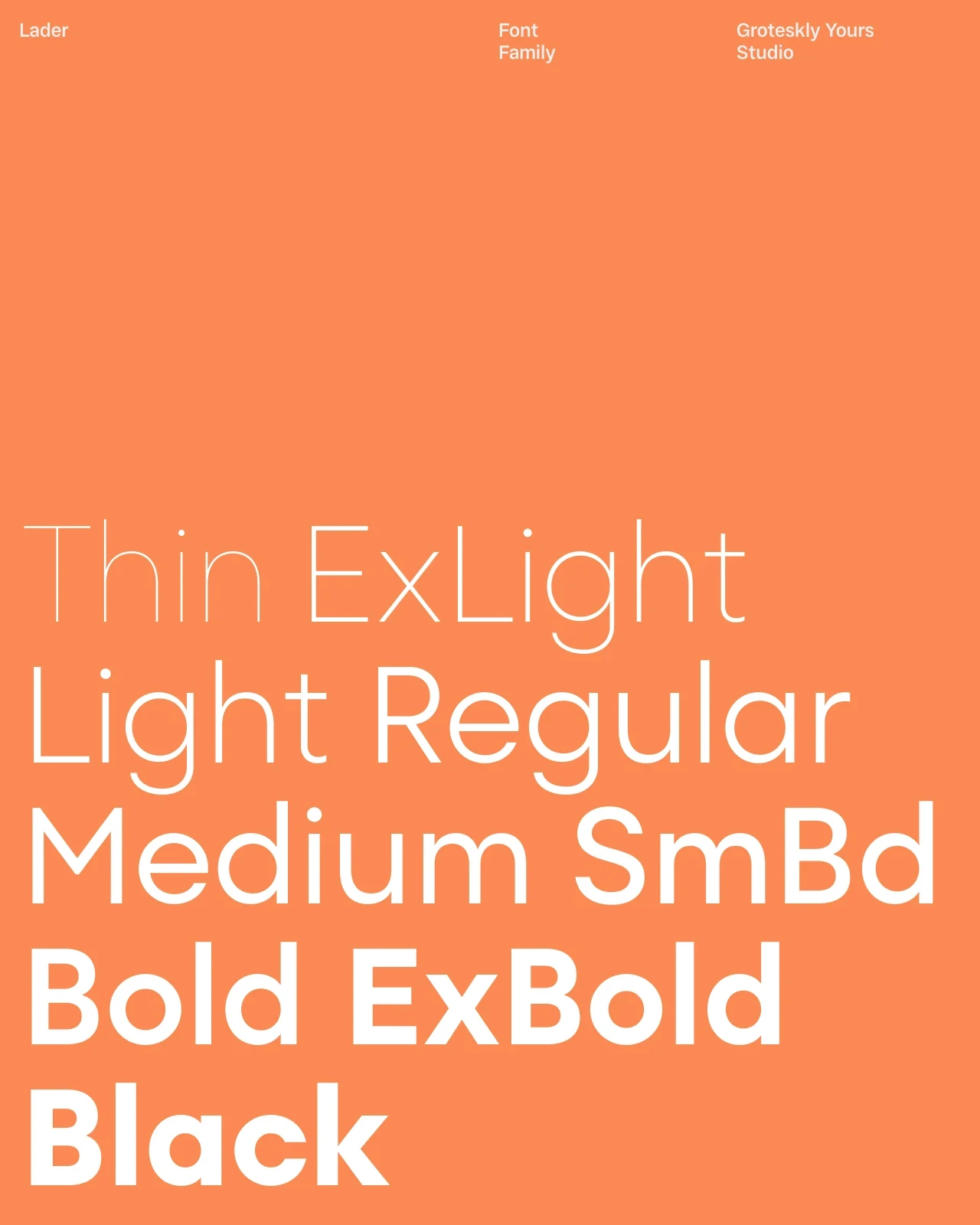
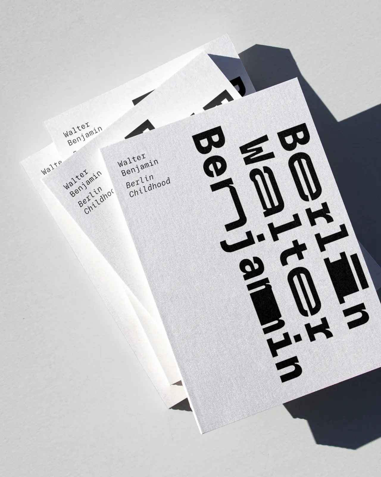
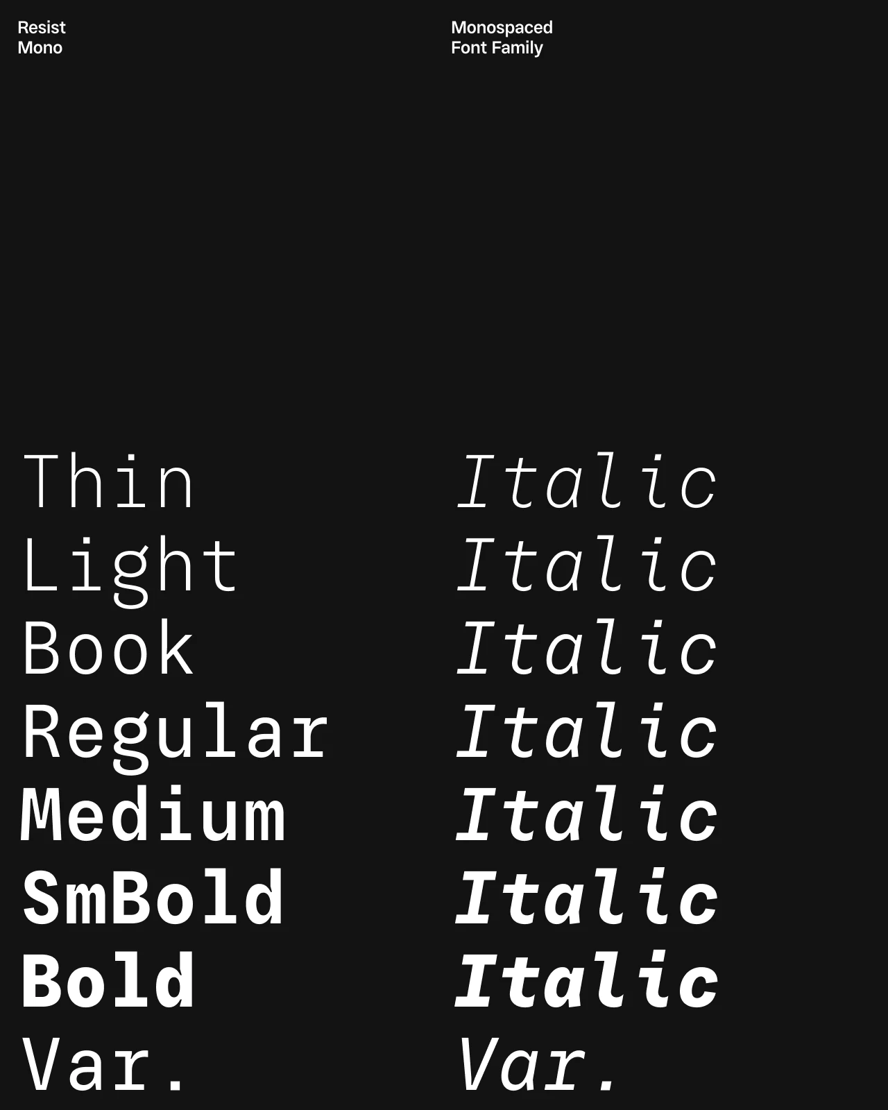
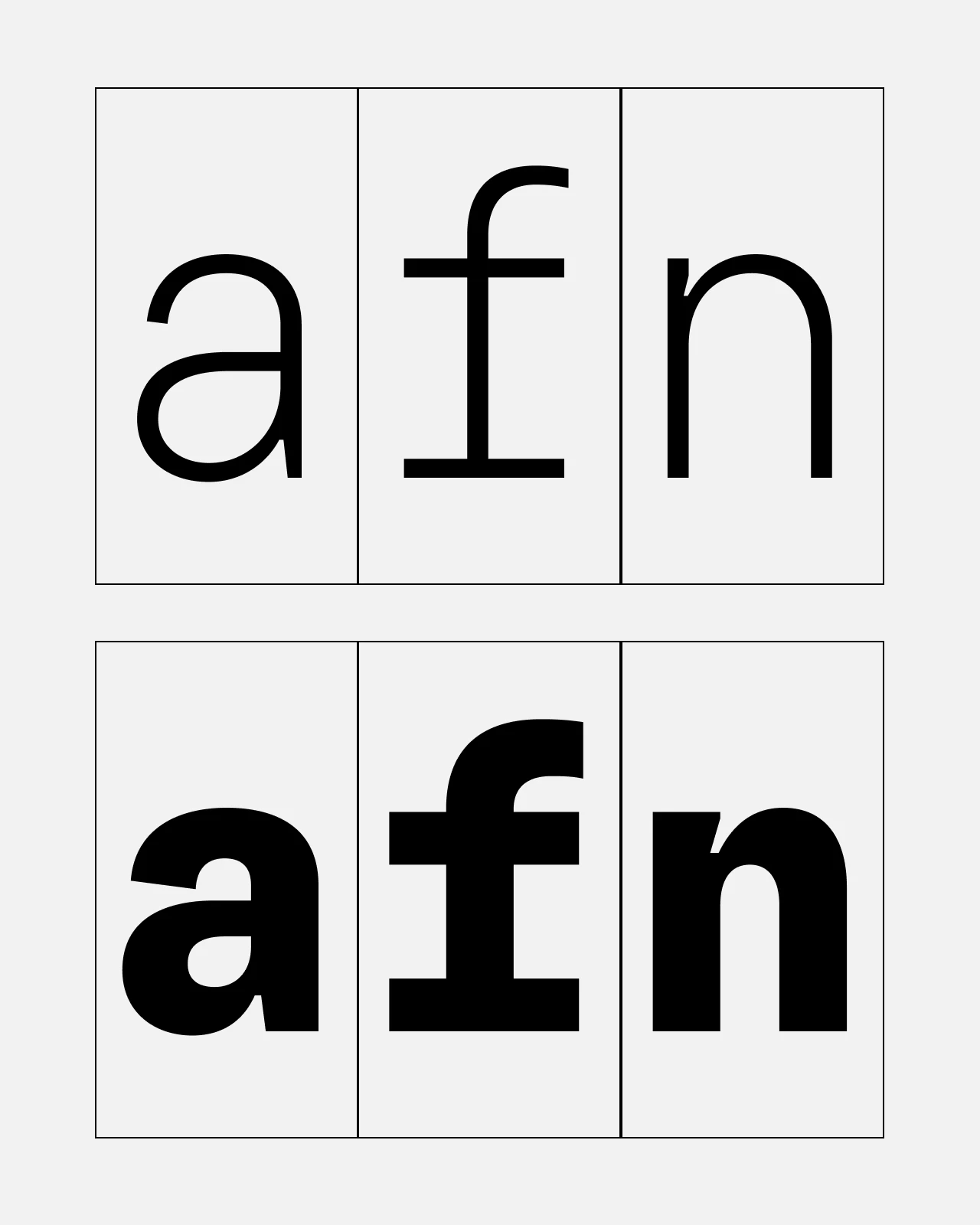
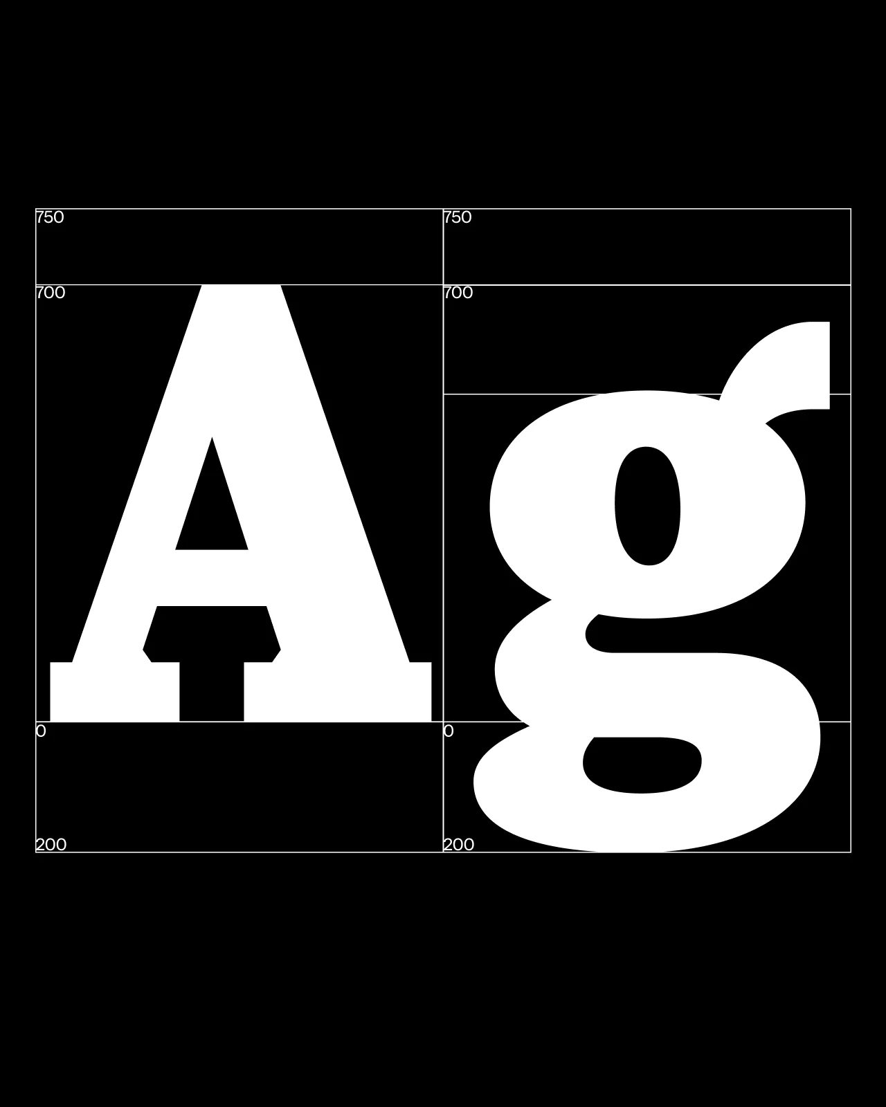
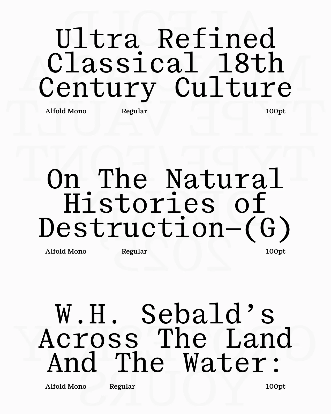
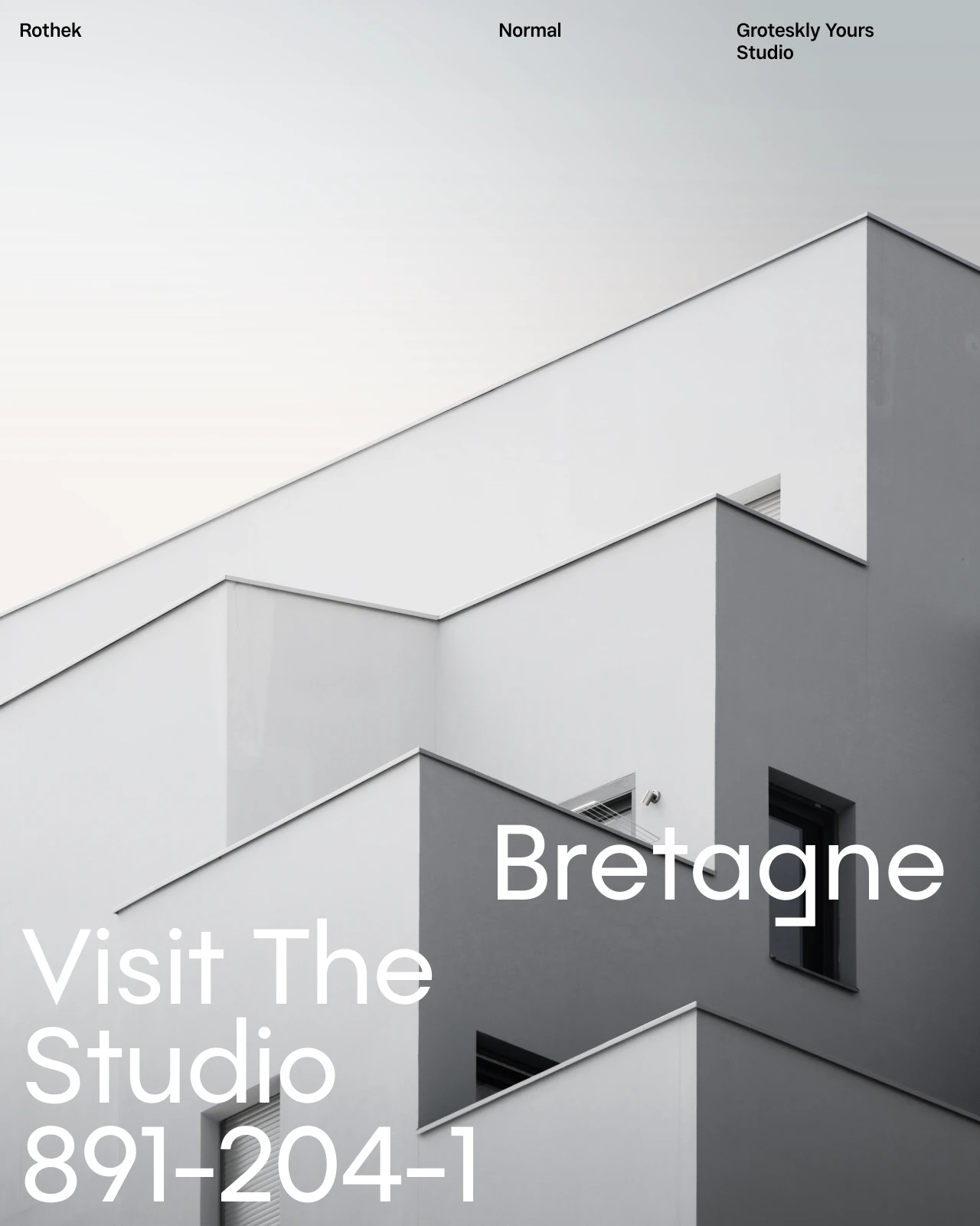
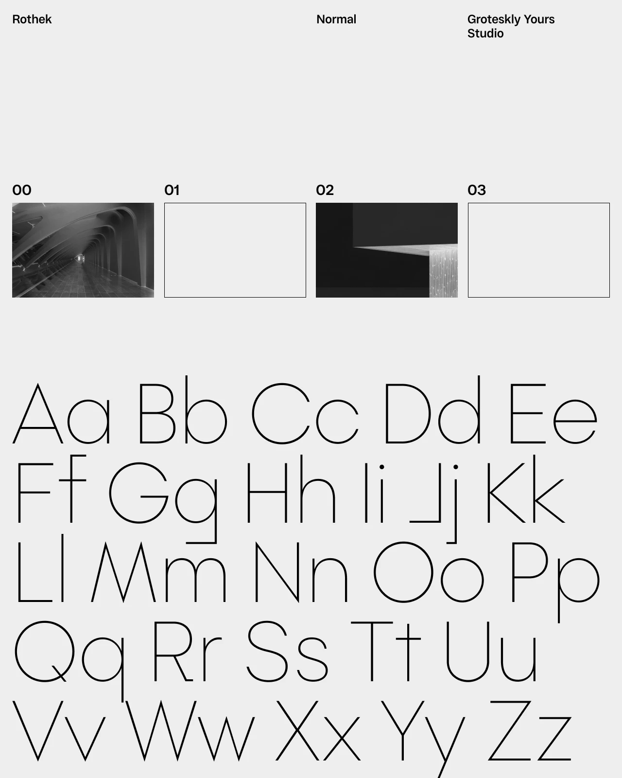
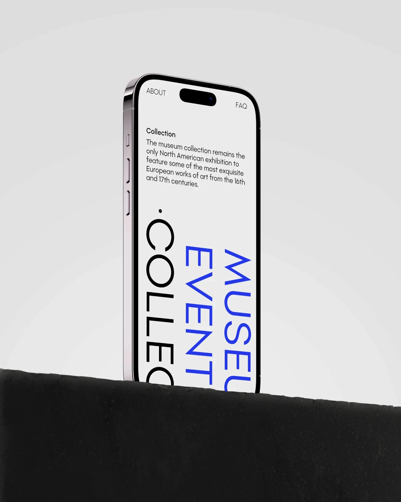
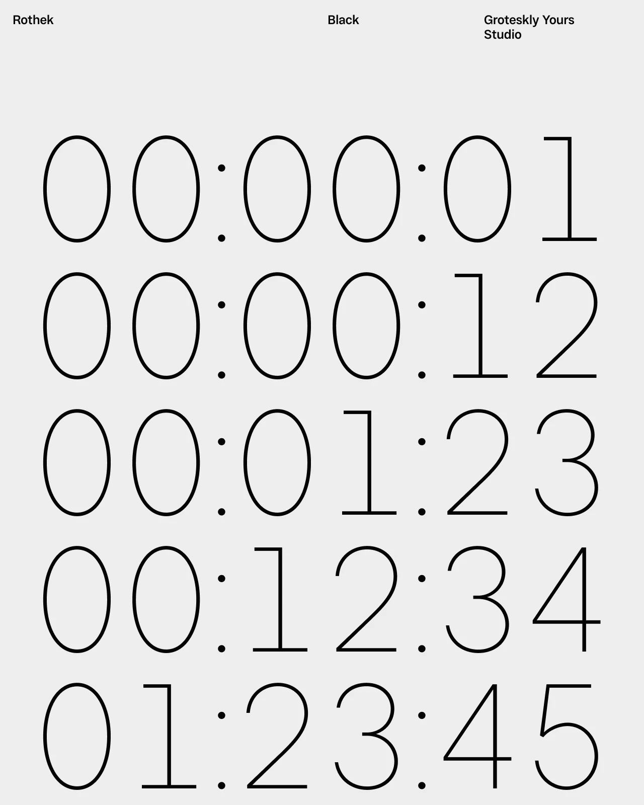
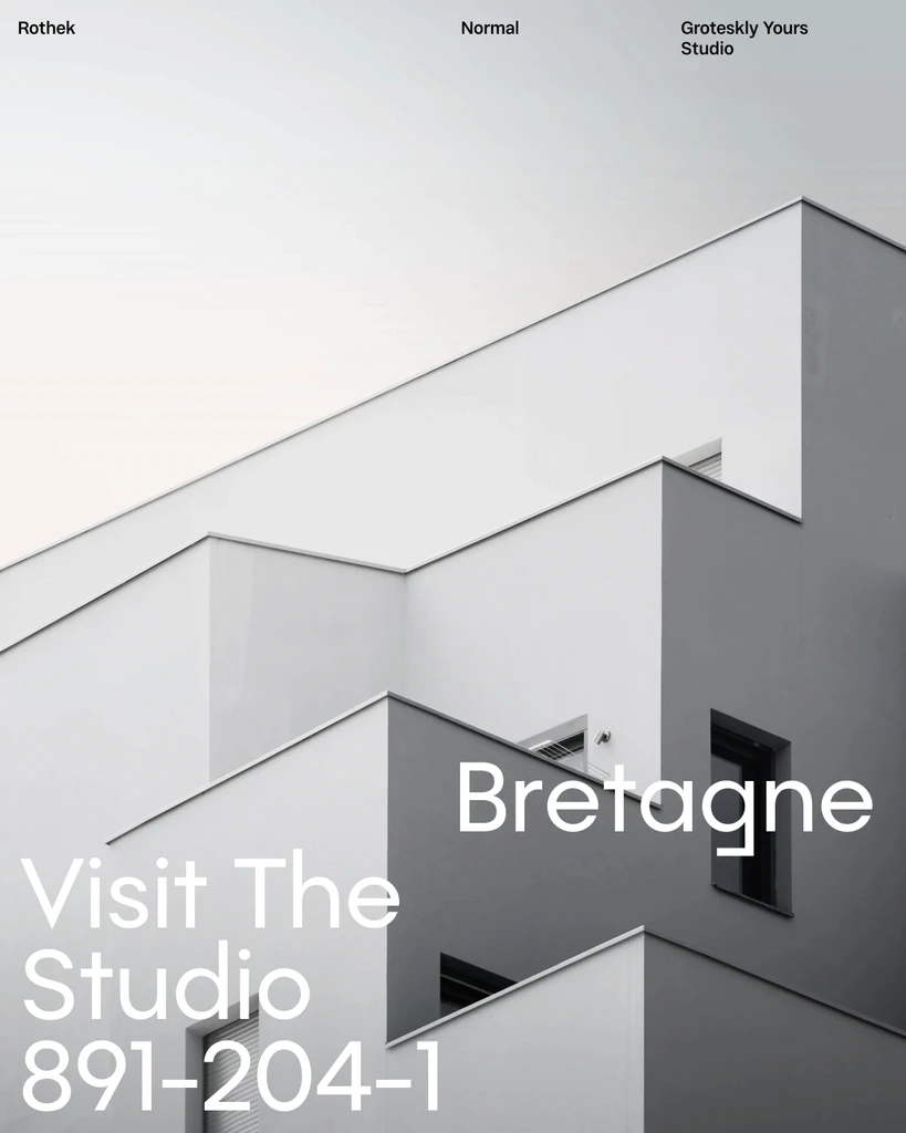
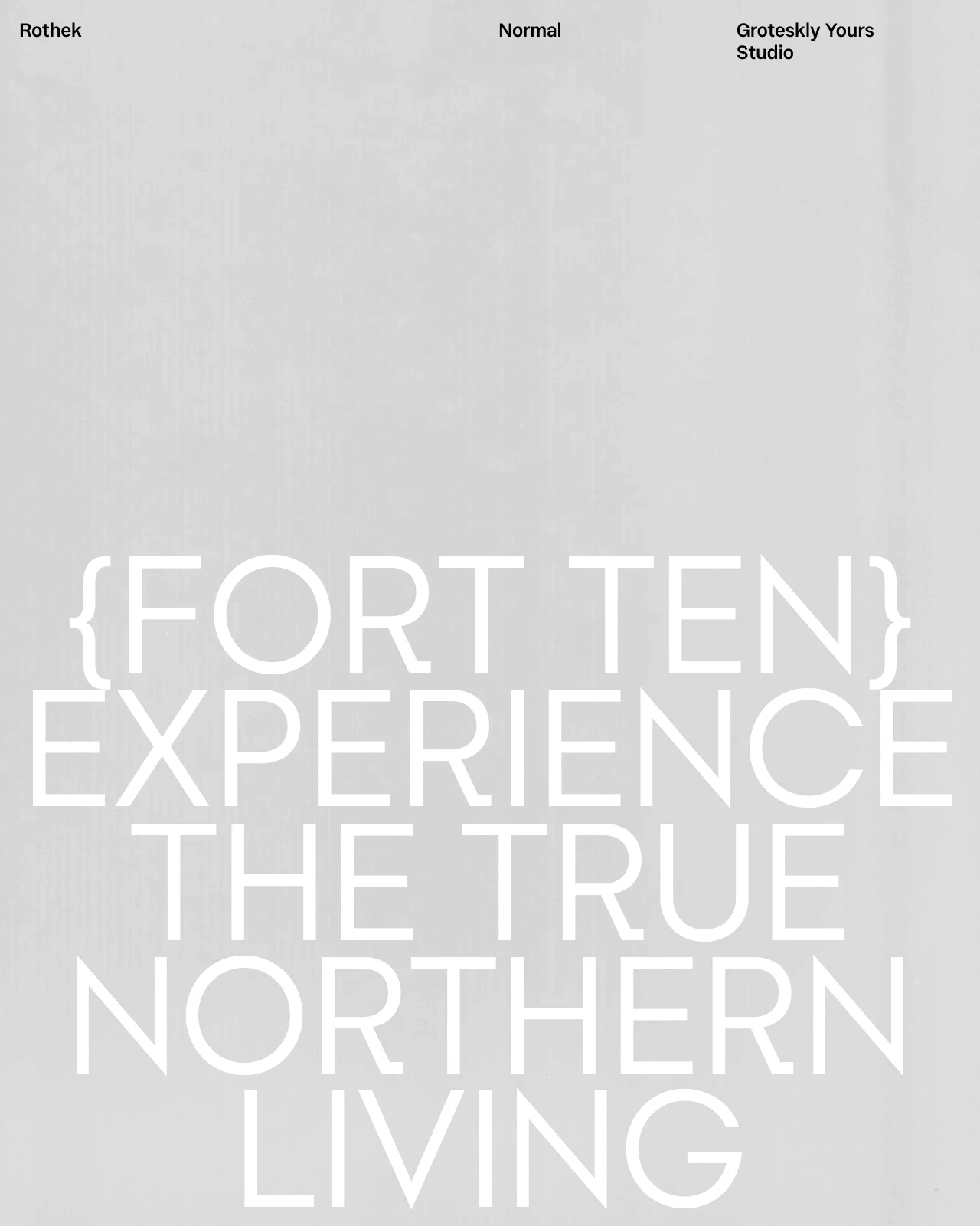
This collection brings together editorial fonts for long-form reading, headlines, captions, and supporting text. Some families are quieter and text-focused, while others add more expression for covers and display work. Compare their proportions, spacing, and readability in real layouts, then use the available trial versions before choosing a commercial license.






Frequently Asked Questions
What are editorial fonts?
Editorial fonts are typefaces designed for publications and content-rich layouts where readable text, clear hierarchy, and consistent rhythm are important.
What are editorial fonts used for?
They are commonly used for magazines, books, newspapers, reports, websites, articles, captions, and other editorial design projects.
What makes a good font for magazine or book design?
A good editorial font should remain readable at smaller sizes, create comfortable spacing, and provide enough contrast between headlines, subheads, captions, and body text.
Can editorial fonts be used for websites?
Yes. Editorial fonts can work well for blogs, digital magazines, news websites, and content-heavy pages when the chosen family performs clearly on screen.
Should editorial typography use serif or sans serif fonts?
Either can work. Serif fonts often create a traditional reading feel, while sans serif fonts can provide a cleaner and more contemporary tone.
Can editorial fonts work for both headlines and body text?
Some families are designed for text, while others are better suited to headlines or display use. Combining complementary styles can create a stronger editorial hierarchy.
Can I try the fonts before buying a license?
Yes. Trial versions are available so you can test the fonts in real layouts before choosing a commercial license. Use the trial font to check the typeface at the sizes and formats needed for your project.