Wide Fonts
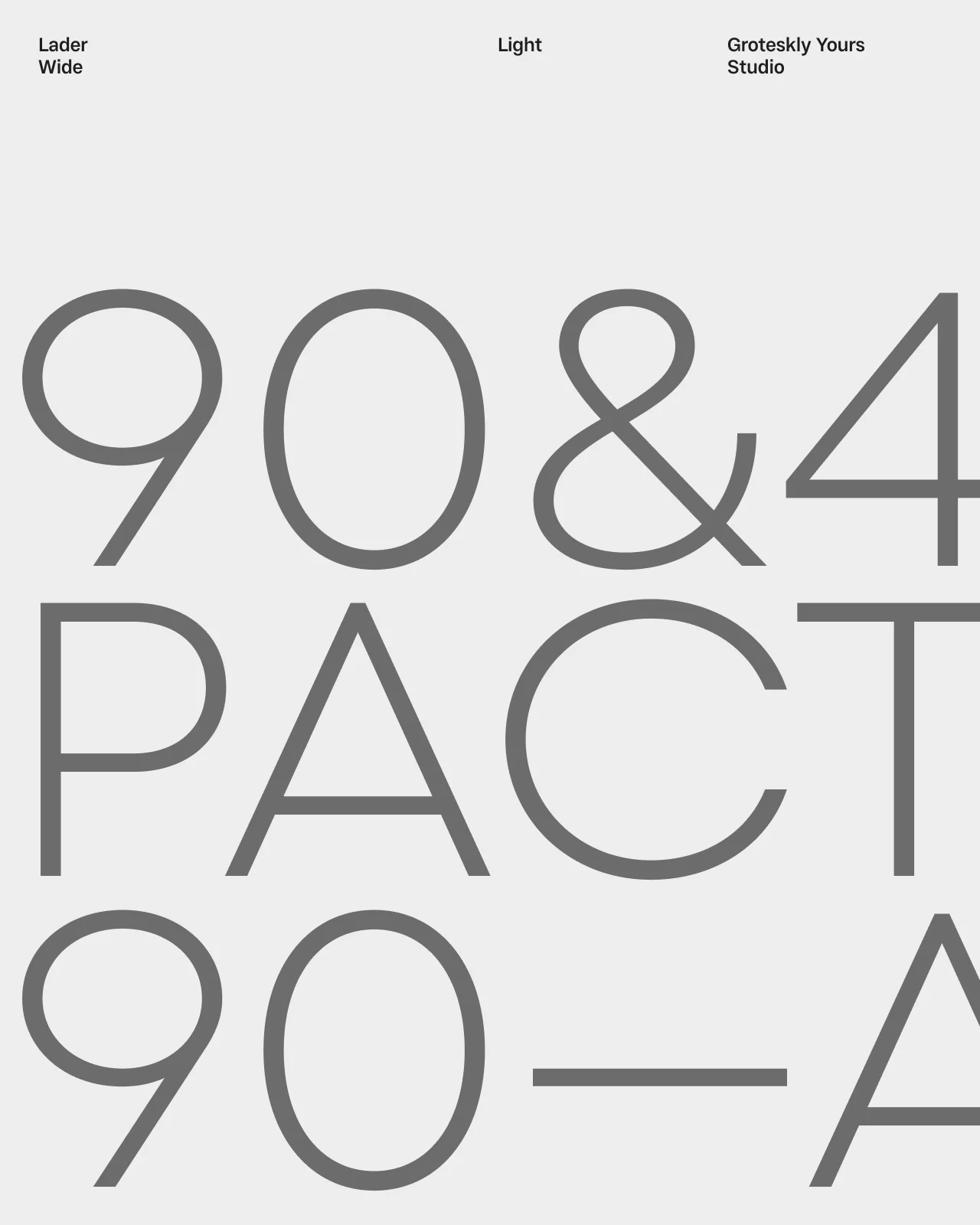
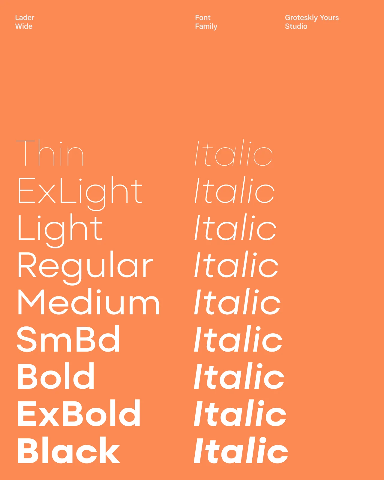
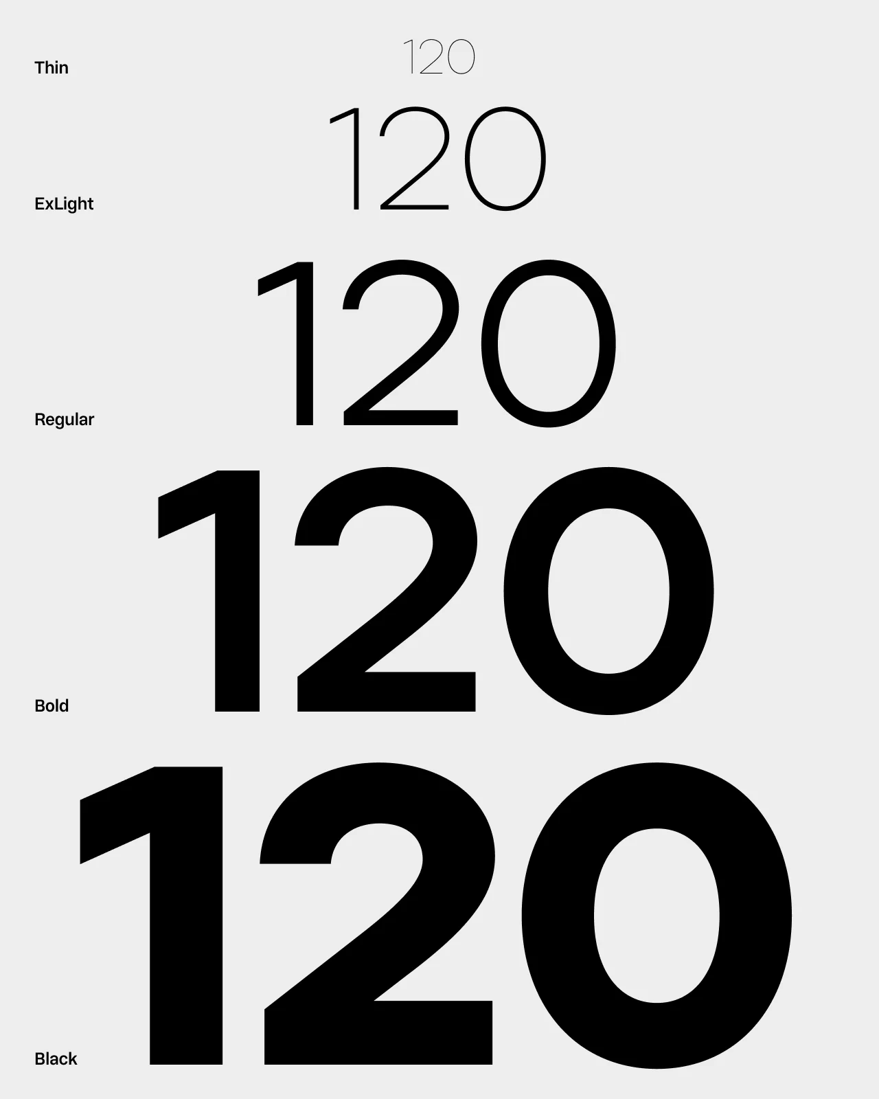
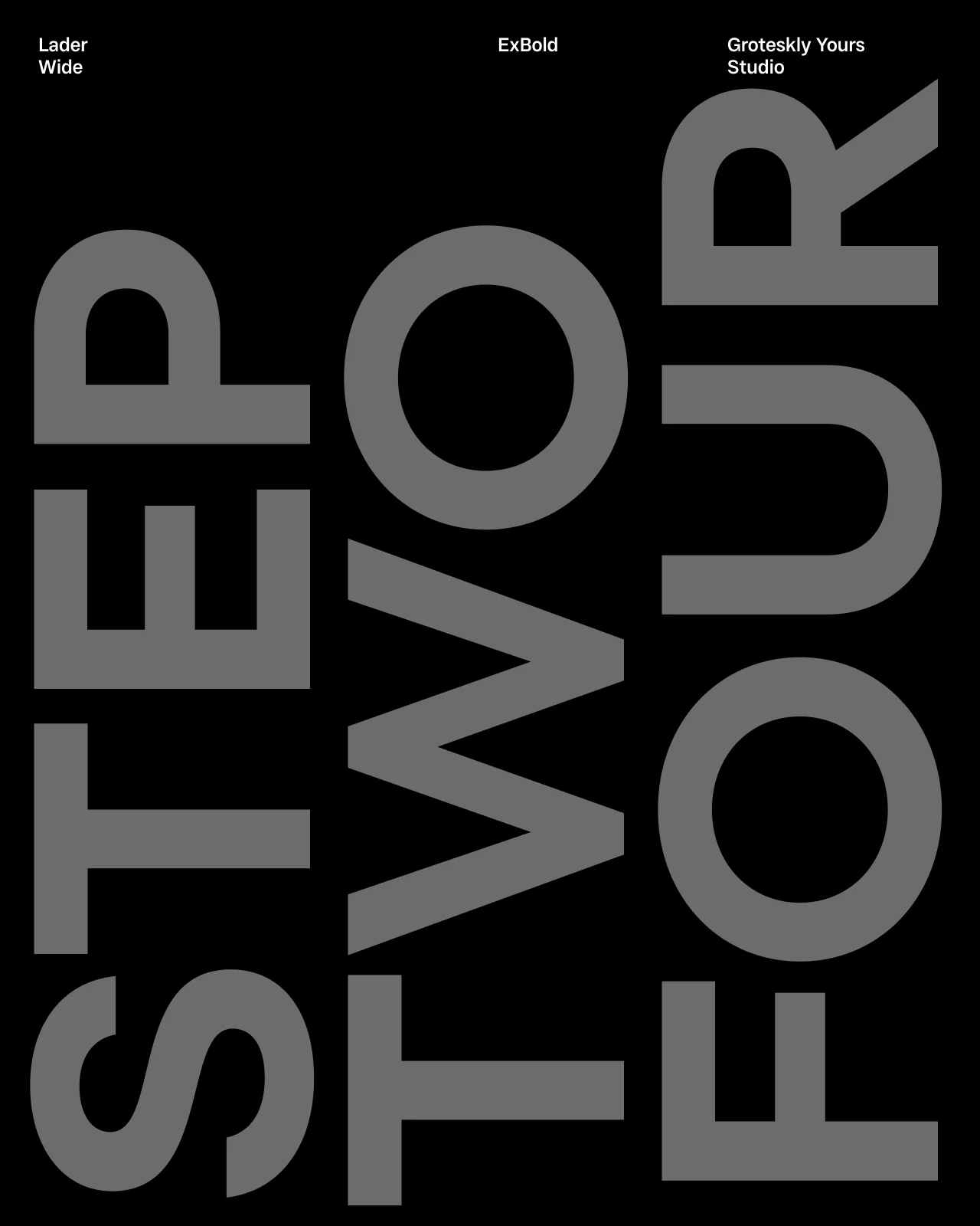
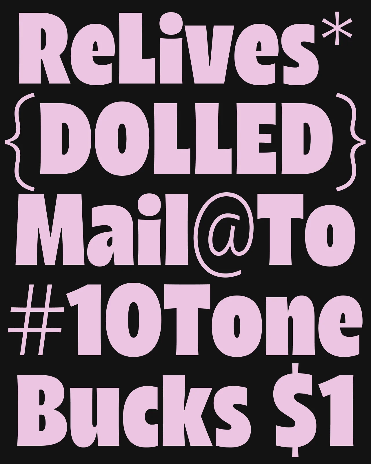
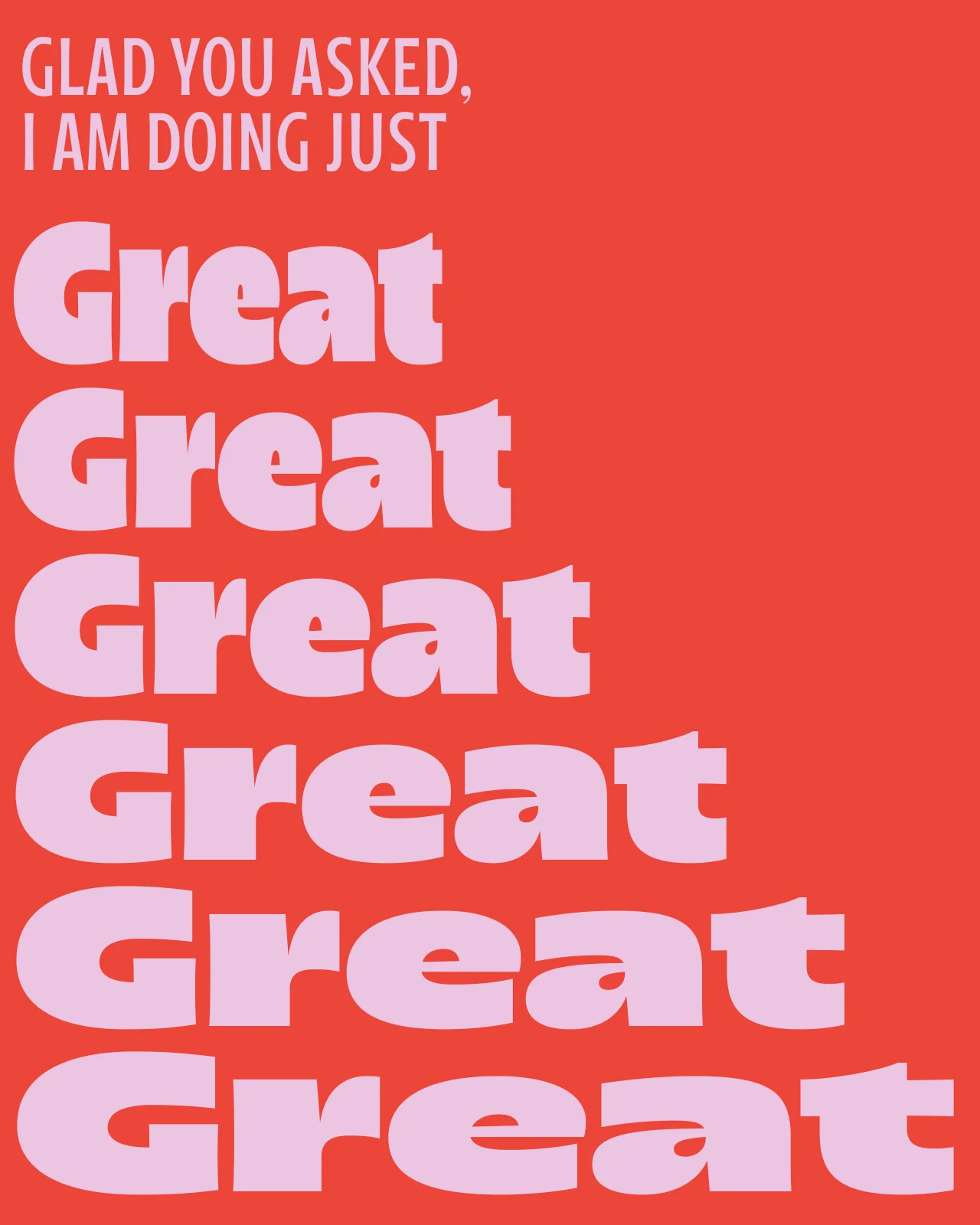
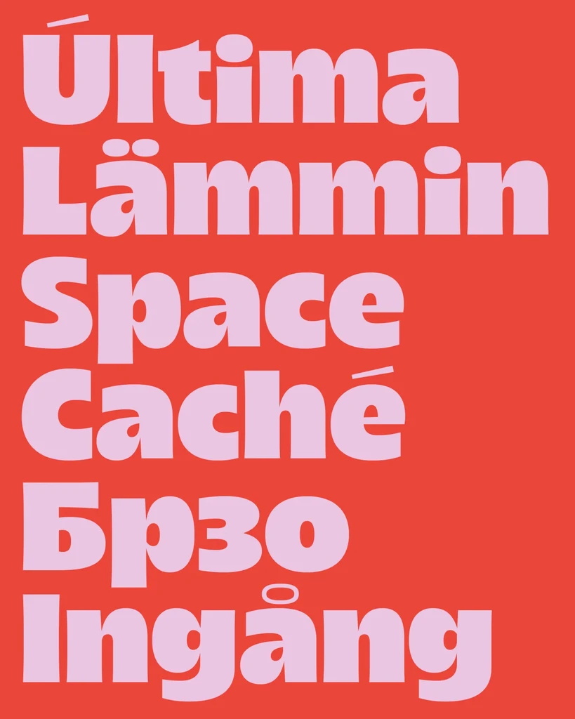
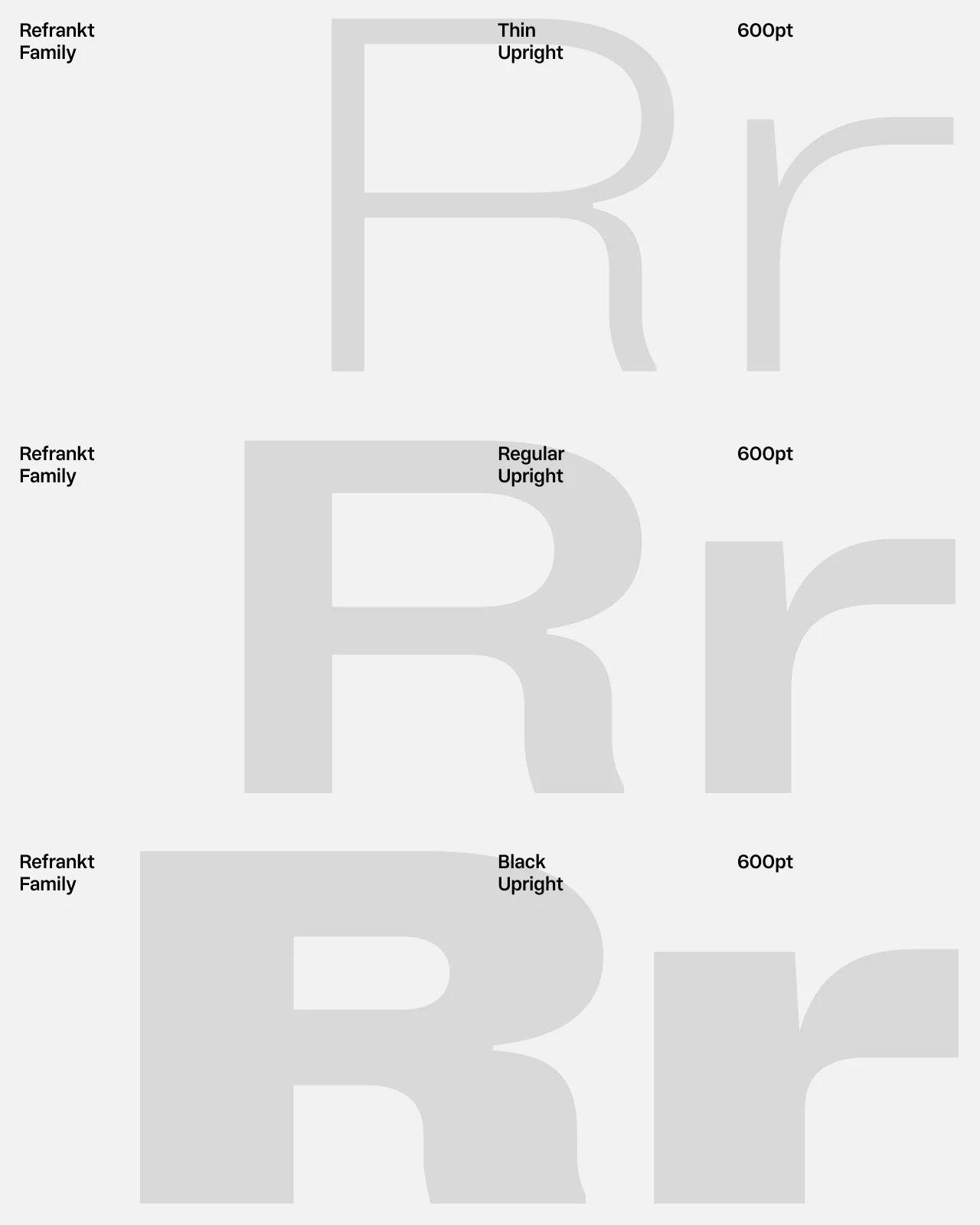
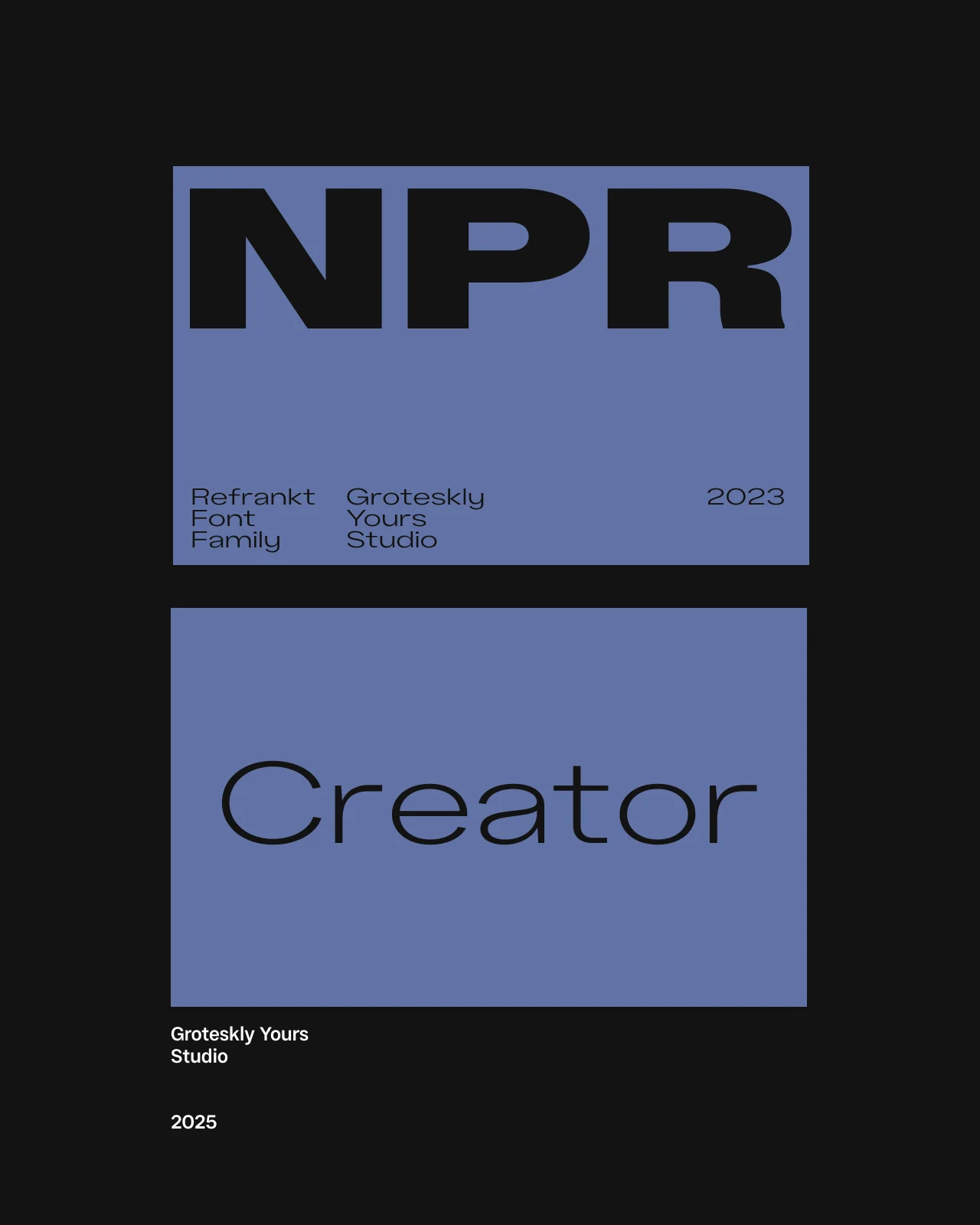
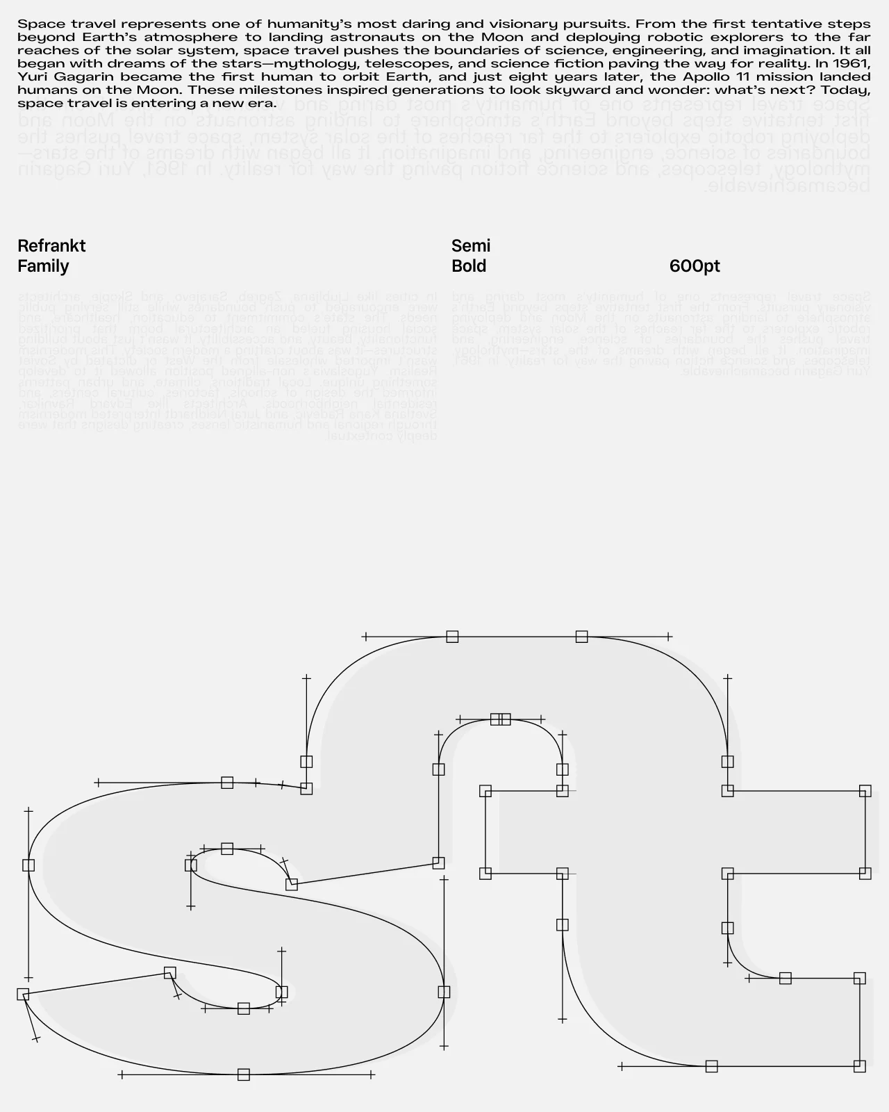
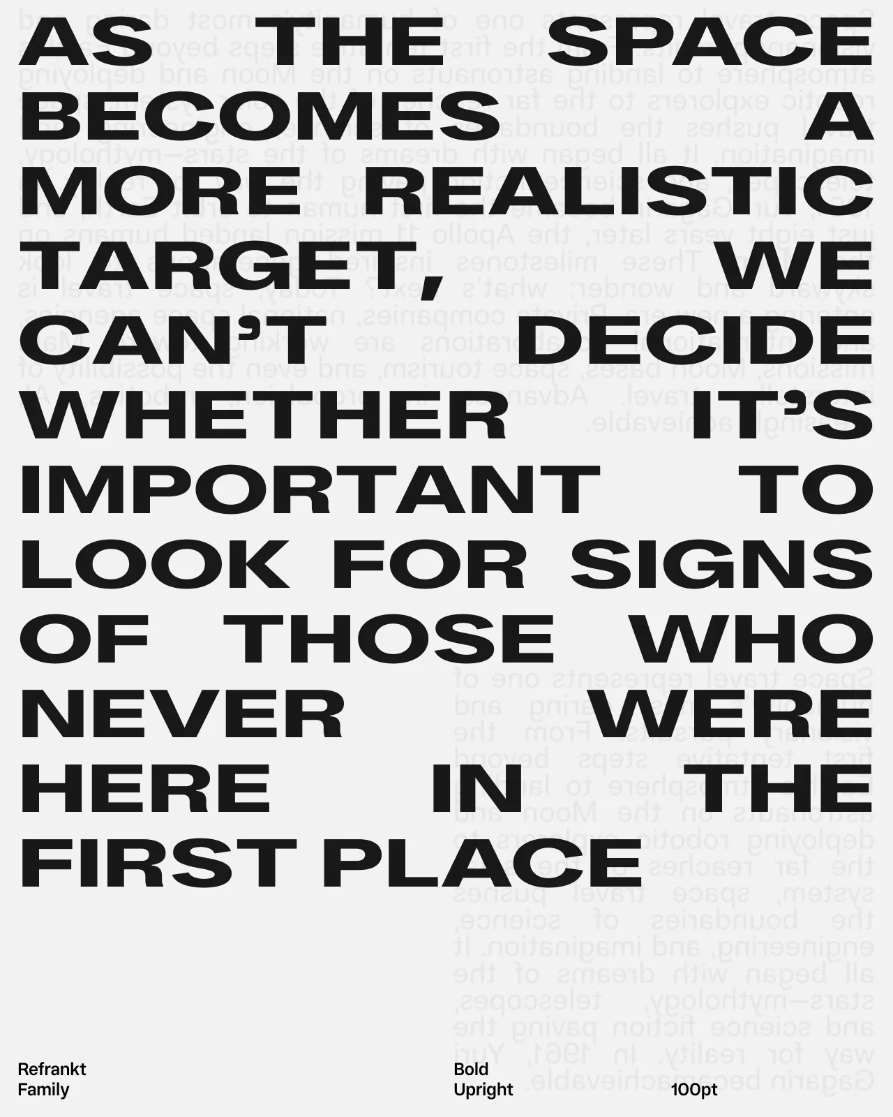
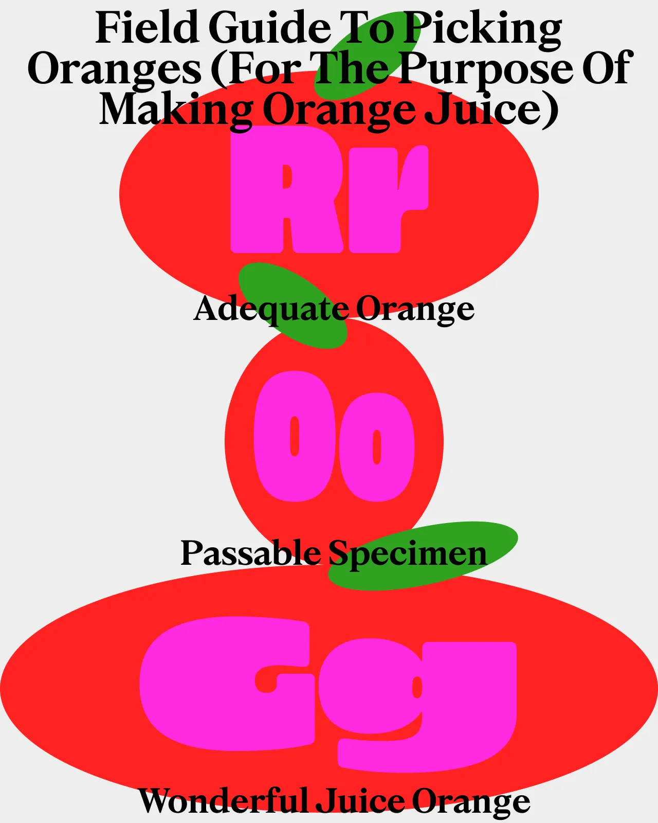
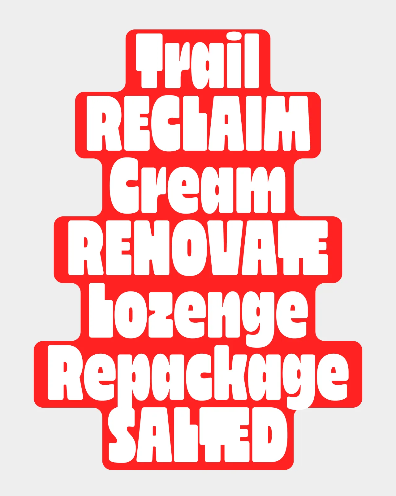
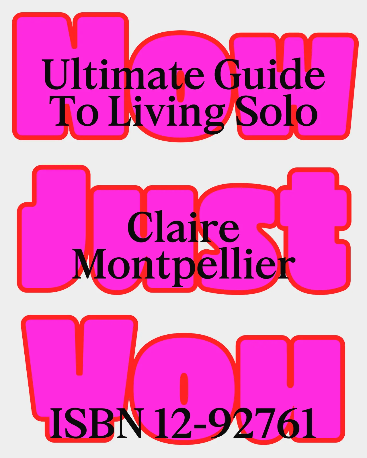
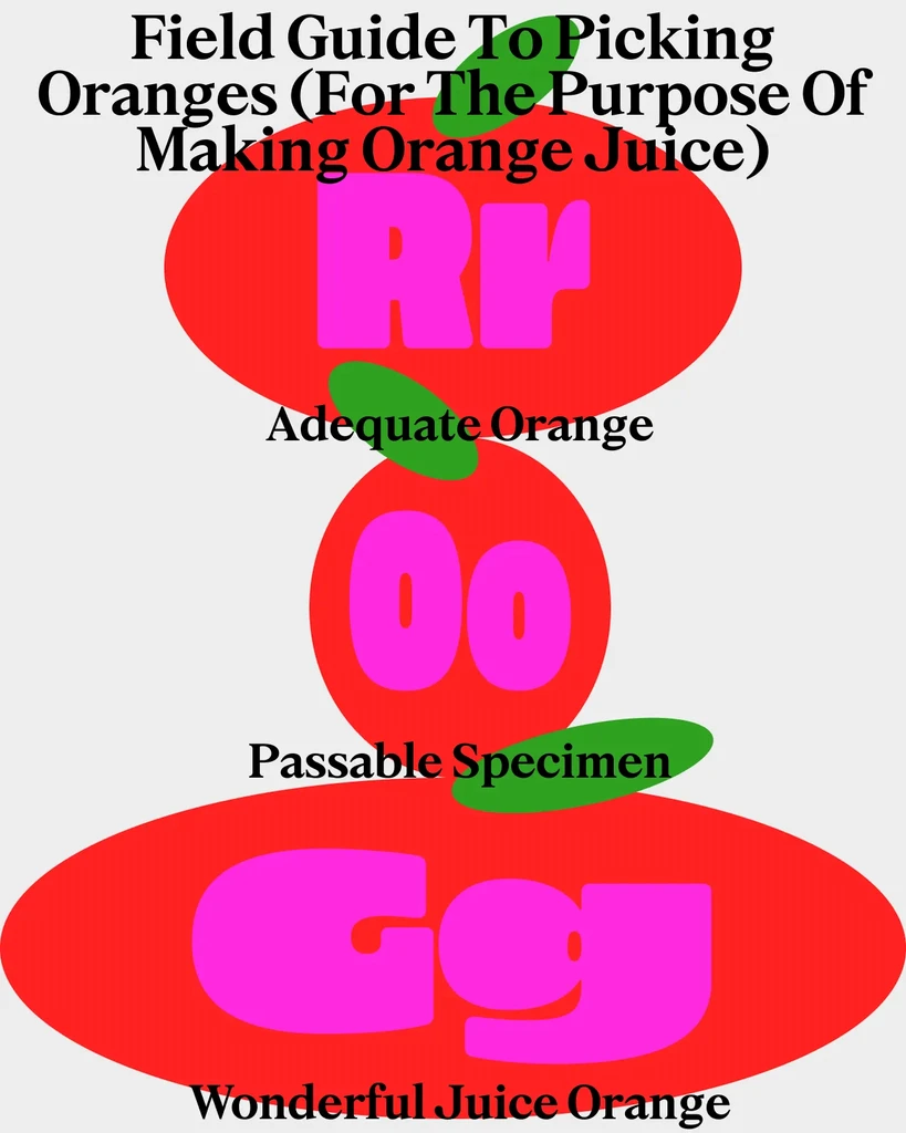
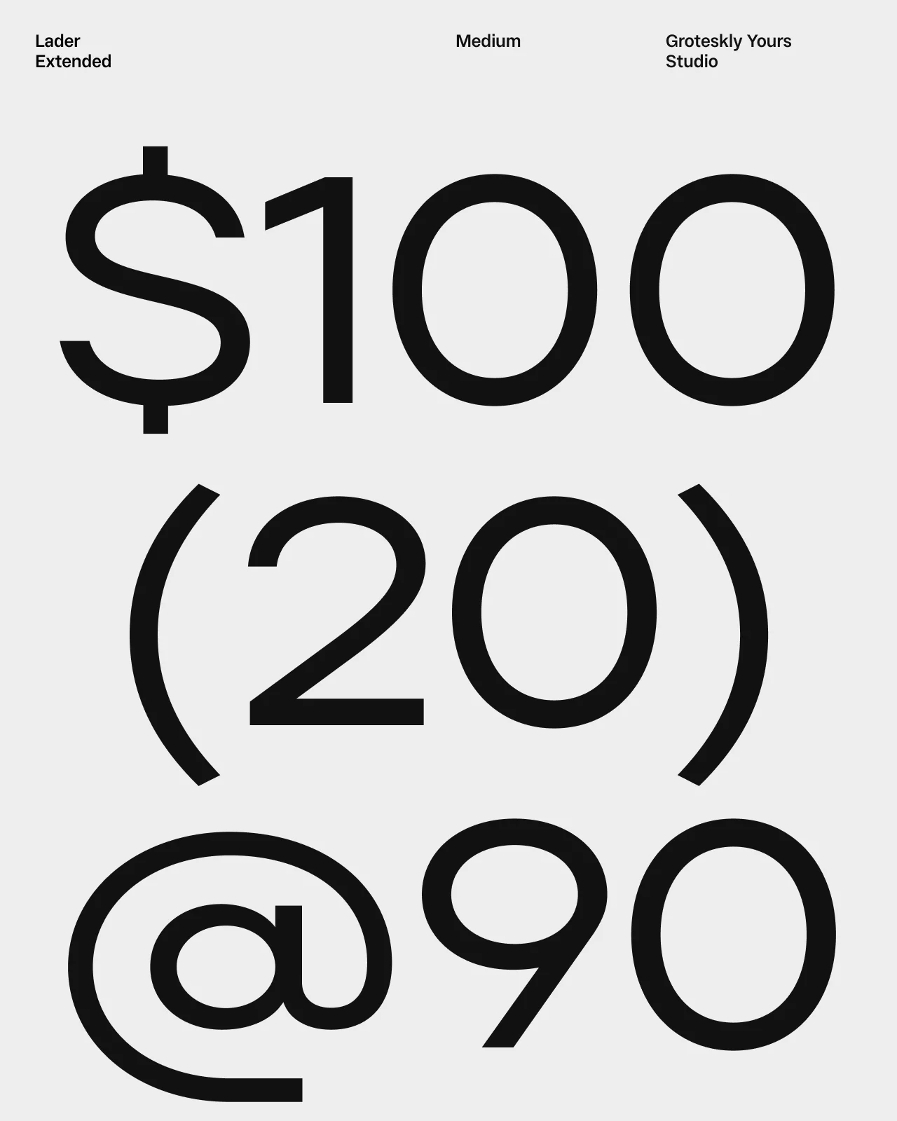
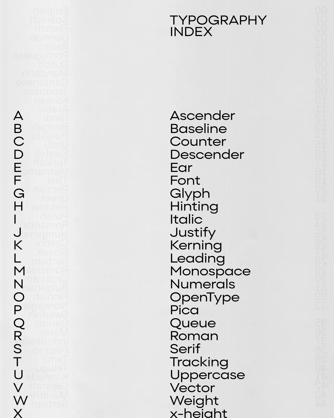
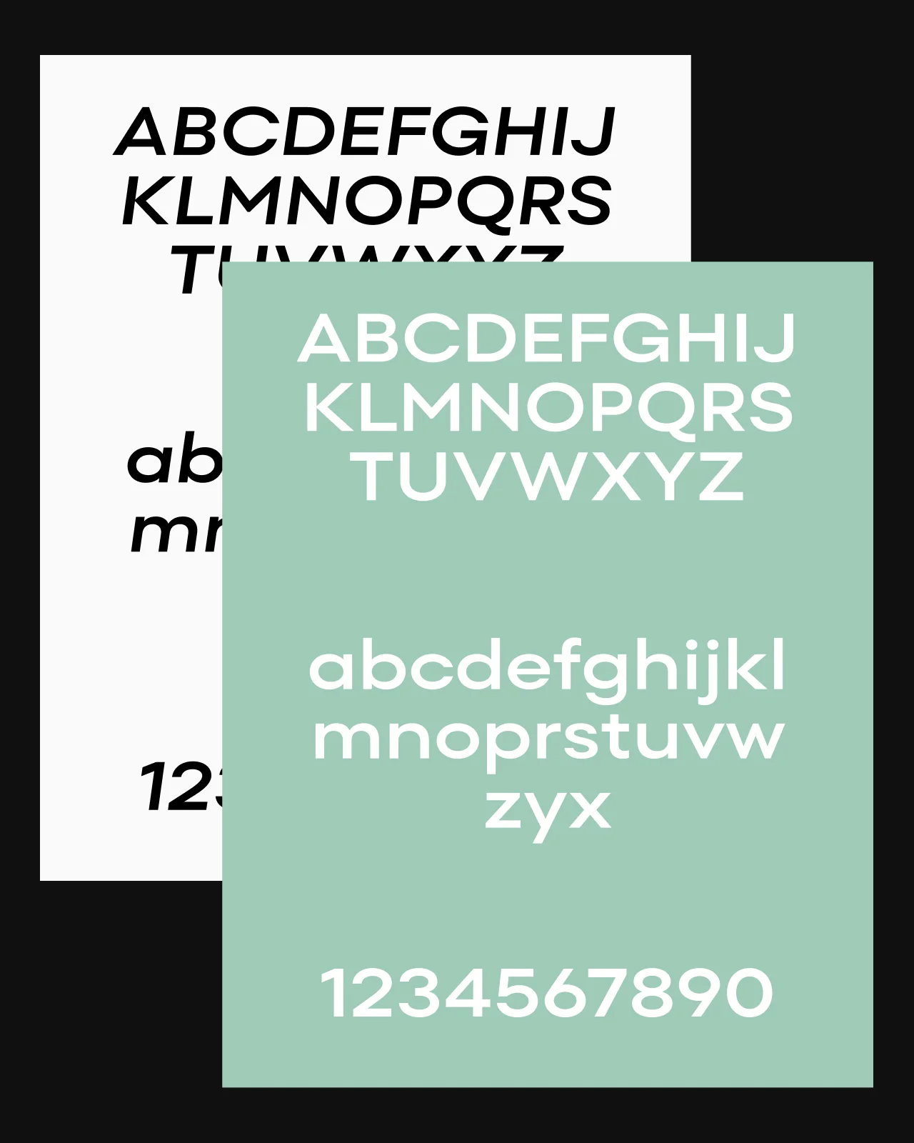
Wide fonts have wider letterforms than standard-width fonts, which gives text a more defined horizontal presence. Wide fonts are useful when you want a headline, logo, or poster to occupy more space without simply increasing the font size or weight. This collection brings together wide typefaces with different proportions, structures, and personalities. Some are designed for bold display work, while others have a more measured rhythm for branding, editorial layouts, and digital interfaces. Their extended forms create a strong visual silhouette while keeping the letterforms clear and balanced.
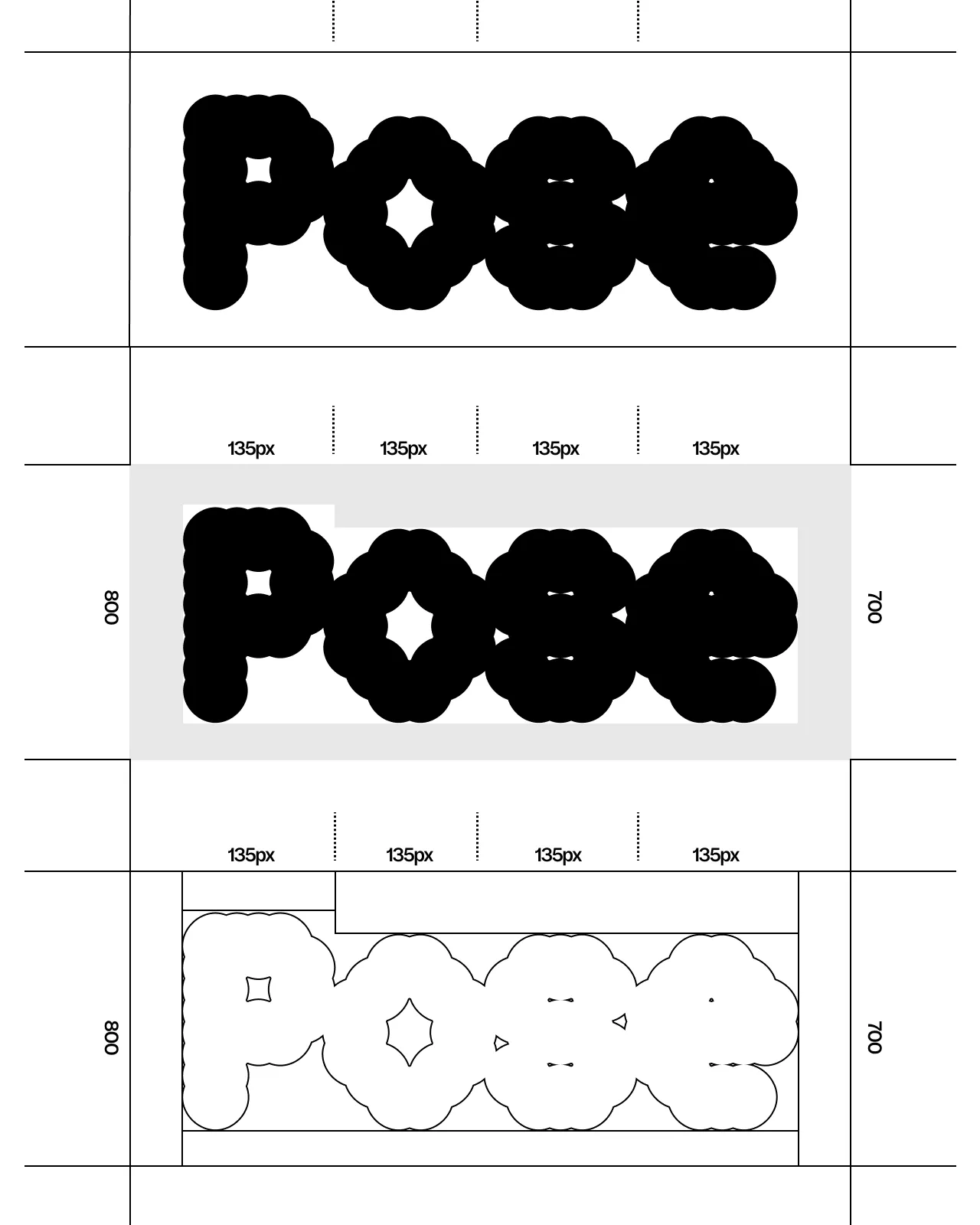
Wide fonts work well for logos, headlines, posters, packaging, and other designs where width is part of the visual identity. Trial versions are available so you can test the families in real layouts before licensing.






Frequently Asked Questions
What are wide fonts?
Wide fonts have broader letterforms than standard-width typefaces, creating a stronger horizontal presence.
What are wide fonts used for?
They are commonly used for logos, headlines, posters, packaging, title designs, and branding.
Are wide fonts suitable for logos?
Yes. Their proportions can create a distinctive silhouette for wordmarks and logotypes.
Are wide fonts suitable for body text?
Wider fonts usually work best at display sizes, so think headers, titles, etc. Some can work for short passages, but their width may reduce the number of words per line.
Can wide fonts be used in web design?
Yes. They work well for headings, banners, navigation, and other display elements. Just test line breaks across screen sizes and choose the correct web license.
Can I try the fonts before buying a license?
Yes. Trial versions are available so you can test the fonts in real layouts before choosing a commercial license. Use the trial font to check the typeface at the sizes and formats needed for your project.