Subtle Fonts
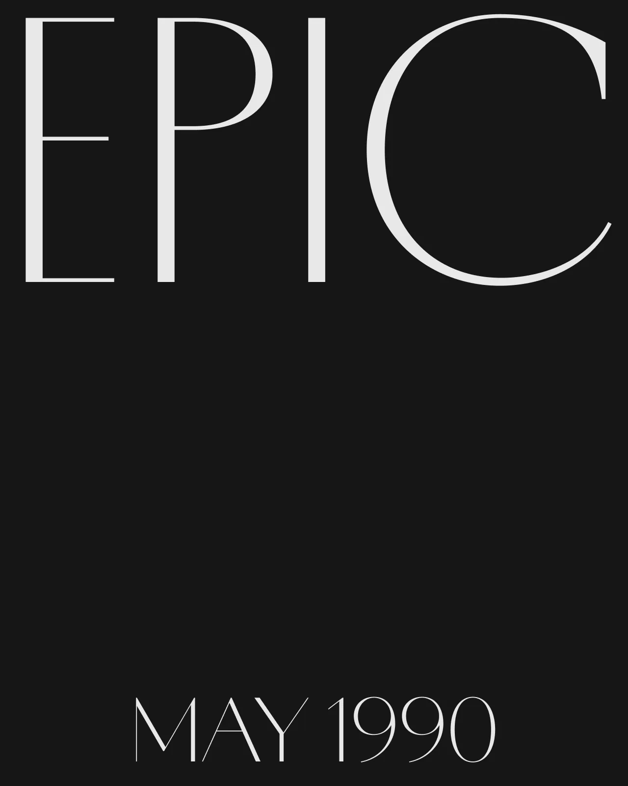
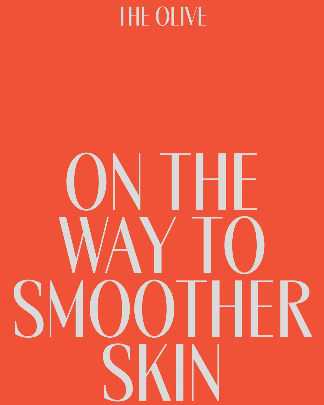
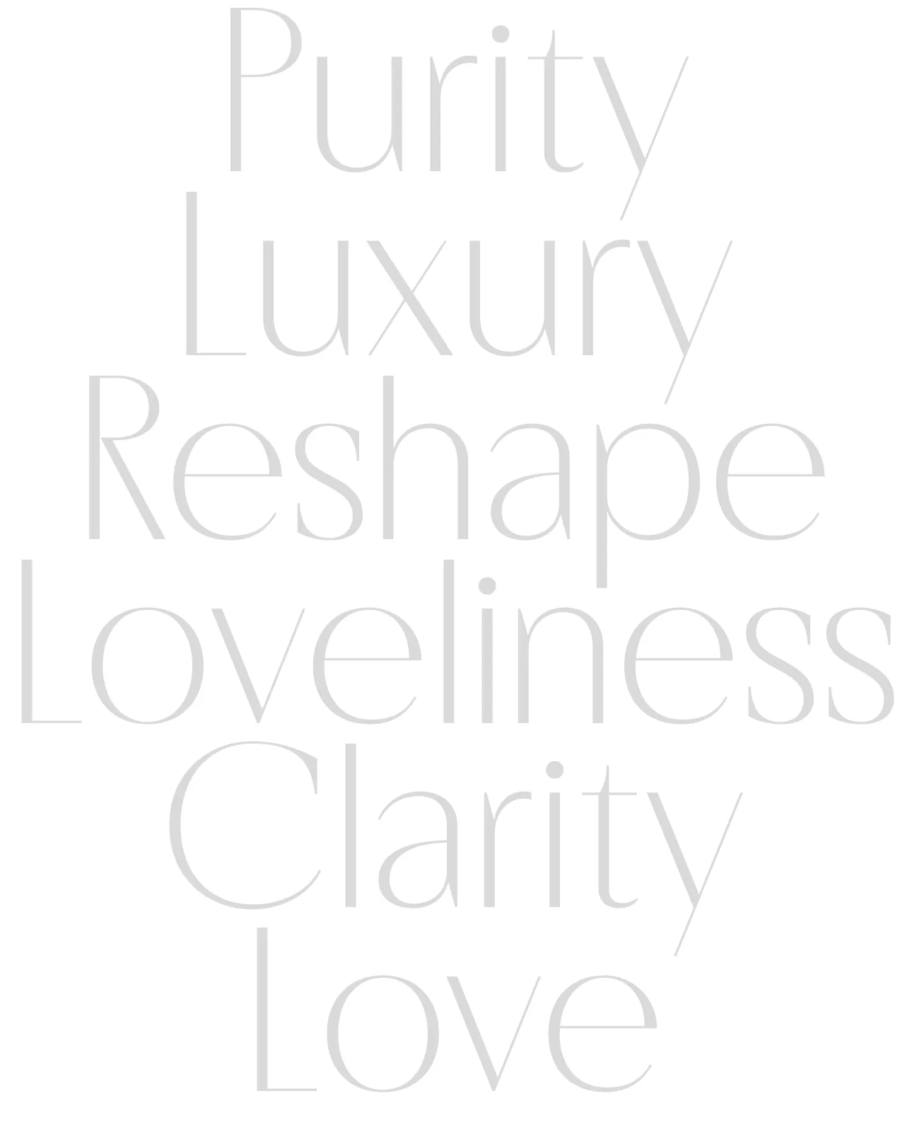
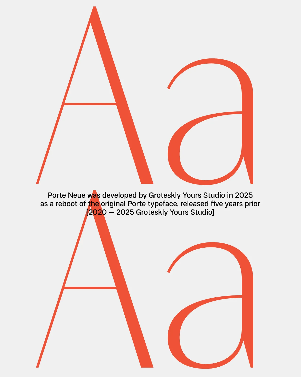
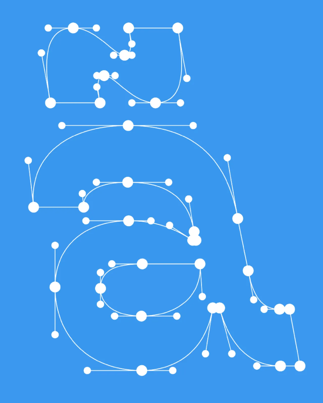
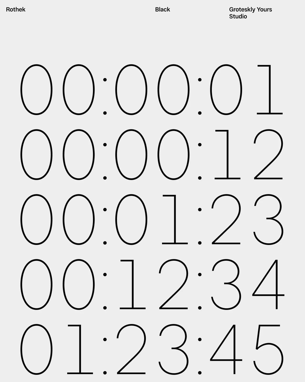
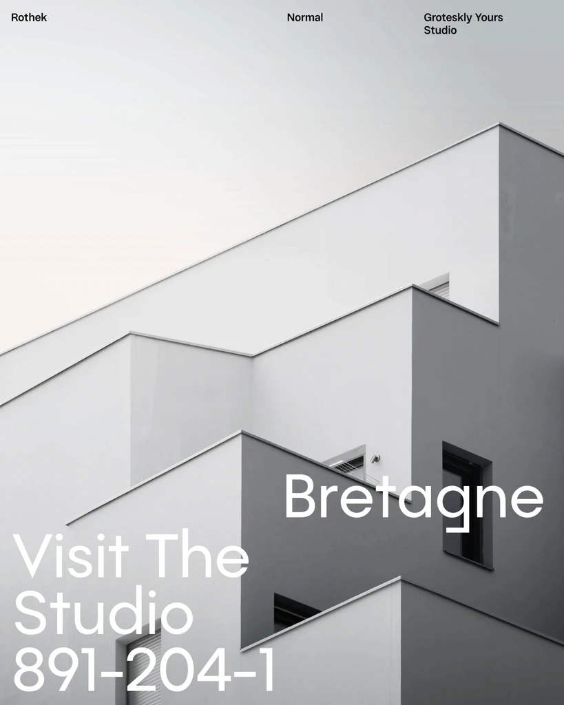
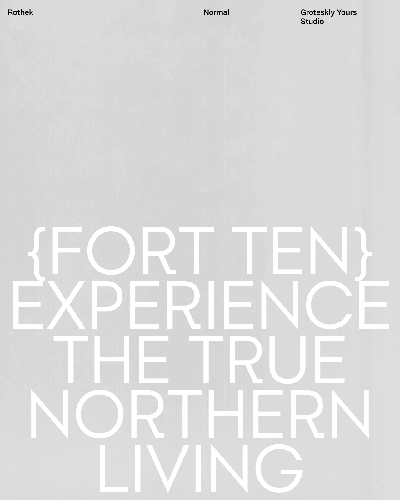
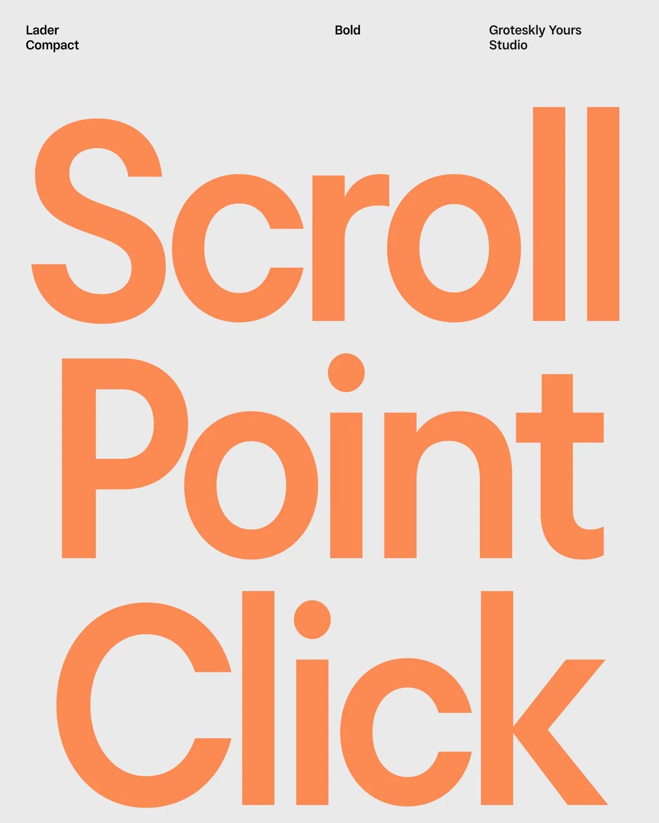
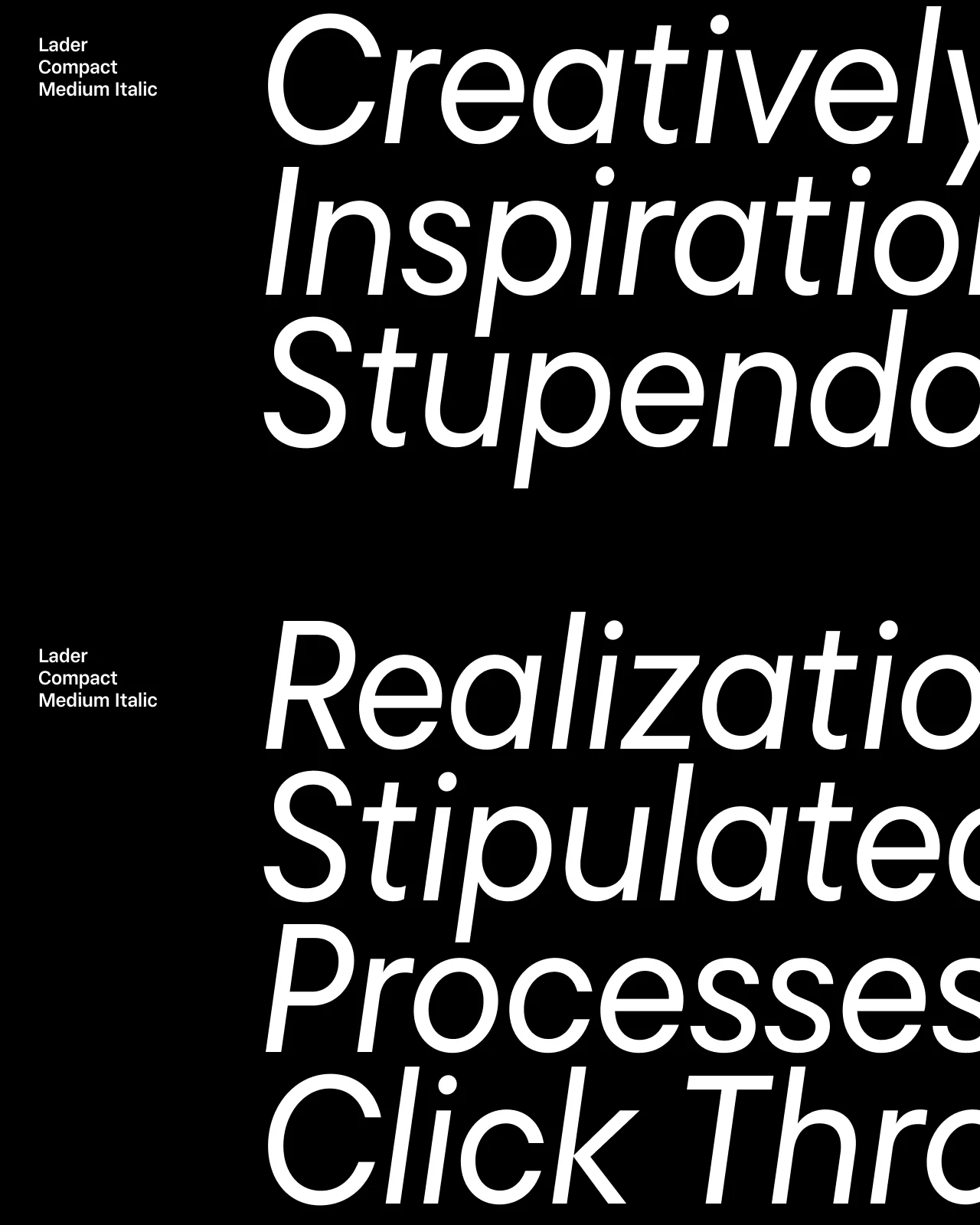
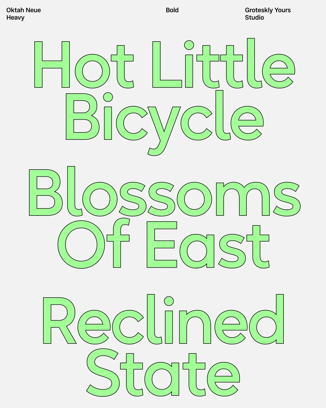
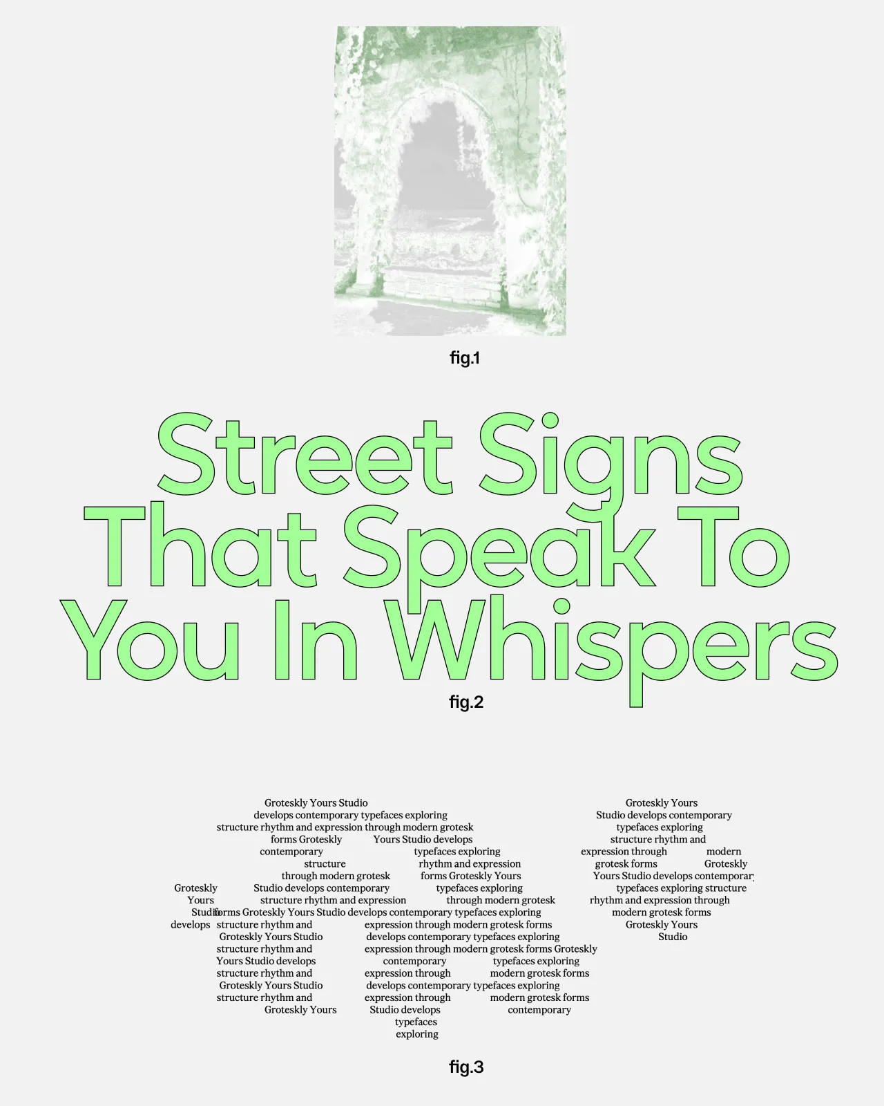
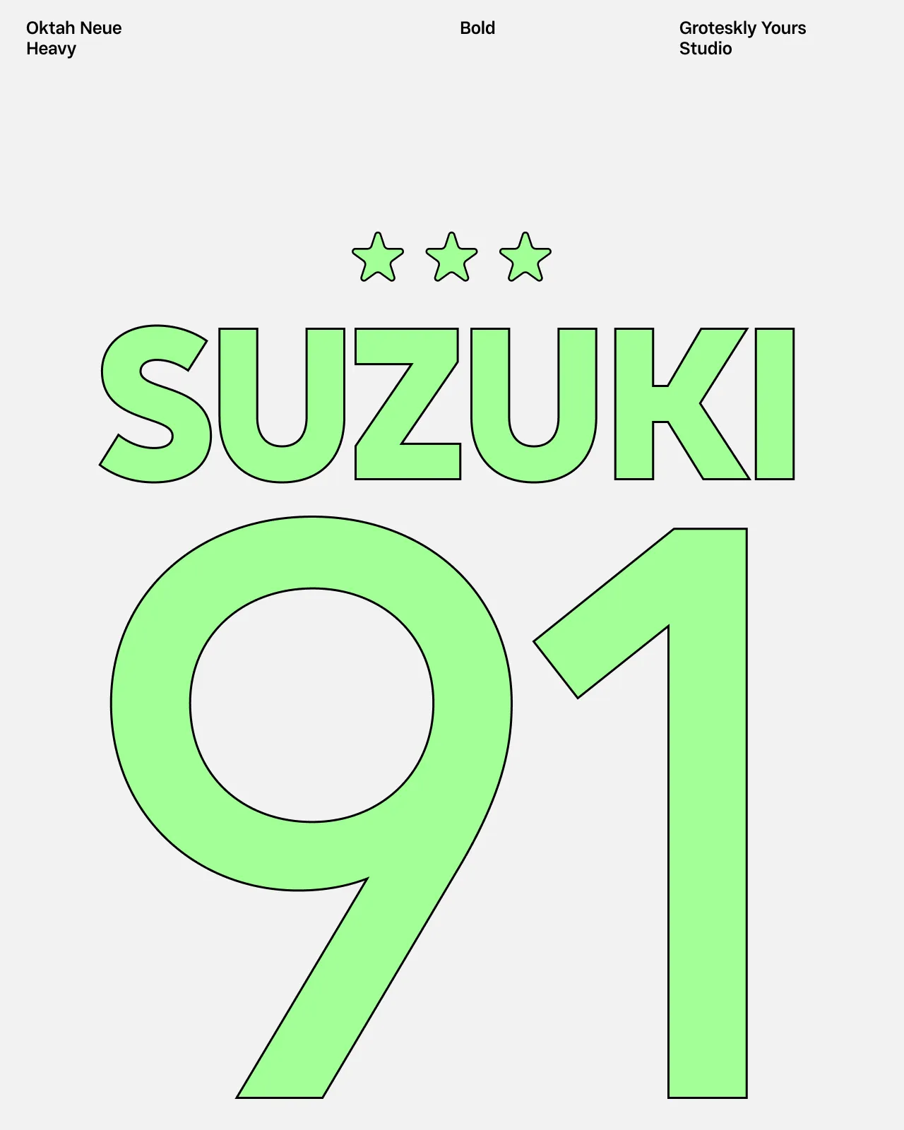
Subtle fonts are typefaces defined by restraint, balance, and careful detail. They favor measured proportions and controlled contrast, allowing typography to integrate quietly into a layout without drawing unnecessary attention.
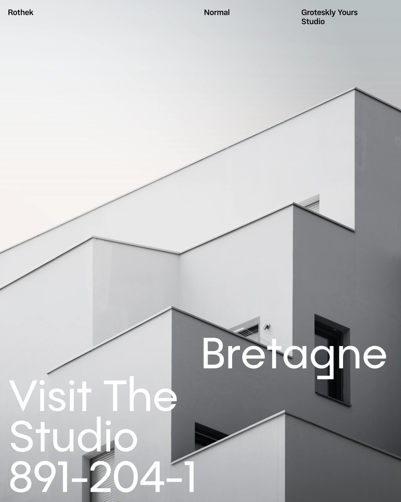
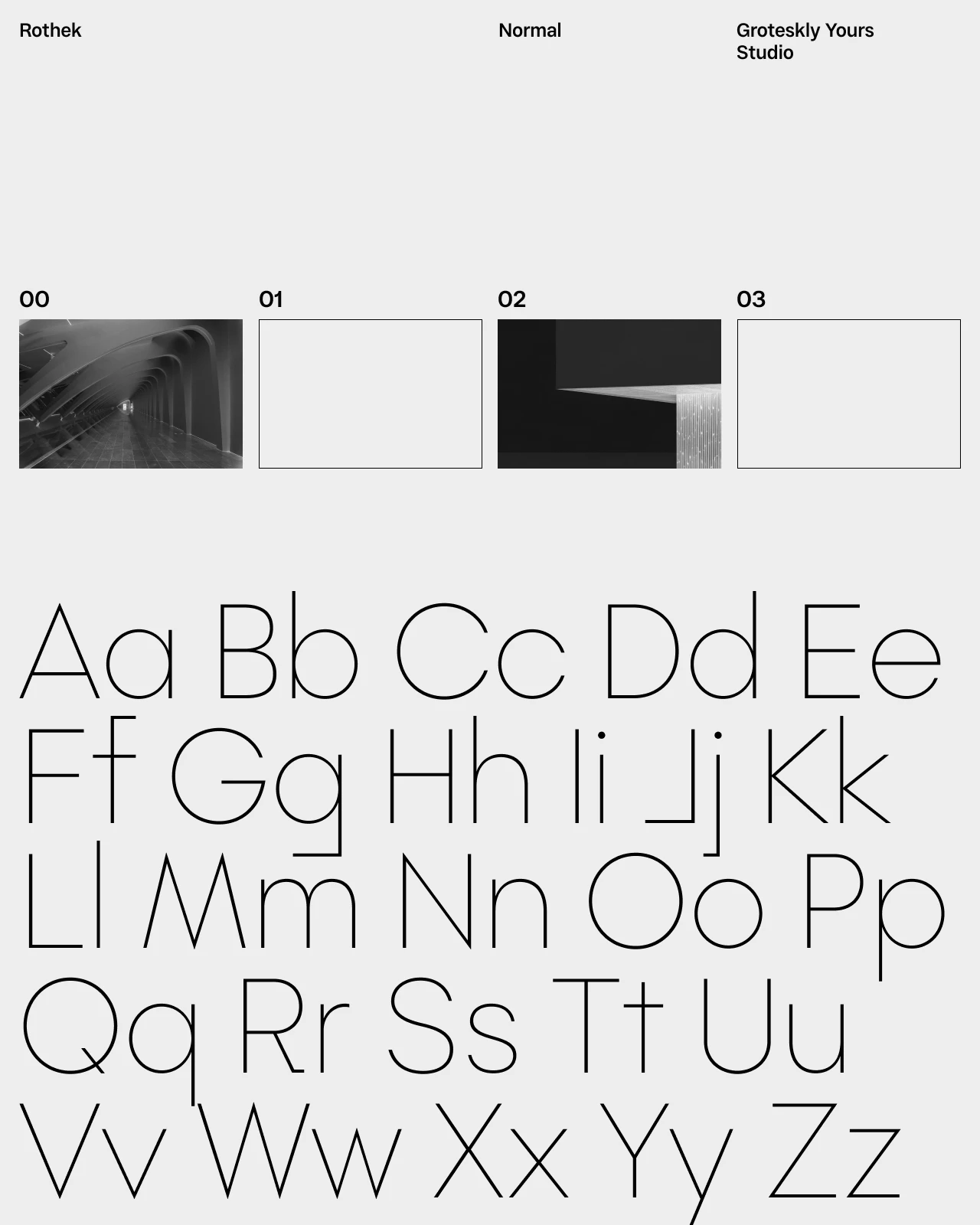
This collection includes subtle typefaces with refined structures and consistent spacing. Each font family emphasizes clarity and rhythm, resulting in reliable readability across print and digital environments. The overall approach focuses on precision and tonal balance rather than visual emphasis.
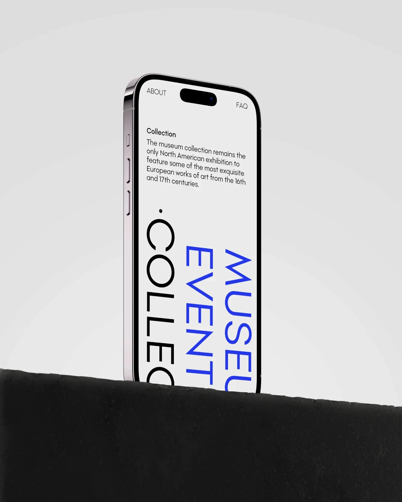
Subtle font families are commonly used in branding, editorial layouts, and digital interfaces. Free trial versions are available, allowing the fonts to be tested in real layouts before licensing.








Frequently Asked Questions
What are subtle fonts?
Subtle fonts have restrained details and a controlled visual presence. They add tone and character without becoming the dominant element in a design.
What are subtle fonts used for?
They are usually used for branding, editorial layouts, websites, interfaces, packaging, invitations, and projects that need a refined or understated tone.
Are subtle fonts suitable for branding?
Yes. Subtle branding fonts can create a polished identity that feels considered without relying on loud or highly decorative typography.
What is the difference between subtle and minimalist fonts?
Subtle fonts focus on quiet visual impact. Minimalist fonts usually follow a broader design approach based on reduction, simplicity, and the removal of unnecessary elements.
Are subtle fonts suitable for body text?
Some are. More neutral and legible subtle typefaces can work well for body text, while expressive styles are better used for headings, labels, or short passages.
Can subtle fonts work in luxury branding?
Yes. Refined proportions and restrained details can support a premium or elegant visual identity, especially when combined with careful spacing and layout.
Can I try the fonts before buying a license?
Yes. Trial versions are available so you can test the fonts in real layouts before choosing a commercial license. Use the trial font to check the typeface at the sizes and formats needed for your project.