Slanted Fonts
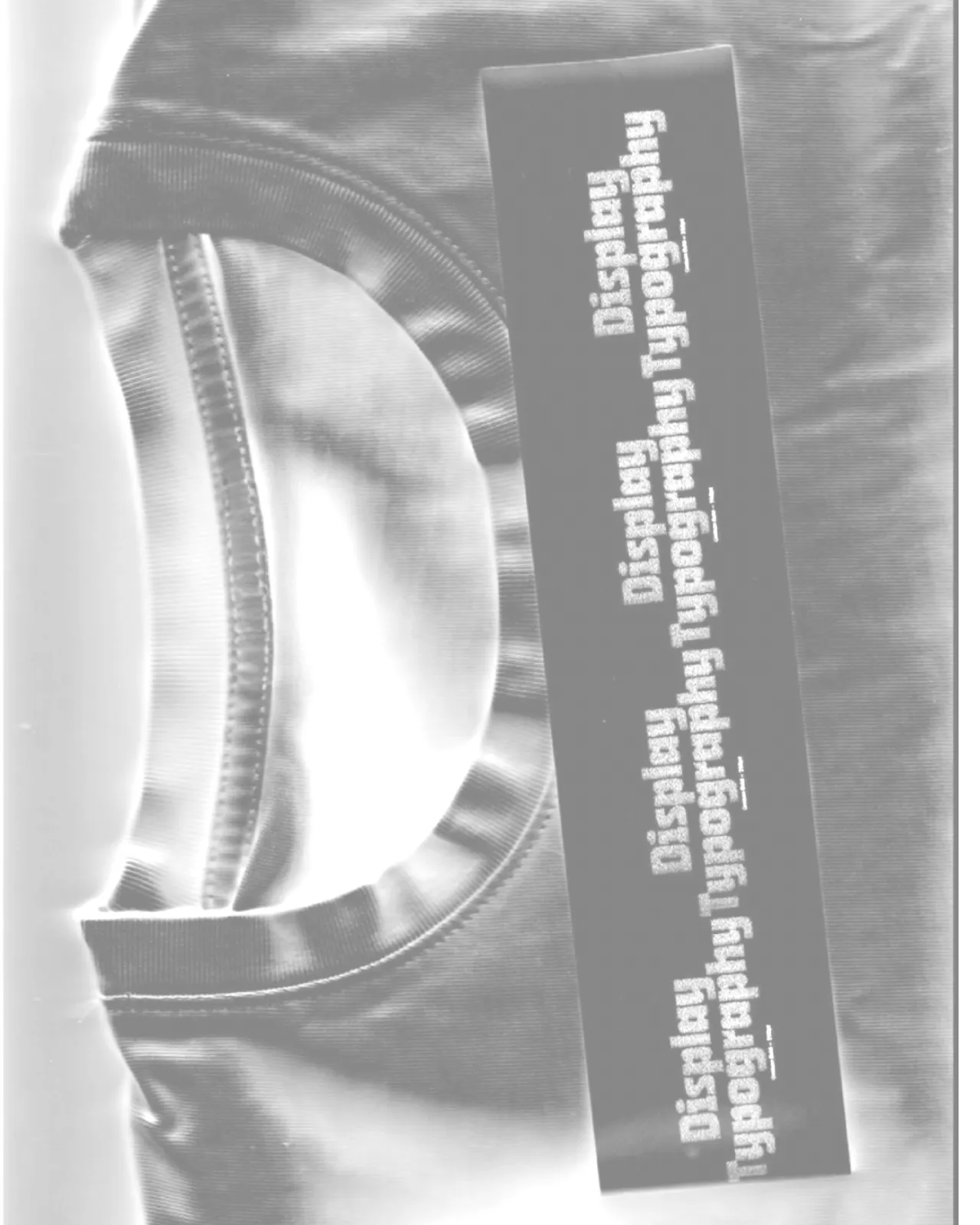
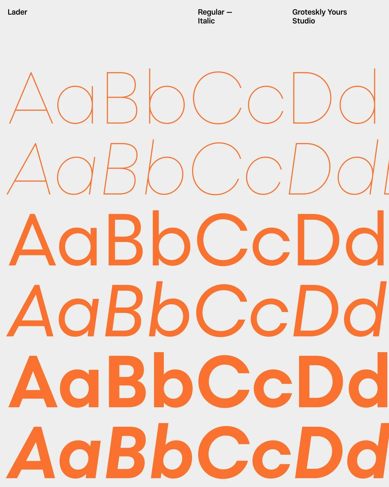
Slanted fonts feature slanted (or italic) letterforms to give text a sense of movement and direction. They can range from subtle oblique styles to more expressive true italics, making them useful when a design needs energy without relying on heavy weights or decorative effects.
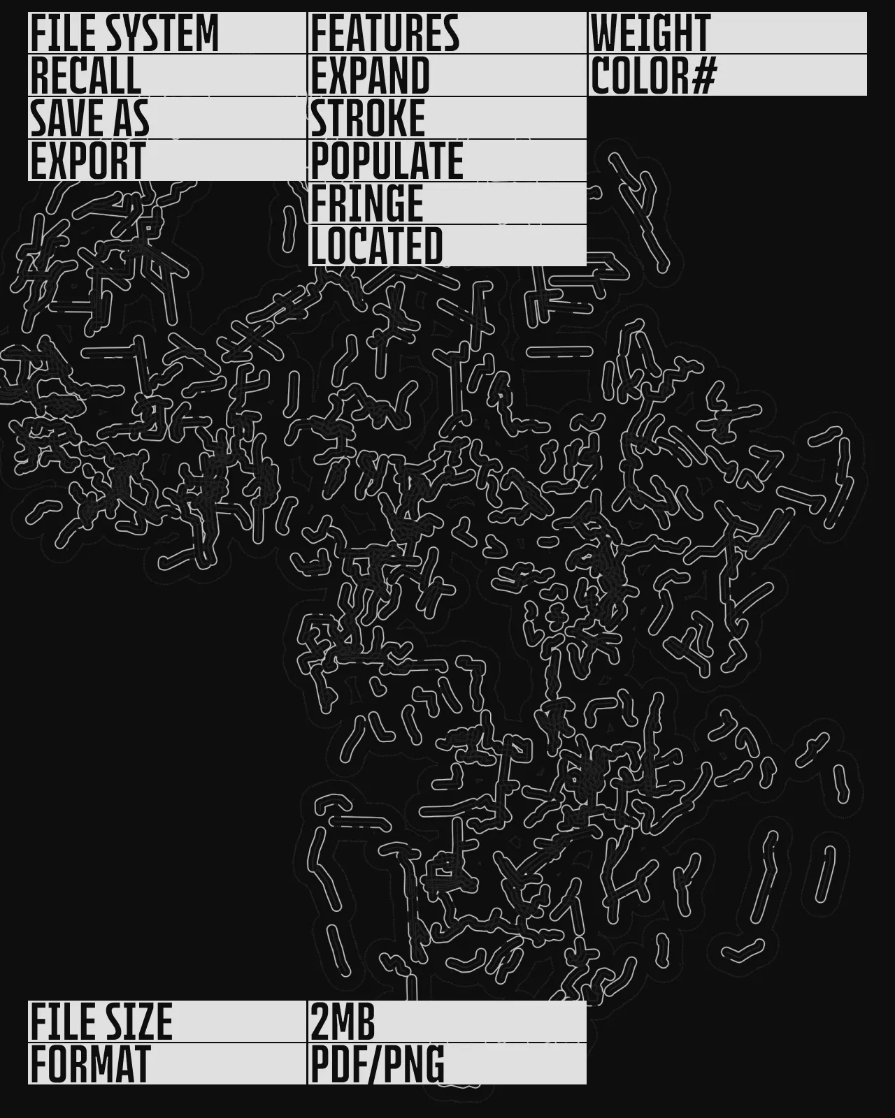
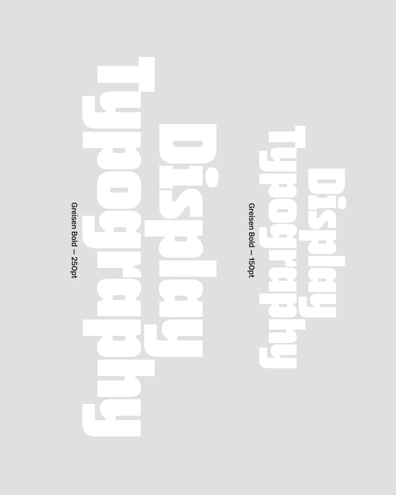
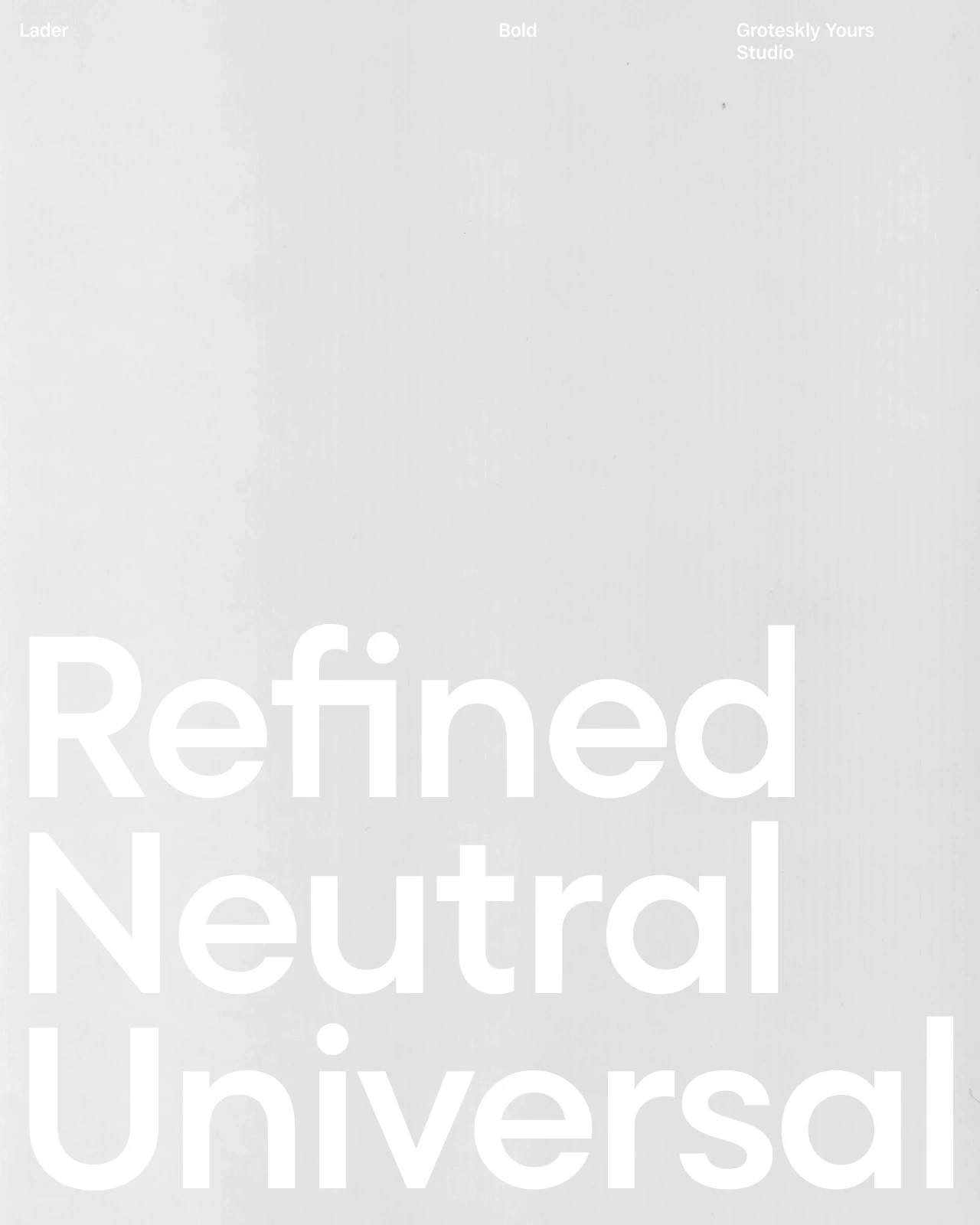
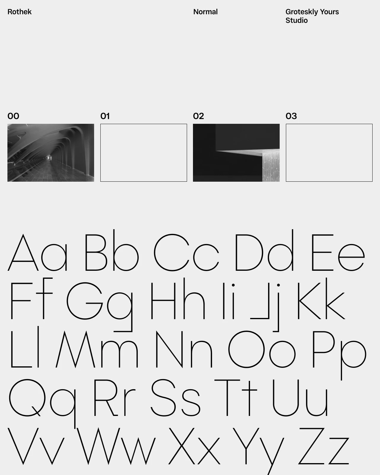
This collection brings together slanted typefaces for logos, headlines, posters, editorial layouts, and digital design. Some families pair upright and slanted styles for flexible typography, while others make the angle a central part of their character. Trial versions are available so you can compare the slant, spacing, and readability in real layouts before licensing.







Frequently Asked Questions
What are slanted fonts?
Slanted fonts use angled letterforms to create a sense of movement or emphasis. The slant can be subtle or highly expressive depending on the typeface.
What is the difference between slanted and italic fonts?
An oblique style usually slants the regular letterforms, while a true italic style may redraw them with different proportions and details. The distinction varies between font families.
What are slanted fonts used for?
They work well for logos, headlines, posters, editorial layouts, packaging, and branding projects that need a more dynamic typographic style. Alternately, italics can be used in typesetting for other purposes.
Are slanted fonts suitable for body text?
They are usually most effective for headlines and short passages. Some families include restrained slanted styles that can work in longer text when used at an appropriate size.
Can I combine upright and slanted styles?
Yes, and you probably should. Combining upright and slanted styles can create hierarchy and emphasis while keeping the overall typography consistent.
Can I try the fonts before buying a license?
Yes. Trial versions are available so you can test the fonts in real layouts before choosing a commercial license. Use the trial font to check the typeface at the sizes and formats needed for your project.