State of the Studio: August 2026
Eugene Tantsurin
·
3 minute read
·
Updated
As of late, we've been releasing more fonts, features, and updates. So many, in fact, that it's becoming hard to keep track of what's what and the general direction the studio is moving in. That's why we wanted to write a few words about the state of the studio, along with our website and work in general. For us, it's an opportunity to look back at what we've been working on, while for readers it offers a bit more transparency into our internal processes.
As of August 2026, here's what's new:
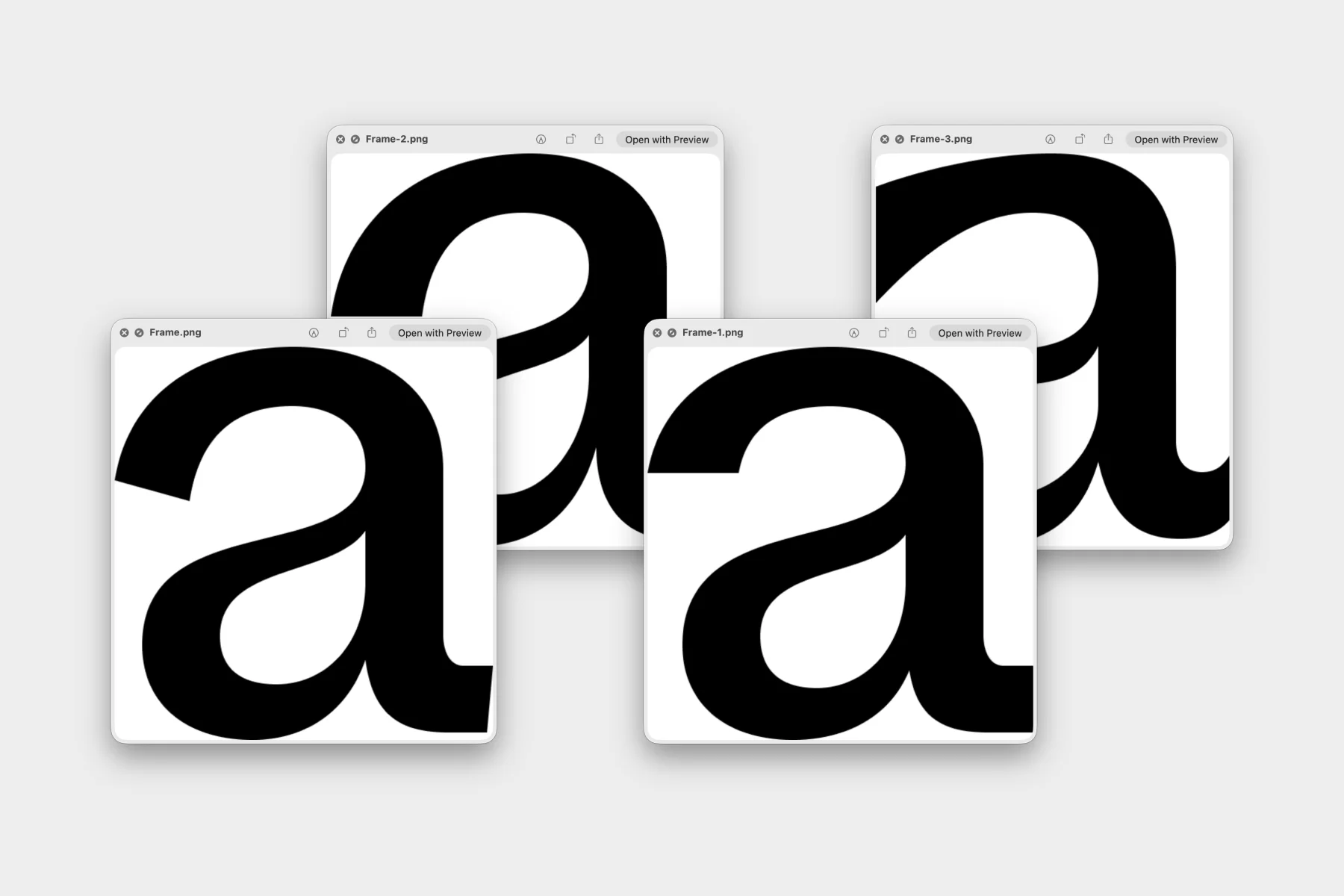
1. Newly released font (Strekka). Strekka is a sans serif family inspired by road signage, industrial typography, and the small changes type picks up over time through weather, repairs, and everyday use. It starts from a clear, practical structure, then introduces uneven details, unusual proportions, and slight distortions that keep it from feeling too clean or neutral. Strekka comes with two subfamilies (Upright and Mono) and can work across identity, editorial, packaging, posters, and digital projects.
2. New article (Strekka: Designing an “Imperfect” Sans Serif) is published in Blog. In this article, we discuss our work on the Strekka family and showcase some of the references that were used to inspire the project. It's a fun read if you like reading about how type is made.
3. We launched our official Telegram channel. It seems like a great alternative to traditional blogging and allows us to showcase some of the new features, updates, and snippets when they are still fresh.
4. Variable font tester update. Some fonts that feature more than one subfamily (for example, Resist Mono and Strekka) now have controls in the variable font tester that allows seamless switching between the two variable fonts. Previously, only one variable font was supported.
5. Suggested fonts section redesign. The latest update features the updated design for the Suggested Fonts section on every specimen page. From now on, suggested fonts are displayed in a new serif font that will slowly be appearing in more sections of our website.
6. New serif family for UI. As mentioned before, we're developing a new type system that will be used across our website and social media. For the time being, you can see the first uses on our Instagram, where it replaces the default Stories typeface. Our plan is to develop and Serif + Sans Serif type system that will be sharing vertical metrics for seamless use within the same text block or section of the website. We're still not sure if this type family going to enter our collection.
7. Smaller updates: updated point size for texts in type testers, updated front page, new collection pages, new SEO titles and descriptions, etc.
Overall, this was an awesome update that featured a number of quality of life improvements. As always, our website remains a virtual playground for us to experiment, so we're looking forward to new ideas. If you have any questions or feedback regarding how our website operates, please get in touch and we'll try to help you.
Groteskly Yours,
Studio