Strekka: Designing an “Imperfect” Sans Serif
Eugene Tantsurin
·
10 minute read
·
“I, on the contrary, have been convinced for some time that perfection is not produced except marginally and by chance; therefore it deserves no interest at all, the true nature of things being revealed only in disintegration.” —Italo Calvino
The latest typeface to join the Groteskly Yours Studio library is Strekka, a sans serif family in 18 styles that was designed throughout the winter and spring of 2026. Strekka is a unique family, both visually and personally, as it was the project that allowed us to explore an aspect of type design that we'd always been fascinated by, and also to draw references directly from the urban environment of the city we live in and love dearly — Belgrade.

The Initial Sketch
Strekka started out as a simple sketch sometime in January 2026 as we were wrapping up work on our previous release, Alfold. Generally, most new projects at the studio start out as experiments; each project is a dare, a what-if, a possibility. For Strekka, we wanted to play around with the concept of deconstruction, or rather how far type can be altered and deconstructed before it ceases to be a system. While any typeface is at first glance a collection of disparate letters that may or may not affect one another, on a deeper level it's a system with a lot of variables, all connected in some way. So, even a small change to one glyph can, in theory, affect the rest of the typeface. We thought about it for a bit and said: “Well, what if it doesn’t? What if we treat type not as a whole but simply as an arbitrary sum of its variables?” And voila — that sounded like an idea worth exploring.

The Source Material
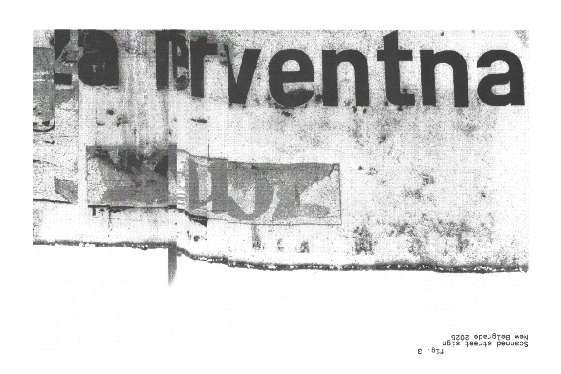
Before the deconstruction could begin, though, we needed some source material for the project. This is when we were reminded of our earlier sketch for a wayfinding font inspired by 20th-century public signage fonts, in particular SNV (also known as VSS). With tight spacing, geometric letterform construction, legible letterforms, and an unmistakable degree of awkwardness, made all the more apparent through its repeatedly naive appearance on street signs, it seemed like a perfect reference point for this project. SNV was first adopted as the main font for road and street signs in Yugoslavia and it continues to be used in Serbia to this day.
However, as with most fonts that are as ubiquitous as SNV, accidents do occur, so the more references we scanned and photographed on the streets, the more we began to notice slight permutations in the original font's appearance. On some signs, letters had cracked due to sun exposure; on others, the signs had been stretched or distorted, throwing the proportions off completely. The more we looked, the more we realized that while we were looking at just one font in theory, in reality we were witnessing an infinite number of instances of various stages of natural deconstruction. While we were theorizing about the degrees to which a typeface can be deconstructed, this very deconstruction was part of the natural process within the urban environment. In fact, we were unwitting witnesses to every stage of a typeface’s gradual deterioration: from slight corrosion on the sides to extreme shrinkage of letters due to sun exposure, which completely altered the appearance of the typeface.
The Design Process
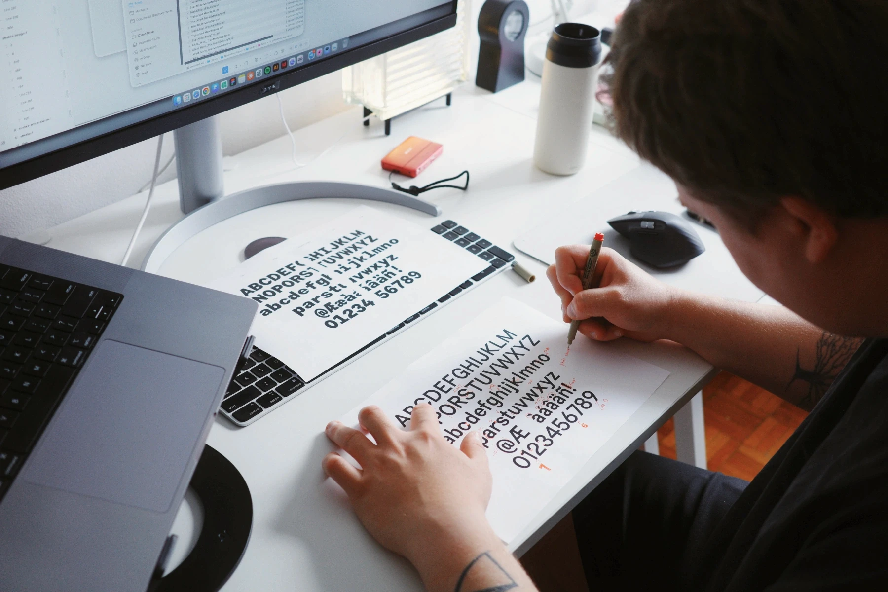
Now that we had an original typeface and a method, we could begin our experiment. The basic method was rather straightforward: stripping away the polish without altering the overall skeleton of the typeface. We also wanted to stay away from turning this project into yet another display font, where style takes precedence over legibility.
The first order of business was the shape of the ovals. Generally, the shape of the 'o' informs several characters, such as 'b', 'd', 'p', 'q', etc. For Strekka, this notion was discarded right away. To preserve the rhythm of the typeface, we introduced a flattened oval that mirrors the shape of the 'n' and introduces just the right degree of awkwardness for the overall look of the typeface. This design decision was only partly ours, as we discovered many road signs where, due to years of sun exposure, the round elements began to distort until they appeared almost flat. Initially, we experimented with consistency of this flattened element throughout the typeface, but settled for a more traditional approach in which in which ‘b’, ‘d’, ‘p’, and ‘q’ shared the same component.
Another element that was immediately attractive to us was the terminals on the 't', 'f' and a few other characters. Generally speaking, it's rather difficult to find a good balance between the inner and outer radii, and in Strekka we decided to avoid that entirely by visually aligning the radii, so that the jarring effect is made even more apparent. This decision helped us later on as we worked on Strekka Mono that contained many elements that appeared mismatched or stretched but in reality were part of the original typeface DNA.
During the early stages of Strekka development, we talked a lot about the little tips and tricks that we use to make a more consistent typeface. While most seemed relevant for this project, we also wanted to give ourselves some leeway, allowing certain inconsistencies to remain. One such element was the apex of ‘M’, which is sharp, in contrast to the flat joint of the 'W'. When designing non-letter characters, we followed the logic of navigation typefaces by increasing the size of periods, commas, and other punctuation marks by an additional 10-20%.
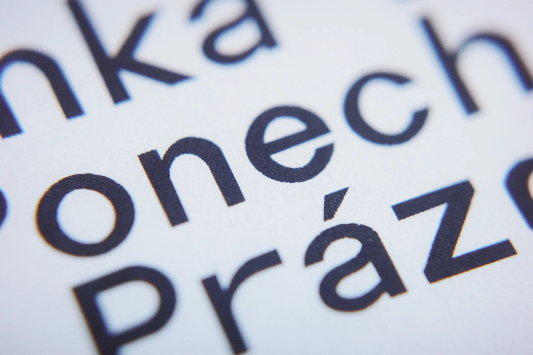
Late in Strekka's development cycle, it was decided to increase the size of diacritics by the same percentage in order to preserve the rhythm in multilingual texts. Larger diacritics did create certain problems for kerning, but in our opinion, the pros outweighed the cons.

How Strekka Was Named
Naming typefaces can be surprisingly easy; and we released many a typeface that from their earlier stages were kept in properly named folders. Some typefaces, however, simply refused to be named. Strekka was of the latter variety.
Provisionally titled *UNTITLED*, it proudly bore this vague name throughout every iteration, type proof, newsletter mention, and Instagram post. Behind the scenes, however, we were at our wits end looking for a perfect name. Since the reference for Strekka was XXX, a navigation typeface, we wanted a name that evoked something similar, or at least had some connection to traffic, transportation, or cargo. In early June 2026, the UNTITLED became Traffikk, only for us to realize that there's another typeface by that name. So, the search began again, but now we were at least sure that we wanted to keep the double 'k' at the end of the title.
Then, seemingly out of the blue, the word strekk cropped up in our research. Derived from the German Strecke, the word found its way into several European languages, where it was used both as a verb meaning to bend or stretch, and as a noun meaning stretch, tension, or sprain. All we had to do was add an ‘a’ to the end to have a name that amplified the idea of wayfinding and even provided insight into the visual character of the typeface.

Mono Subfamily
Whenever we are working on something new at Groteskly Yours Studio, we always try to take a couple of weeks between the initial sketch and the full-time design process to analyze what we want this type family to achieve. Whether it’s going to be a display family or something more utilitarian? How many styles might the family need? Among other questions, there's one that implies the greatest amount of work: do we release the typeface as is, or does it need another family or subfamily to support it. Strekka, of course, was no exception. But here, alas, we ran into something of a roadblock.
Anna was wholeheartedly supporting the idea of Strekka Italic, which was a more conventional and perhaps more utilitarian solution. Eugene was intent on designing a monospaced subfamily to complement the original upright Strekka. To find a way out of such stalemates is not easy when it's just you two who are running the studio. To settle the issue, we prepared sketches for both the italic and monospaced and reluctantly decided to release the mono version first and have the italics ready when we eventually update the font down the line.

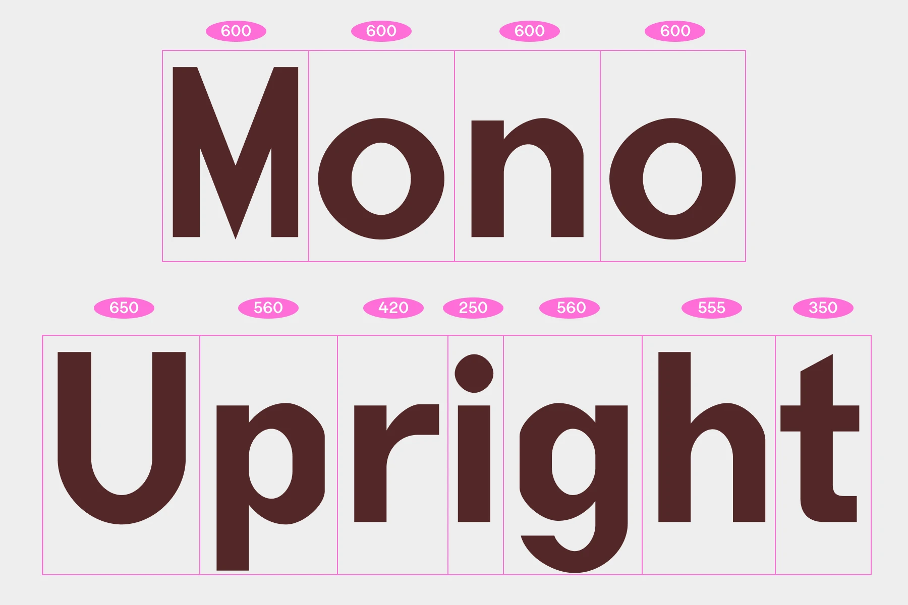
For Strekka Mono, we wanted to preserve the original character structure and quirks of Strekka. If you imagine the two extremes of monospaced fonts, with the super readable and legible code-oriented fonts on one side and the display experimental fonts on the other, Strekka Mono falls comfortably in the latter category. Generally, designing a monospaced font involves a lot more than mechanically adjusting the width of characters to fit a pre-defined space, but as soon as we had the first manually designed draft, we began to wonder: what if, during the first stages, we keep the manual intervention to the minimum and instead let the software create a monospaced version of Strekka by automatically adjusting existing letters to fit the cell width of 600 units.
That’s where RMX Monospacer, a Glyphs plugin from JAF, came in handy. Released as part of RMX Tools, Monospacer allows you to create a mono version of any character by specifying the percentage of stem width and spacing you intend to keep. This approach resulted in some very unexpected outcomes, but nonetheless it was definitely a step in the right direction. All that remained after running the script was to clean up outlines, proof stem widths, and adjust spacing. Thanks to this more mechanical approach, Strekka Mono wound up looking like a more experimental, bolder alternative to the somewhat tame upright version of Strekka.

As with all monospaced fonts, certain characters needed a full redesign to fit the new structure. All fraction glyphs and a number of special characters were redrawn in a more compact way, so as not to extend too much beyond their snug little spaces. For further consistency, we kept the cell width at 600 across all styles of the family, no matter how thin or thick the letters get.
The Family
Looking back at the project now, Strekka feels less like a typeface that was designed and more like one that was discovered. Many of its defining characteristics emerged not from deliberate stylistic choices, but from observing how typography changes when exposed to years of weather, repairs, modifications, and everyday use. What started as a theoretical exercise in deconstruction gradually became an exploration of its real-world counterpart: the slow and inevitable transformation of letterforms through time, use, and circumstance. In the process, Strekka also became our most labor- and research-intensive project to date.
While Strekka Upright and Strekka Mono ultimately became two distinct subfamilies, they were developed as different interpretations of the same idea. The upright explores deconstruction through form, while the mono pushes the same idea through its structure and constraint. As a family, they represent two facets of the same experiment: one shaped by observation, the other by process.
As of June 2026, the Strekka family consists of 18 styles across two subfamilies. Each font contains more than 570 characters, with the total number differing between Mono and Upright for several reasons. As with the rest of our collection at GYS, Strekka features an Extended Latin character set, supporting most Latin-based languages. In addition to that, it features a few alternate glyph sets, allowing designers to customize the appearance of certain glyphs ('a', 'y', 'Q', etc.) directly in software or on the web. Other notable OpenType features include Case-Sensitive Forms that adjust the height of punctuation to match uppercase letters, Ligatures, Fractions, along with a few others. The full list is available on the specimen page of the Strekka font family.
Free trials of the Strekka family are included in our trial catalogue available exclusively at groteskly.xyz


