Porte Neue
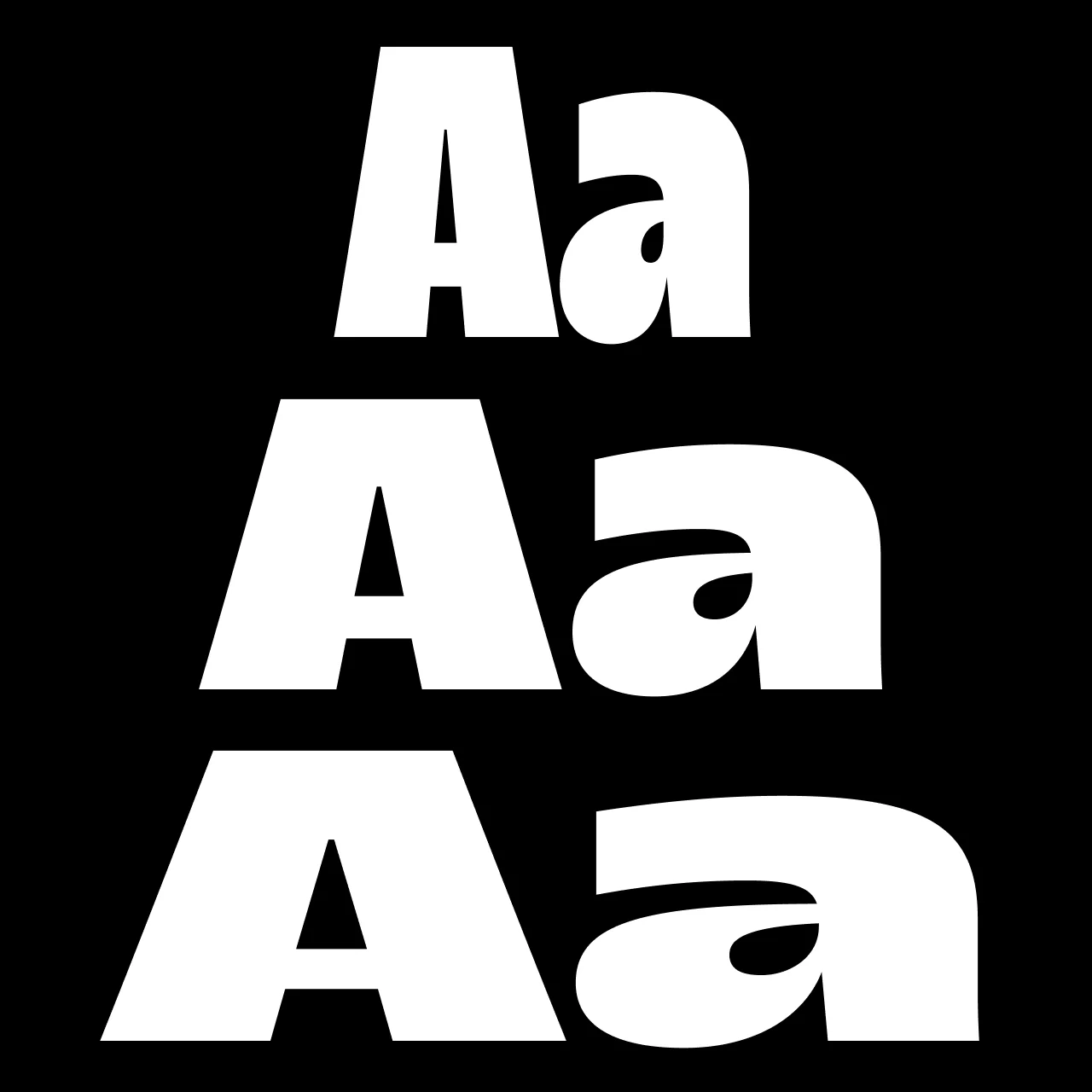
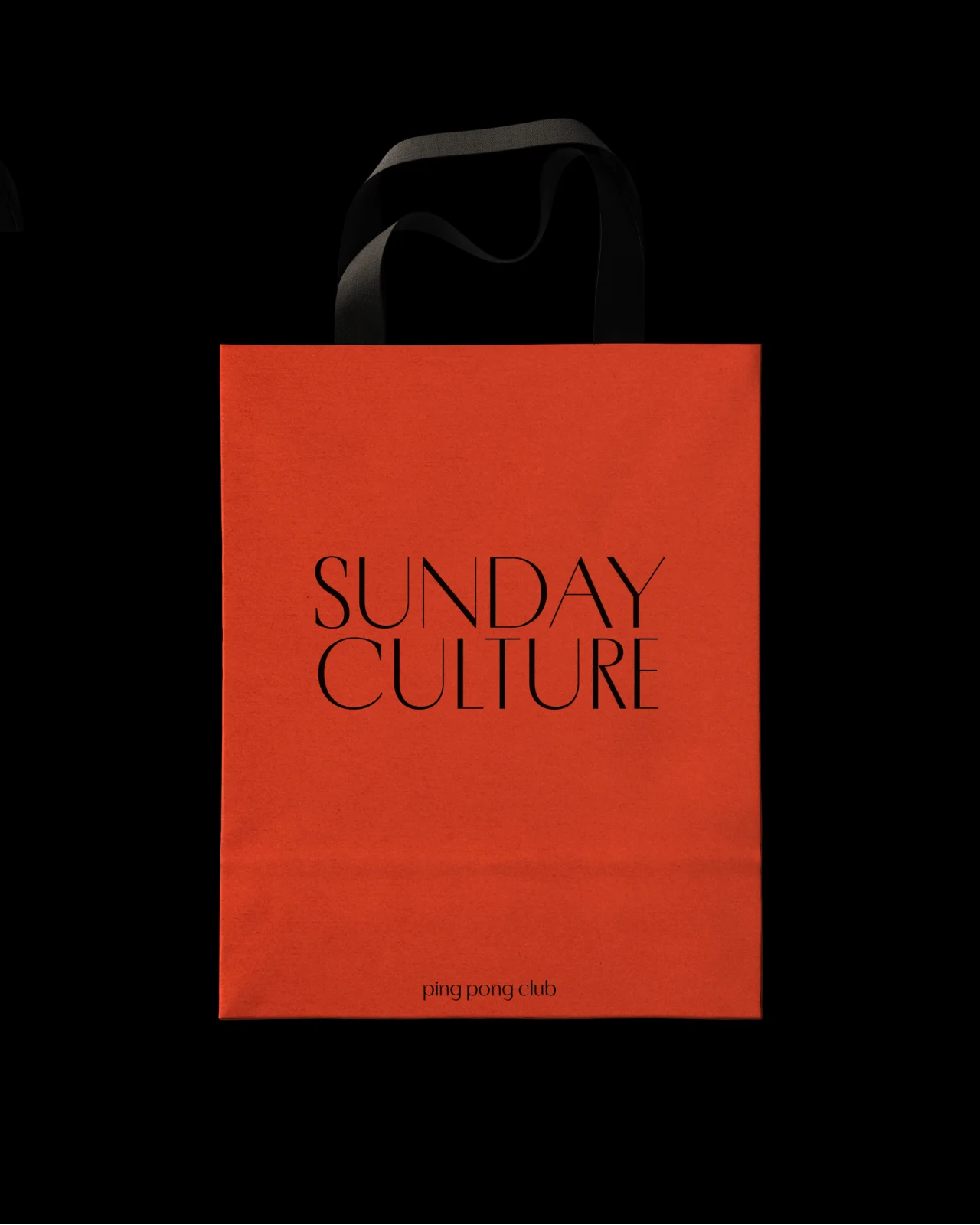
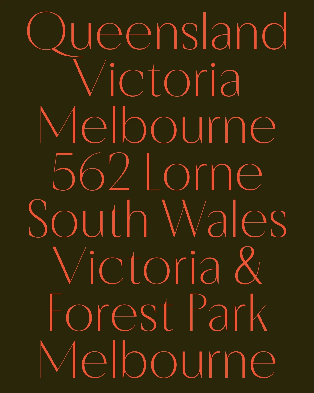
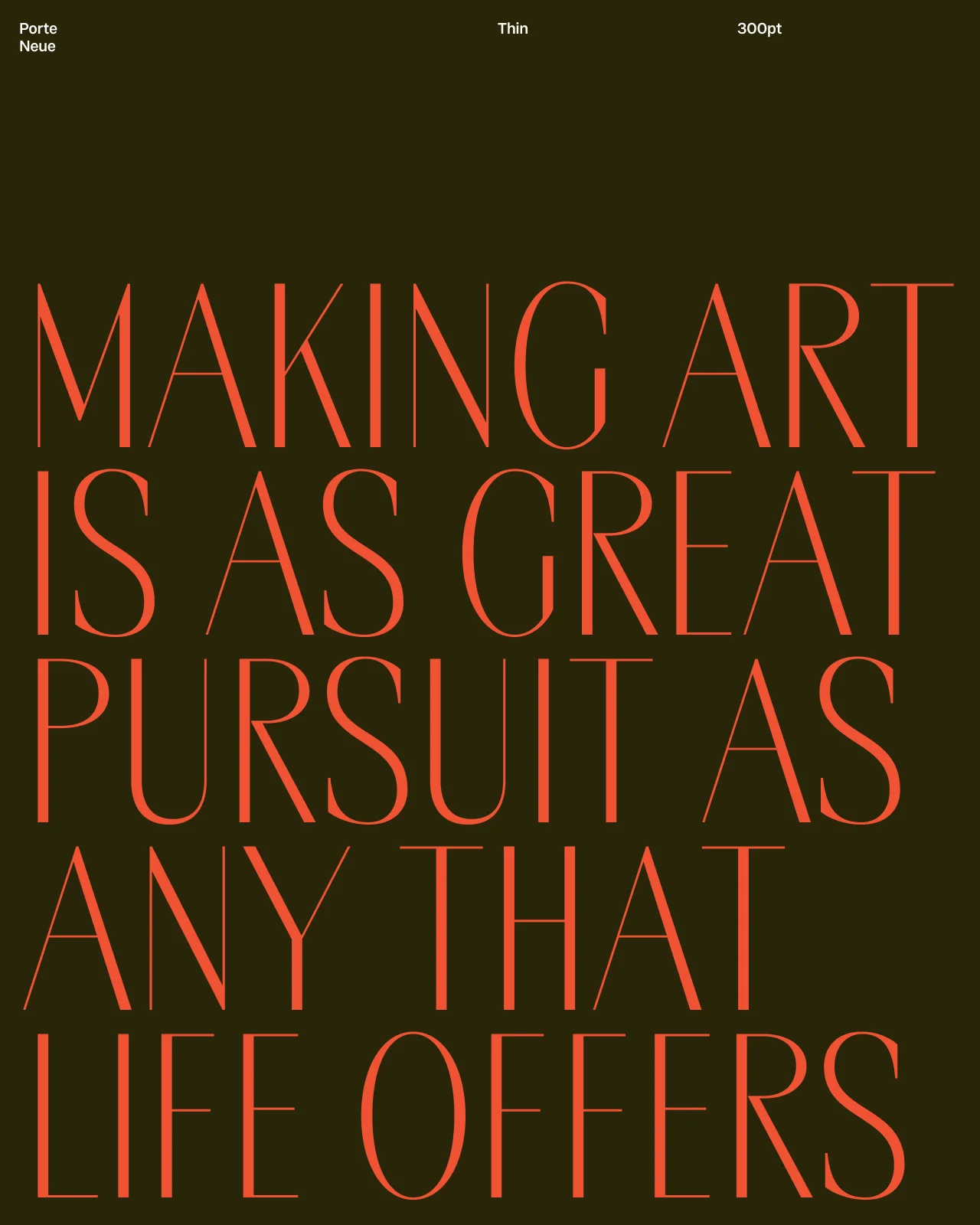
Porte Neue reimagines elegant sans serif letterforms through a modern lens. Influenced by 20th century stone carved plaques of Eastern Europe, it blends serif-like contrast with a clean sans serif structure. With six styles, a variable font, and expanded language support, the final update transforms Porte Neue into a versatile display family suited for expressive, multilingual typography.The addition of alternate narrow forms offer visual flexibility across layouts. Porte Neue lends a sense of quiet authority and elegance to any project it's used for.
Type Testers
Specimen Images


Font Information
Font Family
Family Information
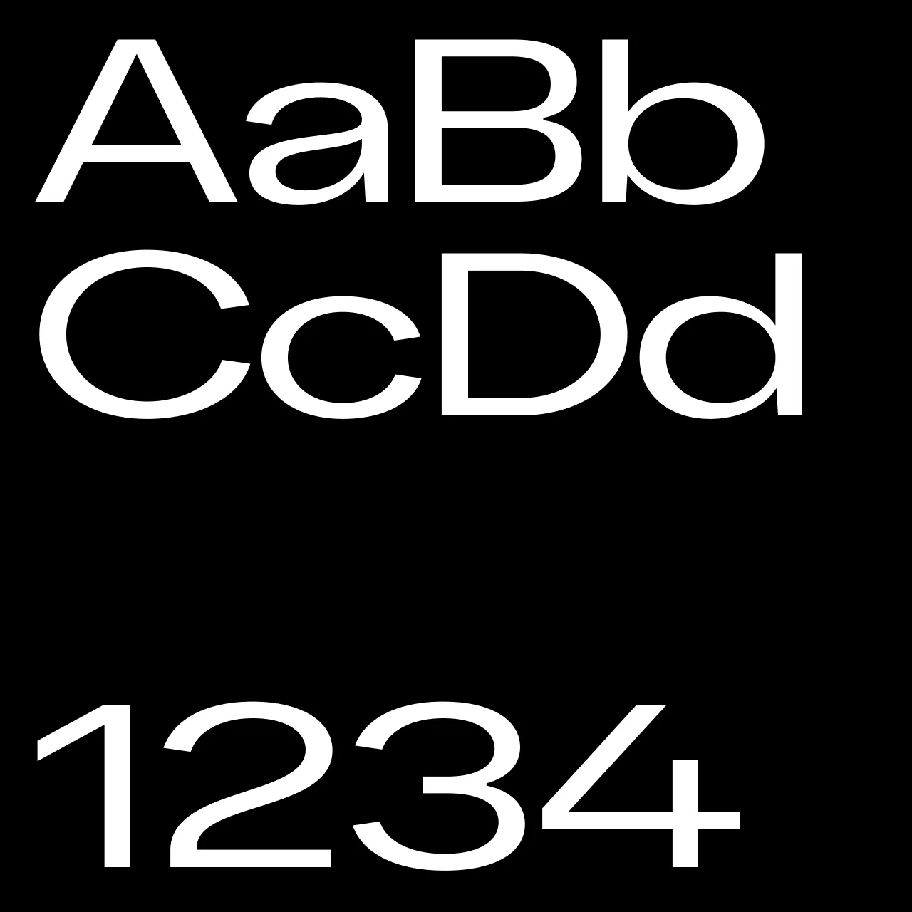
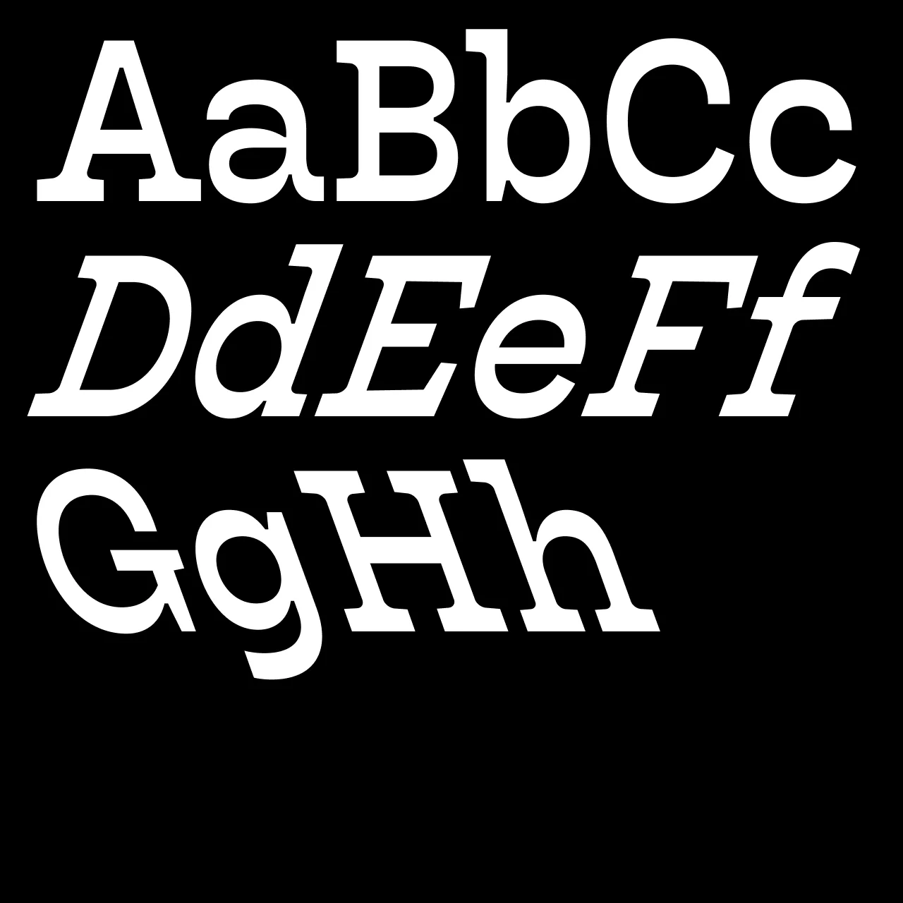
Porte Neue is an elegant font family by Groteskly Yours Studio. Originally released as Porte in 2019, this updated 2025 version refines its classic outlines while expanding the family to six styles plus a variable font. Inspired by Eastern European stone-carved plaques, Porte Neue blends sharp contrast, sans serif font structure, and luxury aesthetic into a striking yet contemporary design.
Designed as a elegant font for branding, editorial design, and standout headlines, Porte Neue offers refined proportions, alternate narrow characters, and extensive Latin and Cyrillic language support. With improved consistency, balanced rhythm, and enhanced diacritic integration, Porte Neue is a versatile type family that brings sophistication and elegance to modern typography.
Porte Neue is available in six sans serif font styles and a variable font. It supports over 200 languages, including Latin and Cyrillic scripts, making it a great choice for designers who want elegance and typographic versatility.