Porte Neue: Elegant Font Family
Eugene Tantsurin
·
5 minute read
·
Porte Neue Release
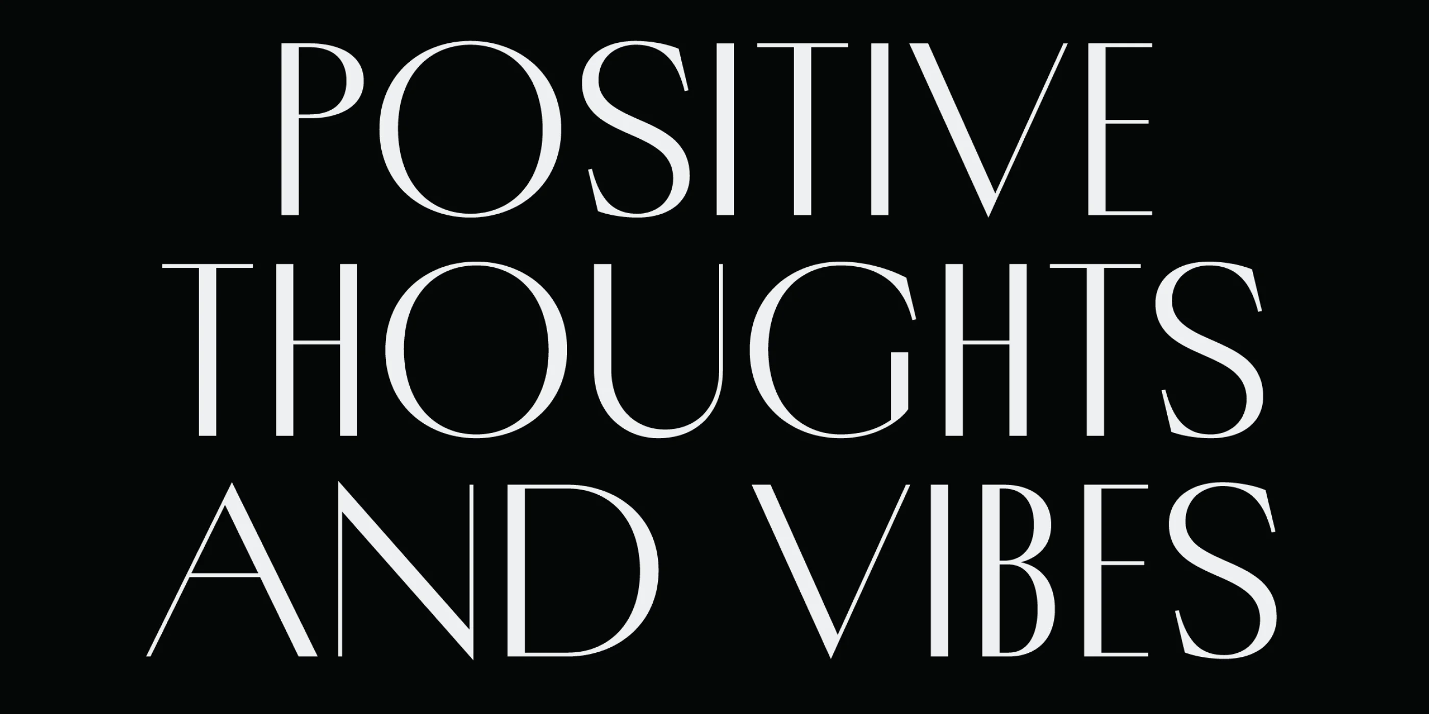
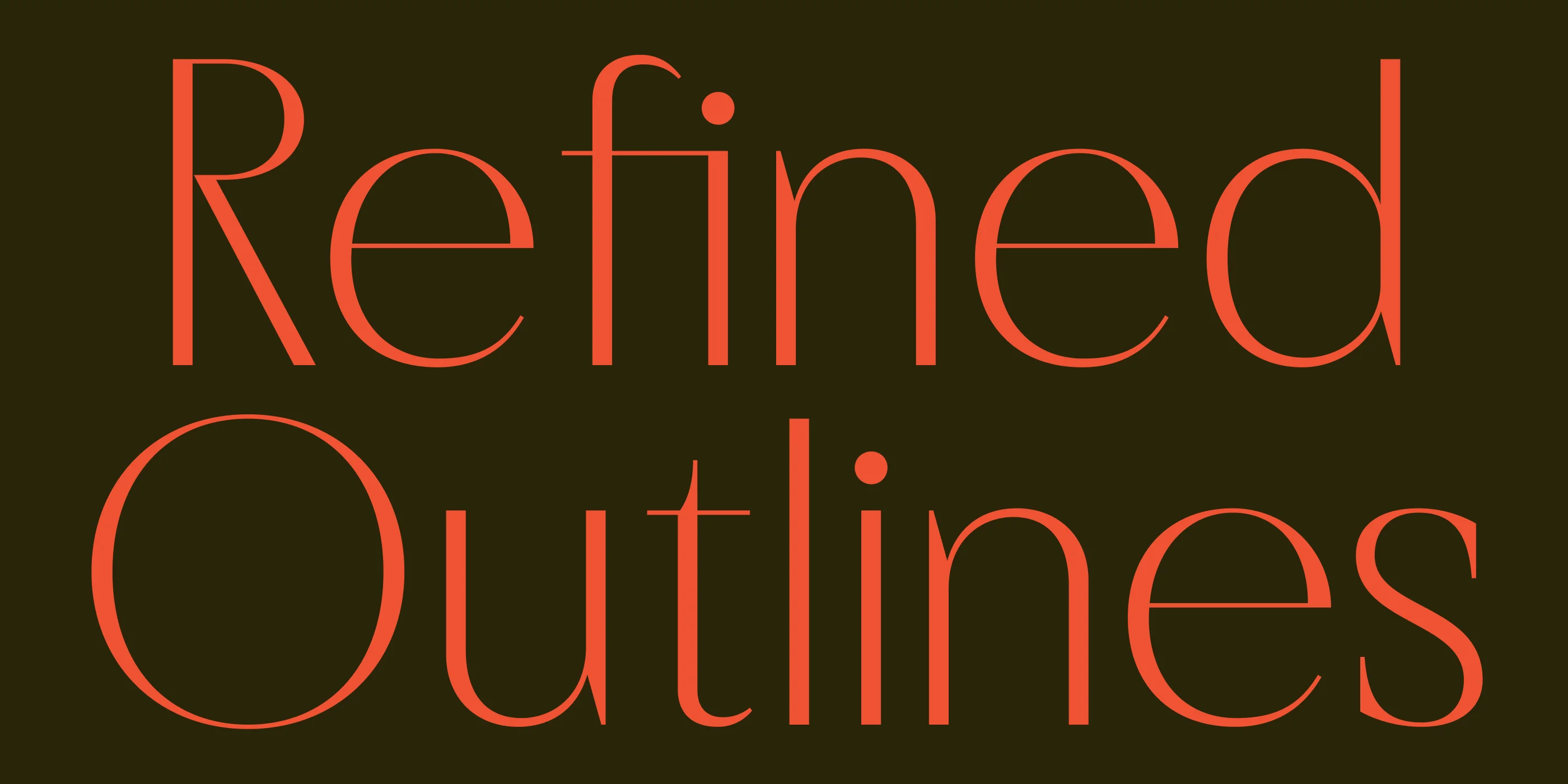
In March 2025, we released Porte Neue, an elegant font family in 6 styles. Porte Neue is an updated version of one of our first display typefaces, initially released in 2019. Porte Neue is an elegant typeface in 6 styles, with sharp stroke contrast, open counterforms, and glyph composition that follows the logic of a classical serif typeface. Inspired by stone-carved plaques of Eastern Europe, this font family was developed for display usage as a headline and title font or as a luxury font for packaging and branding.
Porte Neue attempts to be true to its predecessor, Porte, whenever possible, from the basic glyph composition and structure to the extent of its character set. However, specific alterations were necessary to keep the newly released type family tidy, elegant, uniform, and up-to-date.
↑ Porte Neue elegant type family, released in March 2025
The Original Porte
The first version of Porte was released in 2019. At that time, the entire Groteskly Yours Studio library comprised a handful of display fonts. Porte was the first attempt at reconstructing a typeface from historical references and using that model as a basis for a new font.
Our primary source of inspiration was an archive of Eastern European plaques, often found on the sides of buildings involved in some historical event. Many of these stone-carved plaques used uppercase letters, leading Porte to focus primarily on uppercase characters while introducing lowercase letters only as a complement. In addition to basic Latin and Cyrillic character sets, Porte incorporated various stylistic alternates, swashes, and elegant decorative elements.
↑ Stylistic alternates from the original Porte font
We started working on Porte's first sketches using pen and paper. Later, these sketches were redrawn in Procreate and digitized—first in FontLab 5 and later in Glyphs 2. In fact, Porte was the first project that we developed primarily in Glyphs. Our primary focus was on preserving the elegance and smoothness of the original stone-carved plaques and transferring these qualities to a digital sketch.
Looking back at the first version of Porte, it's hard not to pinpoint the inaccuracies and shortcomings of our work. Certain characters feel off, and some proportions are just out of place—and yet, behind all that, it's hard to argue that the original Porte worked very well as a display font despite all its undoing. Released through selected marketplaces, it did well in terms of initial sales. It enjoyed moderate limelight for a few years, remaining a popular choice among designers looking for a luxury font.
↑ Original Porte redesign, December 2022
In 2022, we decided to revisit the project and give it a facelift. Our goal wasn't to reinvent but to fix what felt unmistakably off. The basic structure of the font remained unchanged, and while some letters did change significantly, the update was by no means definitive. It was an attempt to retain Porte's original elegant vibe while adding elements that imparted a more sharp feel of a luxury typeface meant for magazines and editorial design.
↑ Porte's redesigned elements, December 2022
The more prominent changes focused on the letters 'R' and 'K', with their legs redrawn to be straight and slightly flaring. Terminals on the letters 'C' and 'S' were redrawn with a sharper angle. To compensate visually for the distinctive letter proportions, we decided to widen the top elements of some characters, more notably, the top bowls of 'S' and 's'. On careful inspection, one would notice that this update was a step in the right direction, a clear break from the original idea, yet not as drastic as warranting a separate release.
Porte Neue Release
In the summer of 2024, we started developing our new website. As we worked, we often turned to our font collection to evaluate the best way to showcase it online and market fonts in the most favorable light possible. When we started working with Porte, we immediately felt it was the most apparent outlier among the studio's display fonts. In 2025, we started working on an update to keep Porte up-to-date with the rest of our collection.

↑ Porte Neue updated family structure
From the start, it was evident that Porte desperately needed more varied font styles, even as a display type family. When Porte was first released, it seemed acceptable for an elegant display font to feature just one style. Five years later, it was a no-brainer that more styles were needed to keep Porte relevant for designers and brands alike. The original plan was to supplement the existing Porte Regular with Medium and Bold font styles, thus bringing the total number of fonts to 3. However, as the project progressed, we soon realized it was necessary to expand the Porte Neue family in another direction by adding Thin and Light font styles. The final version of Porte Neue now comes in 6 styles, along with a Variable Font.
↑ Porte Neue Thin, released as part of Porte Neue family
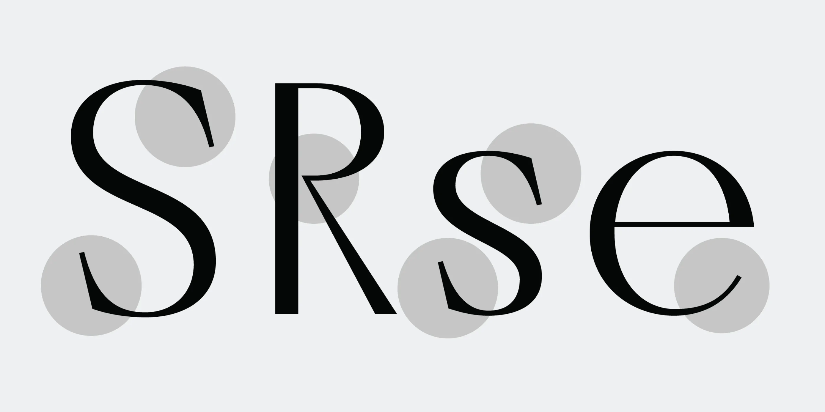
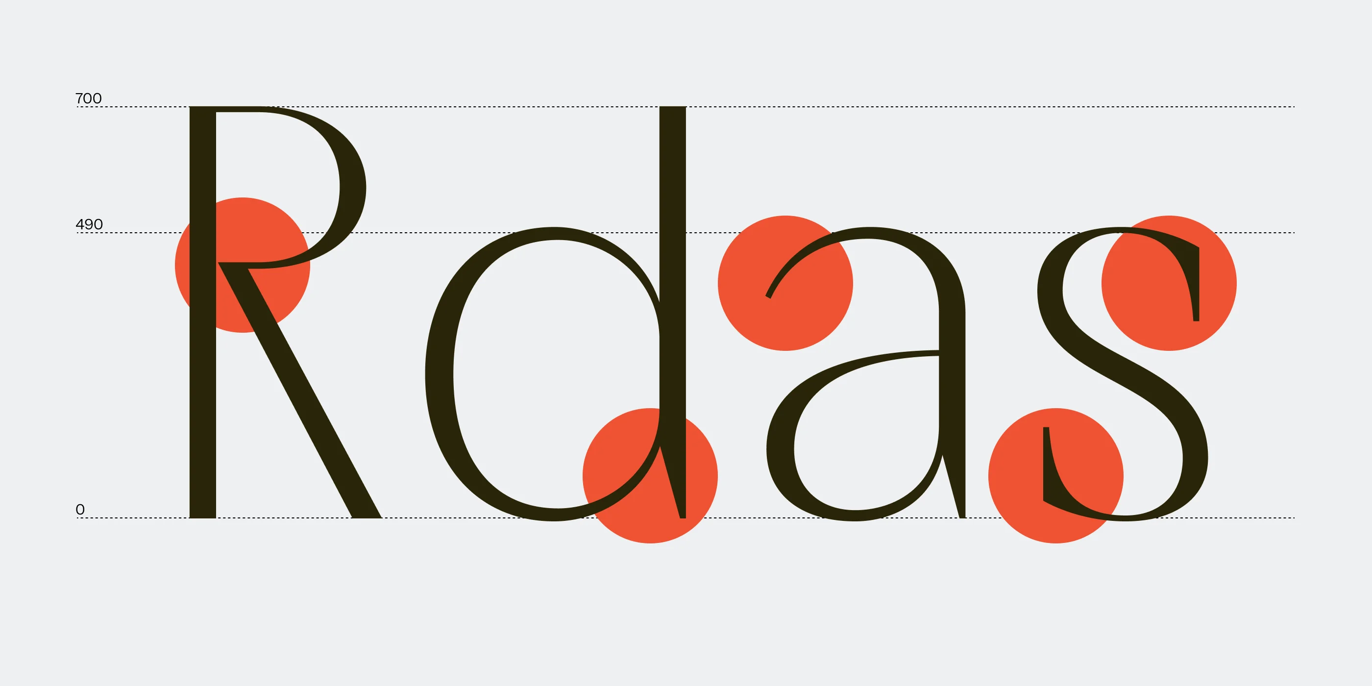
With the overall structure of the family in place, we started adjusting elements that seemed out of place or downright wrong. For this update, it was essential to preserve Porte's elegant look and feel, and if there were obstacles along the way, we were not afraid to make alterations. We began by adjusting the angle of terminals, keeping them at neutral 90 degrees. Next, it was imperative to fix Porte's overall rhythm, which was achieved by balancing the widths of letters, making them more consistent within their separate groups (e.g., wide letters, standard letters, narrow letters). Keeping the characters' widths consistent created a more uniform and proportional flow to Porte Neue, making it a more approachable option for designers.
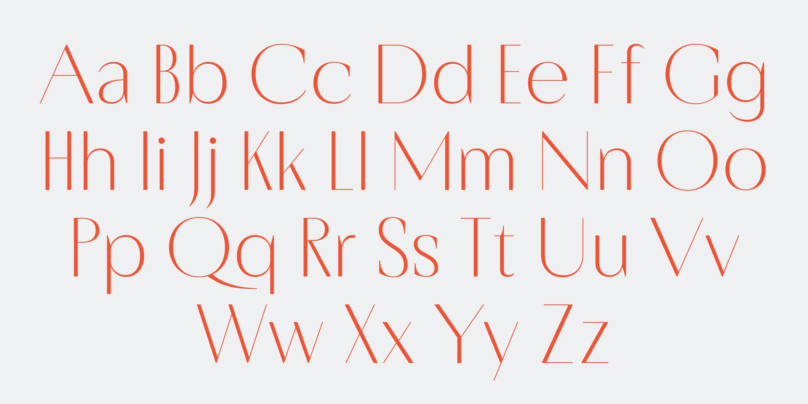
↑ Updated character set in Porte Neue, released in 2025
For those who still found Porte Neue's rhythm too inconsistent for their project, we created a separate stylistic set, Narrow Characters. This set features alternate narrow letterforms for each character, resulting in a smoother, more elegant look. It is now accessible from the OpenType menu in any graphic design software or on the web.
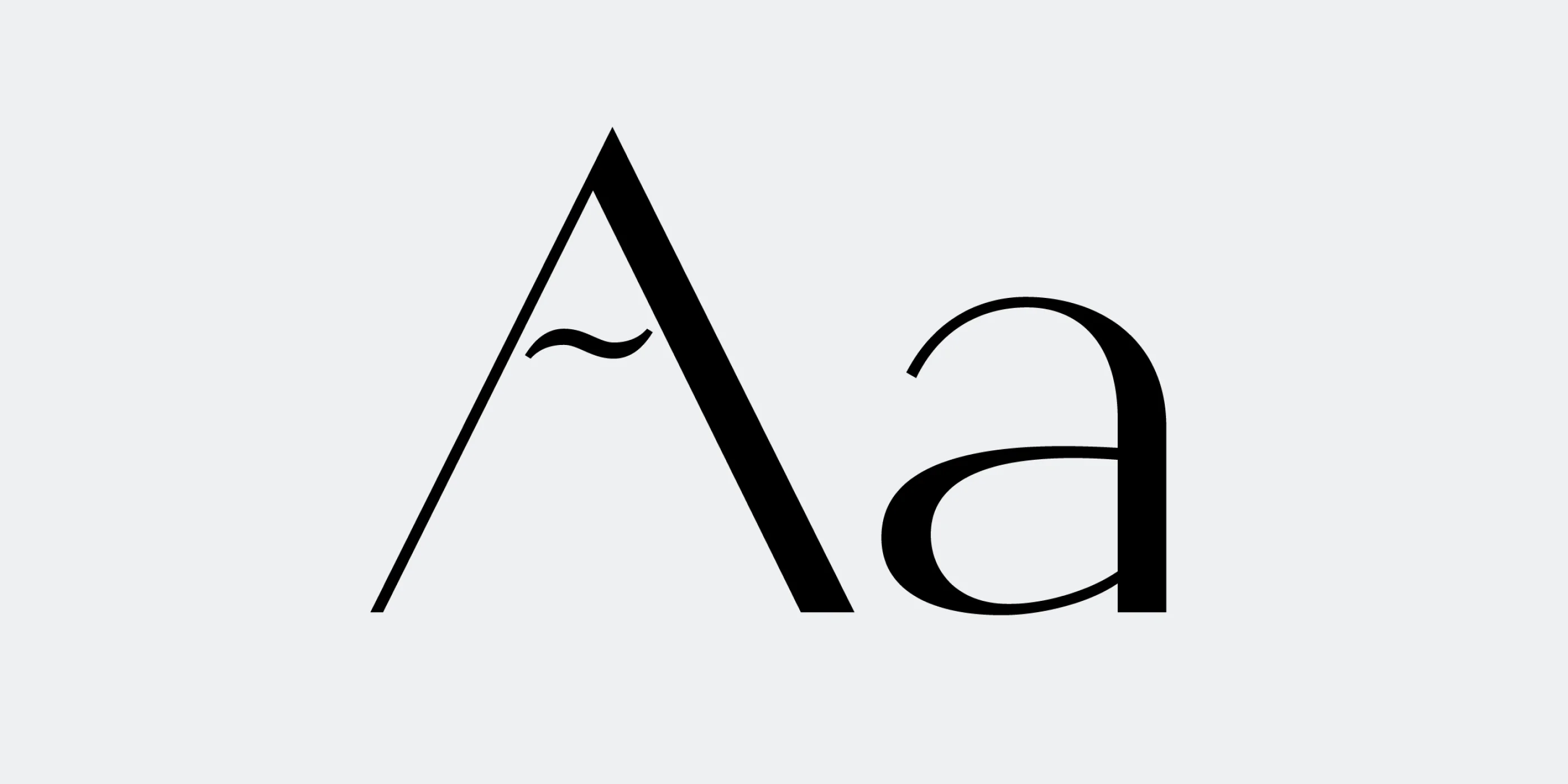
Another feature of Porte Neue that deserved mention was an entirely redrawn lowercase set, available in both Latin and Cyrillic. In the original Porte, lowercase was more of an afterthought, which we tried to make up for by designing a stunning set of elegant lowercase characters that work great on their own and only complement the uppercase characters, not detract from them.
↑ Elegantly redesigned lowercase characters in Porte Neue
From the outset, Porte supported a wide selection of languages, and this update sought to expand its capabilities as a multilingual font even further. Serbian letters have been added to ensure full support for the Serbian language, enhancing accessibility and usability for Serbian-speaking designers and brands.
In Porte Neue, we tried redesigning diacritical marks to match the base letters better, ensuring a more consistent and natural look. The adjustments improve readability and make the typeface feel more cohesive across different languages while keeping its character clear, elegant, and approachable.
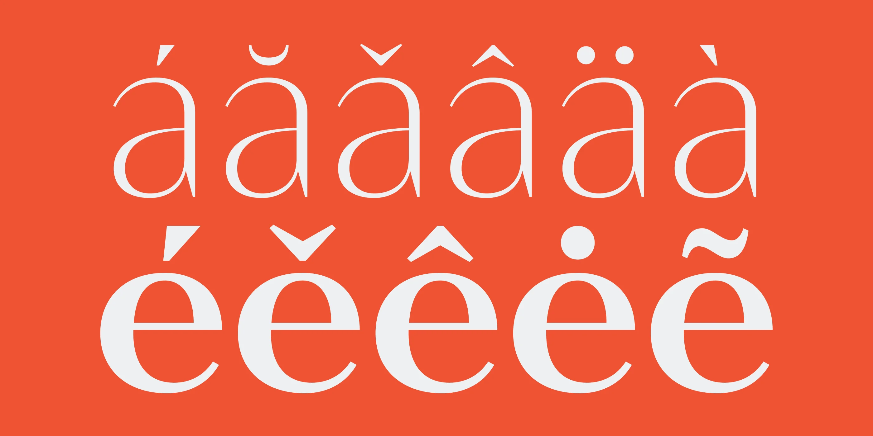
↑ Updated diacritical marks in Porte Neue
Finally, we created a new branding for the updated Porte Neue, refining both the colors and the style of the original Porte promotional imagery. Porte Neue has become a brighter, better, and more elegant font project that deserved a presentation that did it justice and showcased its best features. Working on branding for your typeface is as hard as it's rewarding, as you get to experience the finished project from the graphic designer position and have a chance to make alterations to the typeface if needed.
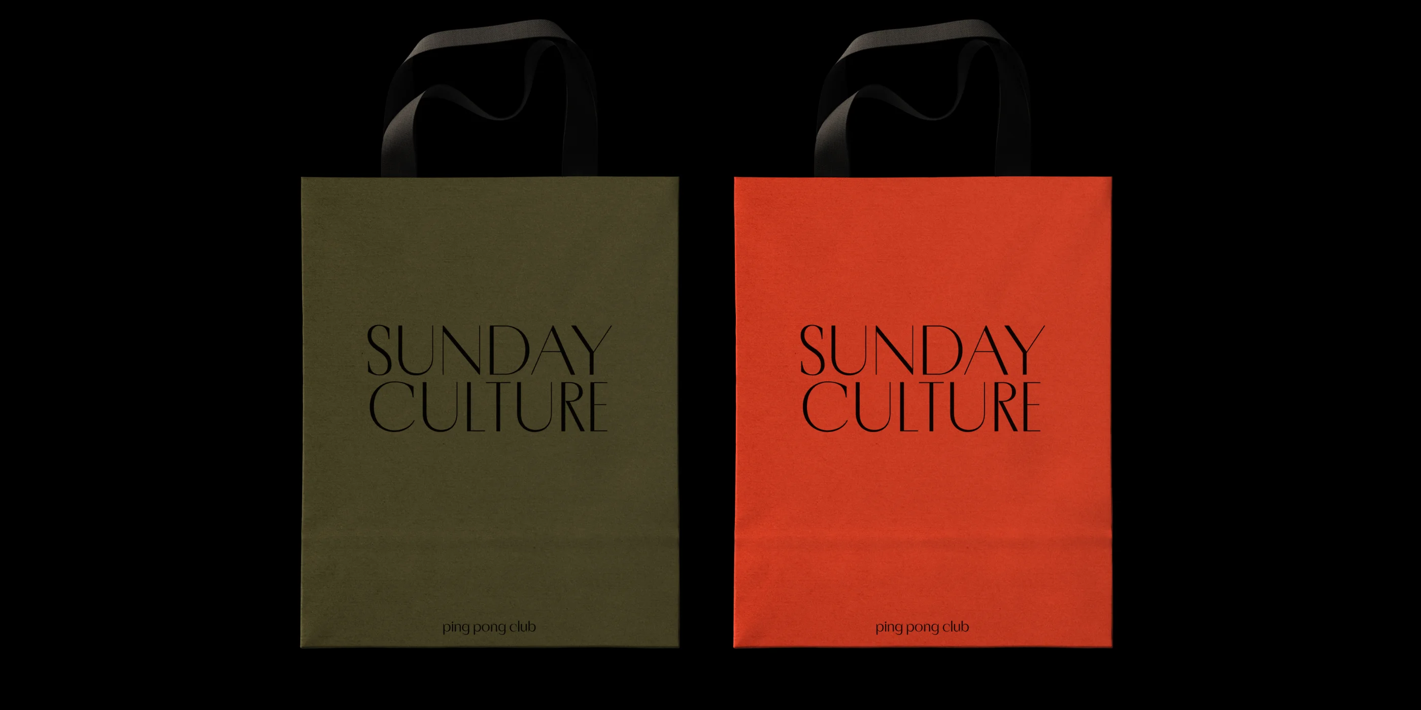
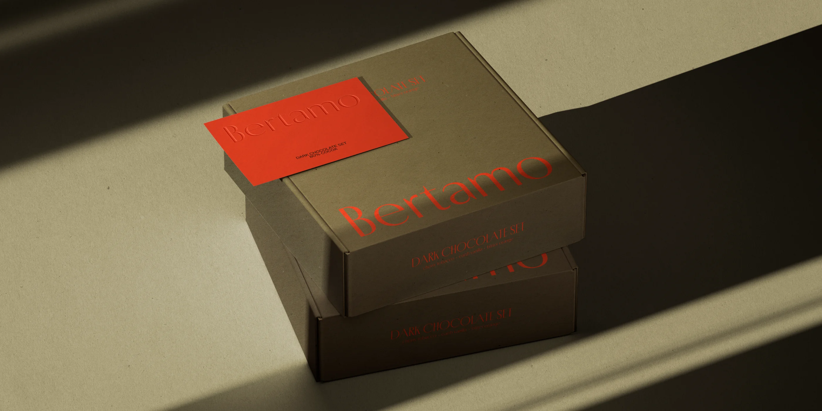
↑ Porte Neue display sans serif type family in luxury branding
Porte Neue Story Continues
We're happy to finally welcome the updated Porte Neue, a fully updated elegant typeface with the flair and grace of a well-crafted display sans serif. Porte Neue is a perfect fit for designers and brands seeking a sophisticated and elegant sans serif typeface with sharp stroke contrast, smooth letterforms, and a luxurious feel. Porte Neue comes in six styles (Thin, Light, Regular, Medium, SemiBold, and Bold) and is a variable font with a fully customizable Weight axis.
Get free trial versions of Porte Neue type family, commercial licenses start at €35.


