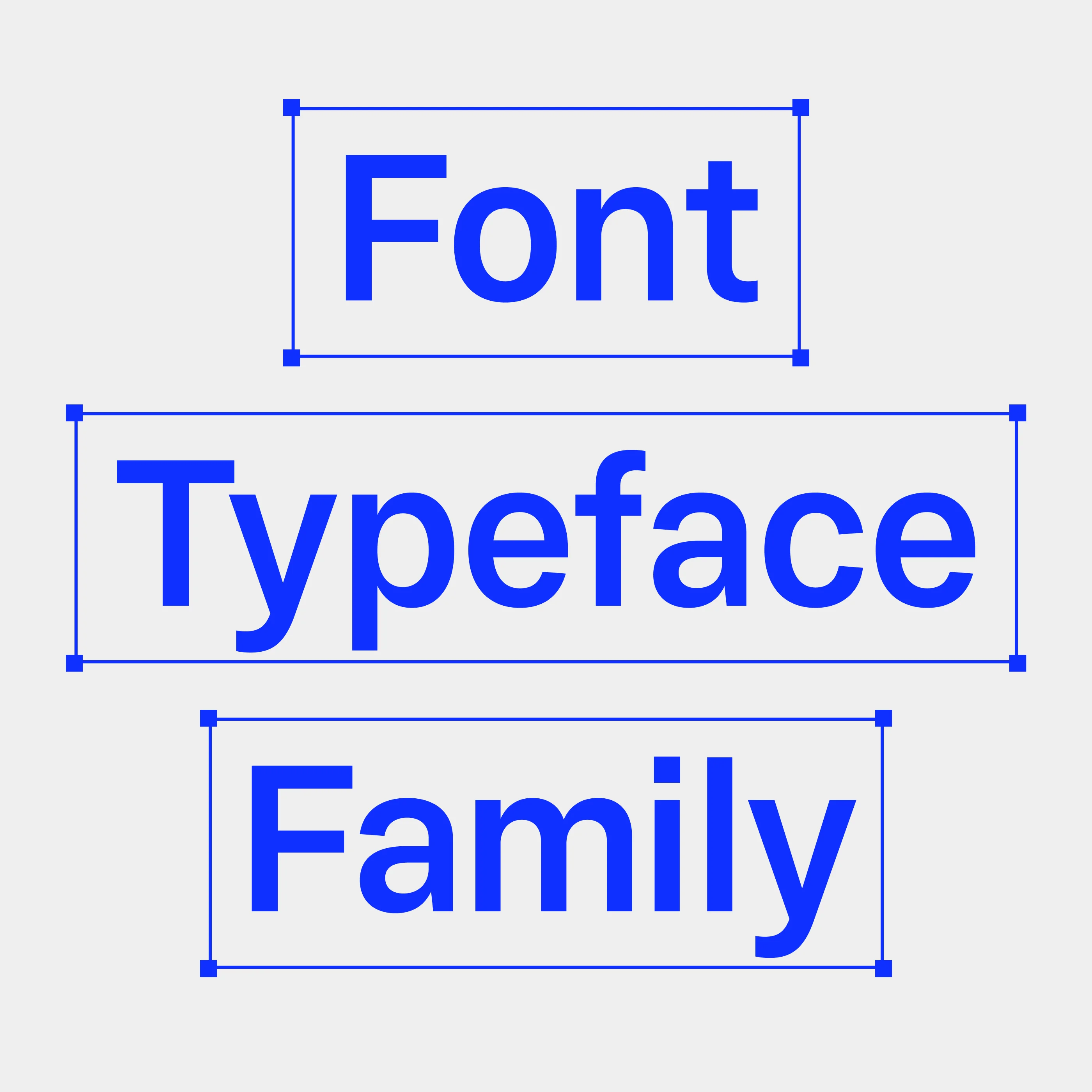
Jouter Sans: Classic Gothic Font

Jouter Sans is a classic Gothic font family inspired by a collection of typefaces from the 1867 Farmer Type catalogue. Jouter Sans is sturdy, charismatic, and functional, perfect for headlines, titles, and body text. Explore our full design process and the history behind Jouter Sans.
Jouter Sans: A Gothic Type Revival
In early 2025, Groteskly Yours Studio released an 18-style classic font family titled Jouter Sans. The project was mainly inspired by a selection of Gothic typefaces from the Farmer type catalogue from 1867, which shared some very idiosyncratic characteristics. Jouter Sans isn't a direct type revival of any of those fonts. Instead, it's an attempt to visualize what an early Gothic type family could look like today. On a more personal level, it's an homage to a wide array of historical Gothic fonts that continue to inspire us.
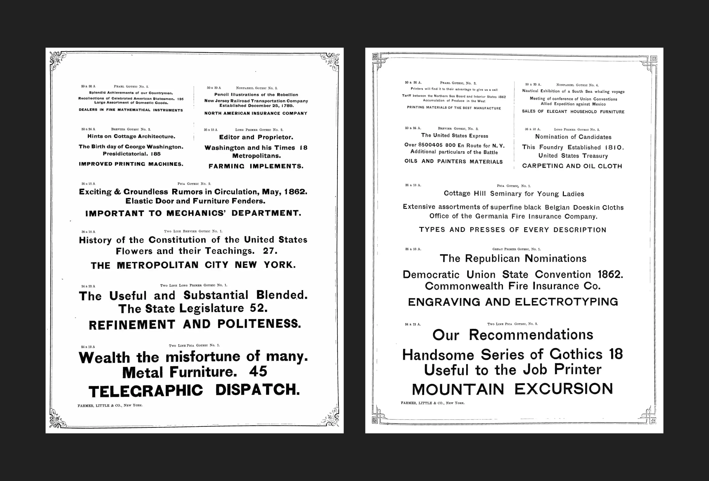
↑ The original Gothic type from Farmer type catalogue
The Inspiration Behind Jouter Sans
Jouter Sans began as a little experiment on Instagram. In a series of Instagram reels, we took our viewers through the initial stages of a classic type revival project, which resulted in a historical sans serif font that later became Jouter Sans. While most of the work on the project was done much later and off-camera, it's fascinating to see how the initially filmed sketches transformed into a more coherent and overall more modern type project that still retains its connection to early Gothic fonts while being firmly and surely a font for contemporary designers.
The initial sketches for Jouter Sans were based on a selection of Gothic fonts (namely, Gothic №1 to Gothic №4) the 1867 type specimen catalogue printed by Farmer, New York. On the surface, the original typefaces looked like fairly average run-of-the-mill sans serif from that period. All four typefaces had features consistent with Gothic styles published by other type foundries of that time. All featured reasonably high contrast, legible letterforms, generous spacing, and somewhat blocky letterforms, consistent with Medium or SemiBold font styles in modern equivalent. On closer inspection, however, there were other, far more fascinating details to be found when you compared individual letterforms with their counterparts in different point sizes. With each point size varying slightly, you could begin to piece together a DNA that much later became the foundation for Jouter Sans: distinct terminals which tapered off in letters 'e' and 'c', flat 90* angle terminals seen on letters such as 'f' and 't', and rough, sturdy numerals.
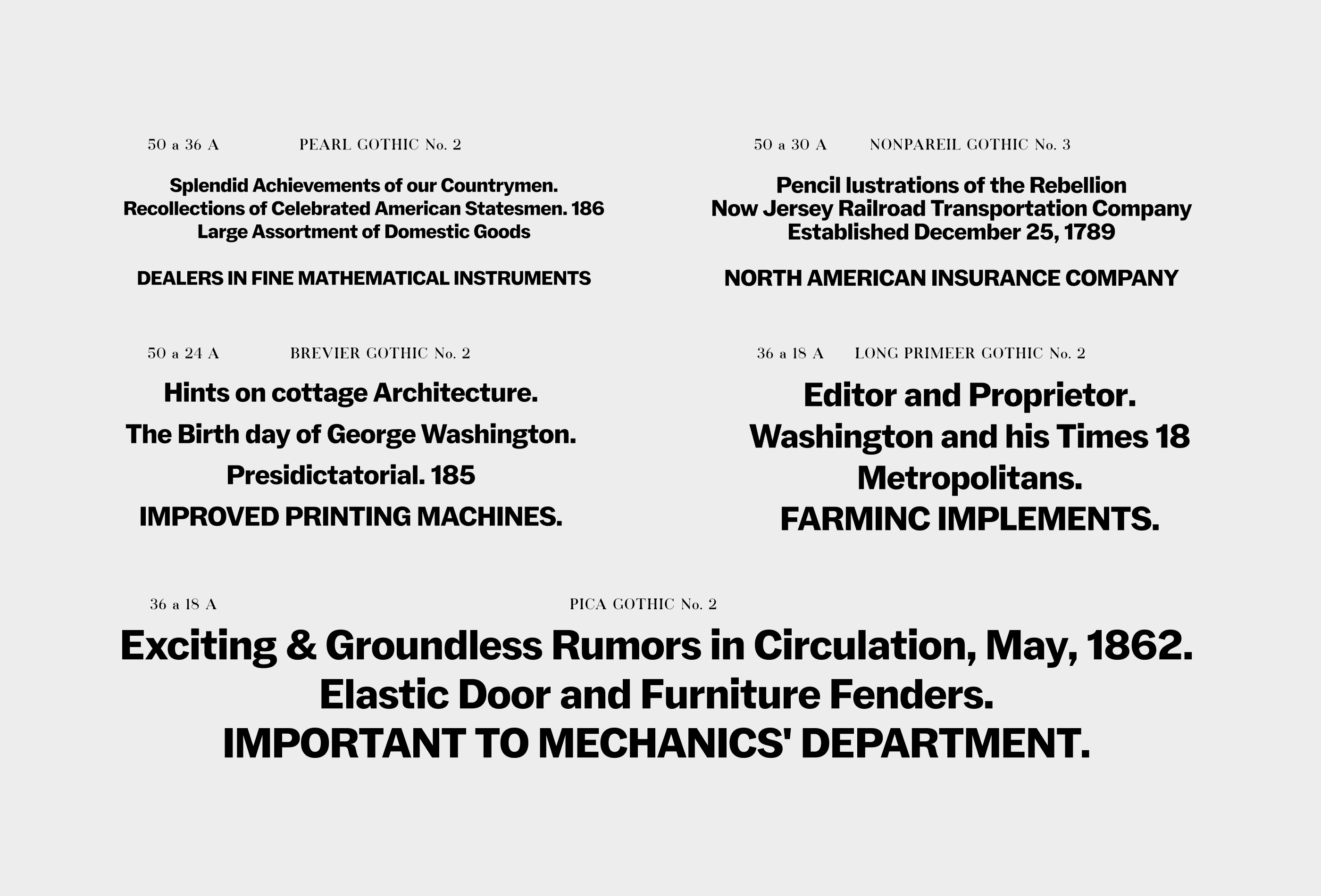
↑ Jouter Sans type revival used in part of Farmer type layout
As we began to work, we discovered other idiosyncratic details that were not uncommon in early sans serif fonts. For example, thanks to its supple and elegant structure, the ampersand was somewhat inconsistent with the rest of the font, which is more commonly seen in serif fonts. The uppercase 'R' featured a rather charismatic leg, appearing slightly off-balance. Some of these details eventually found their way into Jouter Sans virtually unchanged (the ampersand is one of these characters). In contrast, others inspired us in other ways and were merely suggestions: the 'R' in Jouter Sans, after countless different options, was designed with a slightly bowed leg instead of the straighter stroke as it was initially conceived.
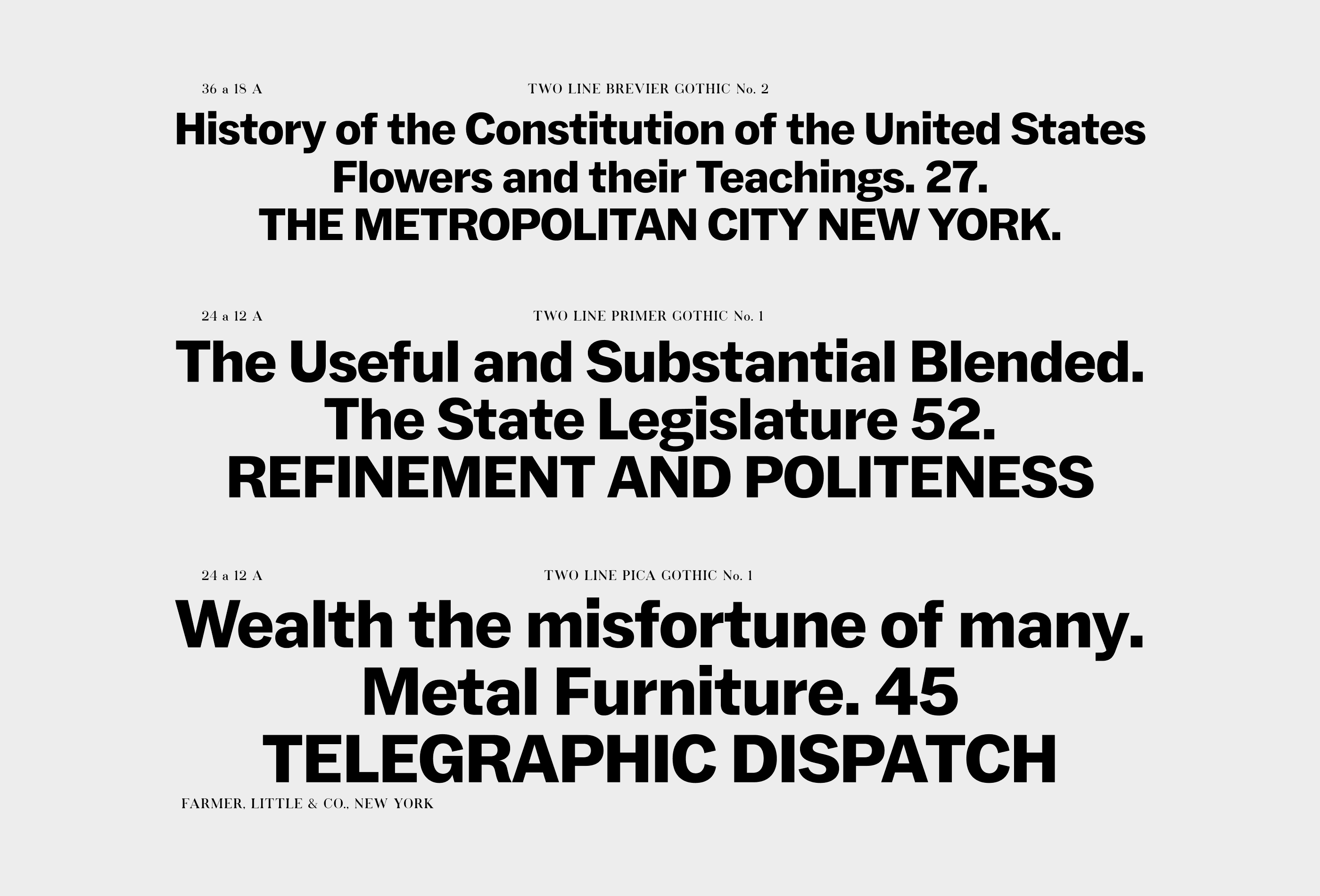
↑ Jouter Sans used in part of Farmer type layout
Designing a Classic Type Revival
While the circumstances surrounding the creation of this particular set of Farmer fonts are unknown, we can only infer what we know from other sources. Alternately, we can imagine the logic behind the overall typeface design based on the only tangible source we have: the printed specimen. None of the Gothic fonts from the catalog achieved the popularity or enduring legacy of more recent Gothic typefaces, such as Trade Gothic, which significantly influenced the typographic landscape in the US. However, this does not diminish their appeal or reflect negatively on the longevity of their design. While working on a type revival, no matter how faithful to the original it aims to be, one of the essential things is to read what the original designer had in mind when working on their font. The best we can describe it is like watching someone over their shoulder through time and deciphering what each stroke and each detail meant for them.
As we worked on Jouter Sans, we tried to preserve as much of the original character as possible while keeping our classic type family modern and functional. Jokingly, we referred to this project as a quasi-revival, as we intended to design a typeface that, while harkening back to its predecessor, remains a genuinely modern sans serif font that feels at home in the context of 21st-century design. We set out to reimagine this inherently American genre, broadening its scope to include characters and concepts that the original 19th-century designers may never have considered. At the same time, we aimed to distill the idea of utility into a timeless principle that transcends eras and continues to serve as a cornerstone of typography.
Our guiding question was: How has the concept of a Gothic sans serif font evolved since its inception? What are we doing differently today? What defines a font as modern, and what renders it outdated? These reflections shaped our approach as we sought to bridge historical context with contemporary needs, reinterpreting utility through the lens of modern typography.

↑ Jouter Sans design features
Design and Features in Jouter Sans Family
The answers to all these questions lie in Jouter Sans. Bold yet refined, it combines the sturdiness of a classic sans serif with delicate nuances. Jouter Sans excels as a display sans serif font and performs equally well in body text, balancing versatility with elegance. While it respects the historical forms of its origin, it integrates them seamlessly with modern innovations, prioritizing legibility and flow.
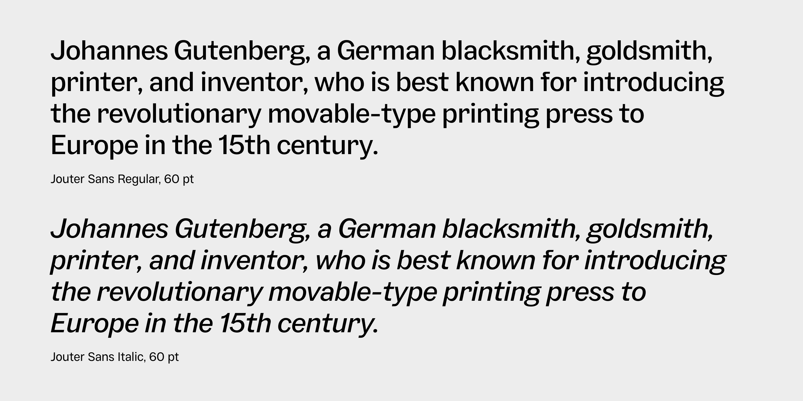
↑ Jouter Sans Regular vs Slanted Italics letterforms
Rather than hiding its heritage, Jouter Sans embraces it, leveraging over a century of advancements in type design. It supports the Variable Font format, allowing users to precisely fine-tune its weight and italic values. Stylistic Alternates offer quick and effortless customization, allowing designers to toggle between various character forms. For a type revival project like Jouter Sans, this adaptability ensures it meets the demands of a wide range of applications while remaining true to its function-first mentality.
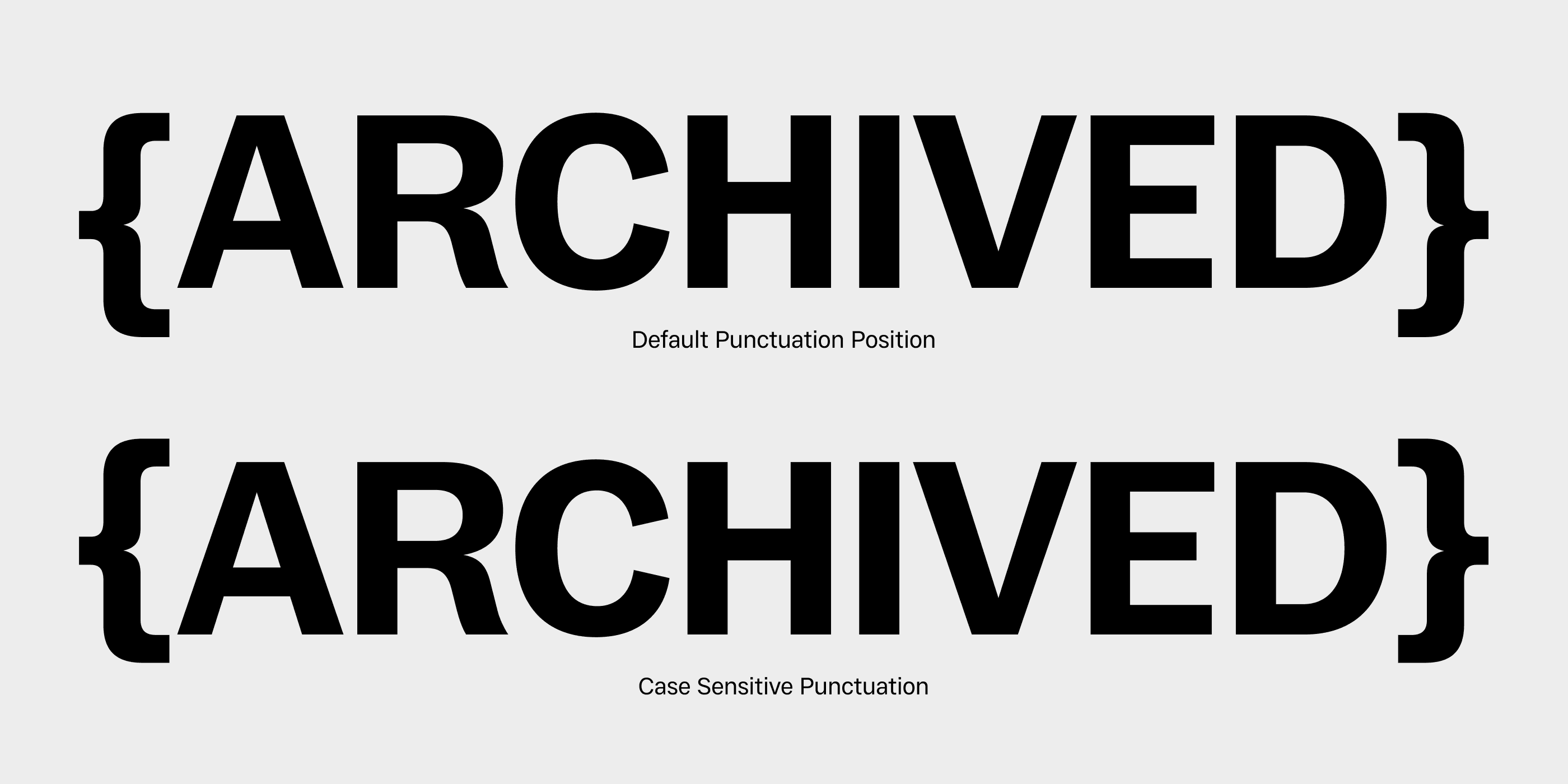
↑ Case Sensitive Punctuation in Jouter Sans
Jouter Sans is available as a family of 18 fonts featuring Upright and Italic styles. The original Farmer type catalogue did not include italic styles, so our rendition is inspired by other Gothic typefaces released around that time. The italic angle is modest but distinctive enough to stand out. With historical type revivals, there’s always a temptation to add features that weren’t part of the original. We considered true italics to complement the family but ultimately opted for more functional and less ornate oblique styles.
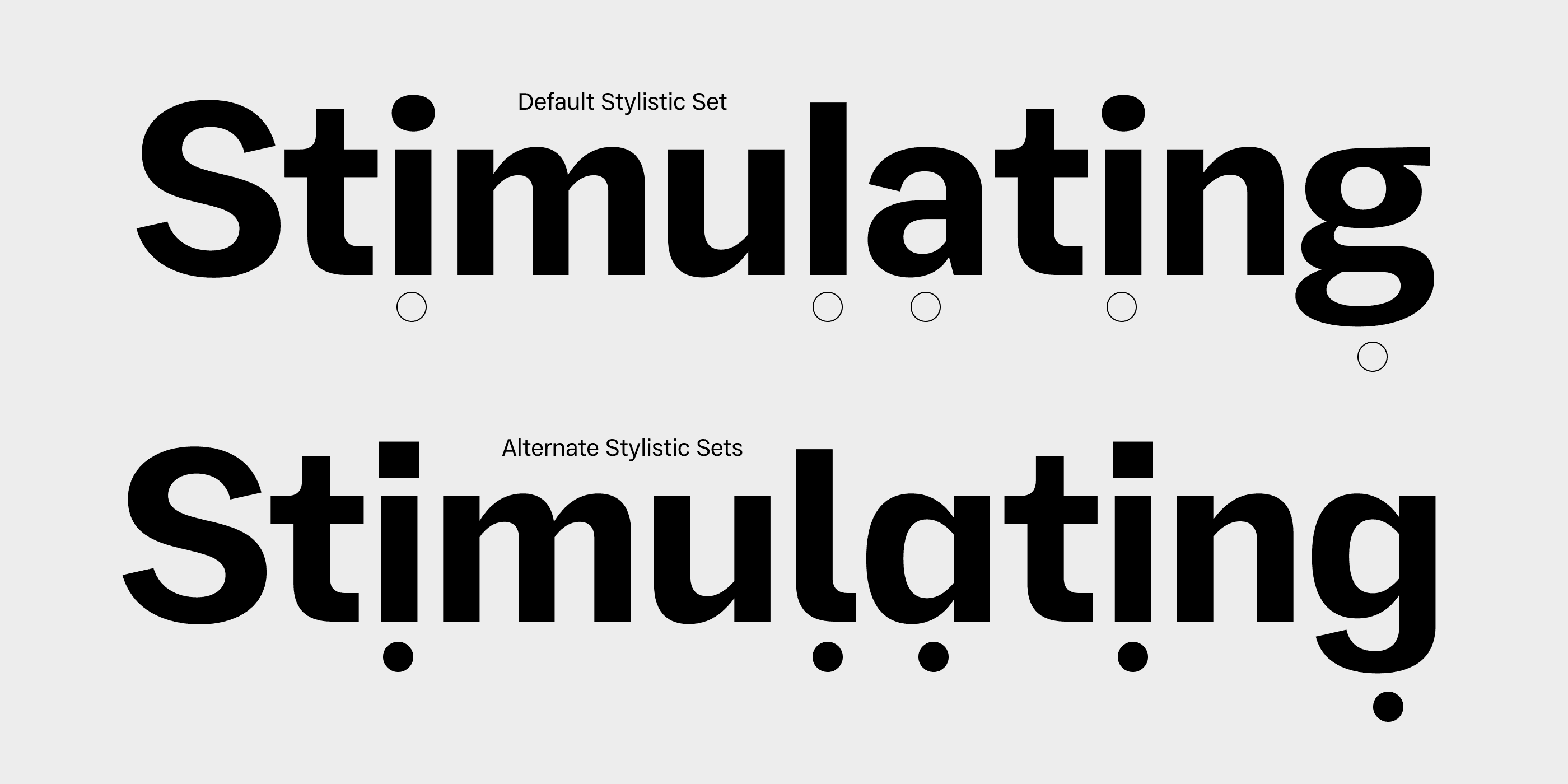
↑ Stylistic Alternates in Jouter Sans
Jouter Sans is a classic font family that shines in headlines and titles but also performs well in smaller bodies of text. It supports multiple OpenType features, allowing designers to modify the font's appearance directly in their software or on the web. Jouter is equipped with 10 Stylistic Sets, enabling designers to choose more neutral letterforms or alter the overall look of the typeface by switching between square and round dots. Additional OpenType features, such as automatic Case-Sensitive Punctuation, Ligatures, and Fractions, are included to streamline workflows.
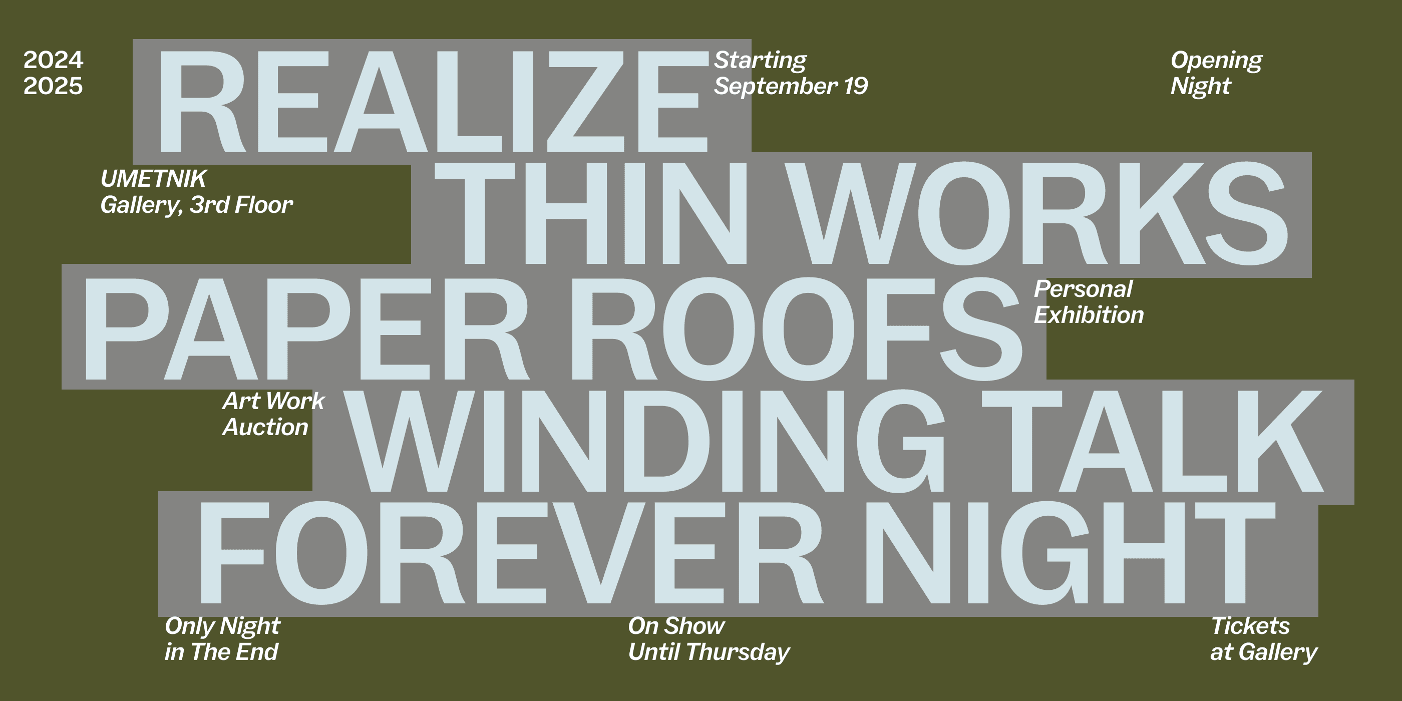
↑ Type poster typeset using Jouter Sans
Jouter Sans is available as a free trial, commercial licenses start at $35.