Design and Typography Trends in 2025
Anna Remm
·
5 minute read
·
Before talking about type trends, it's hard to ignore the fact that typography is shaping the future of branding, web design, and digital marketing. In 2025, fonts and typography will be crucial in brand identity, user experience, and performance. In this trend watch, we explore the latest type trends—from variable and experimental fonts to neutral and futuristic styles—offering real-world typography examples and design insights to help brands stay ahead.
1. Variable Fonts: Flexibility and Performance
Variable typefaces are still one of the most game-changing developments in modern typography and one of the most useful modern type trends. Unlike traditional font families that require separate files for each weight or style, a variable font encapsulates multiple variations within a single file. This means a single font can seamlessly morph in weight, width, slant, or other attributes along predefined axes, offering an expandable range of styles on demand.
Equally important, variable typefaces improve digital branding performance. By consolidating all styles into one file, they dramatically reduce the number of font files a website needs to load, reducing HTTP requests and file size for faster load times.
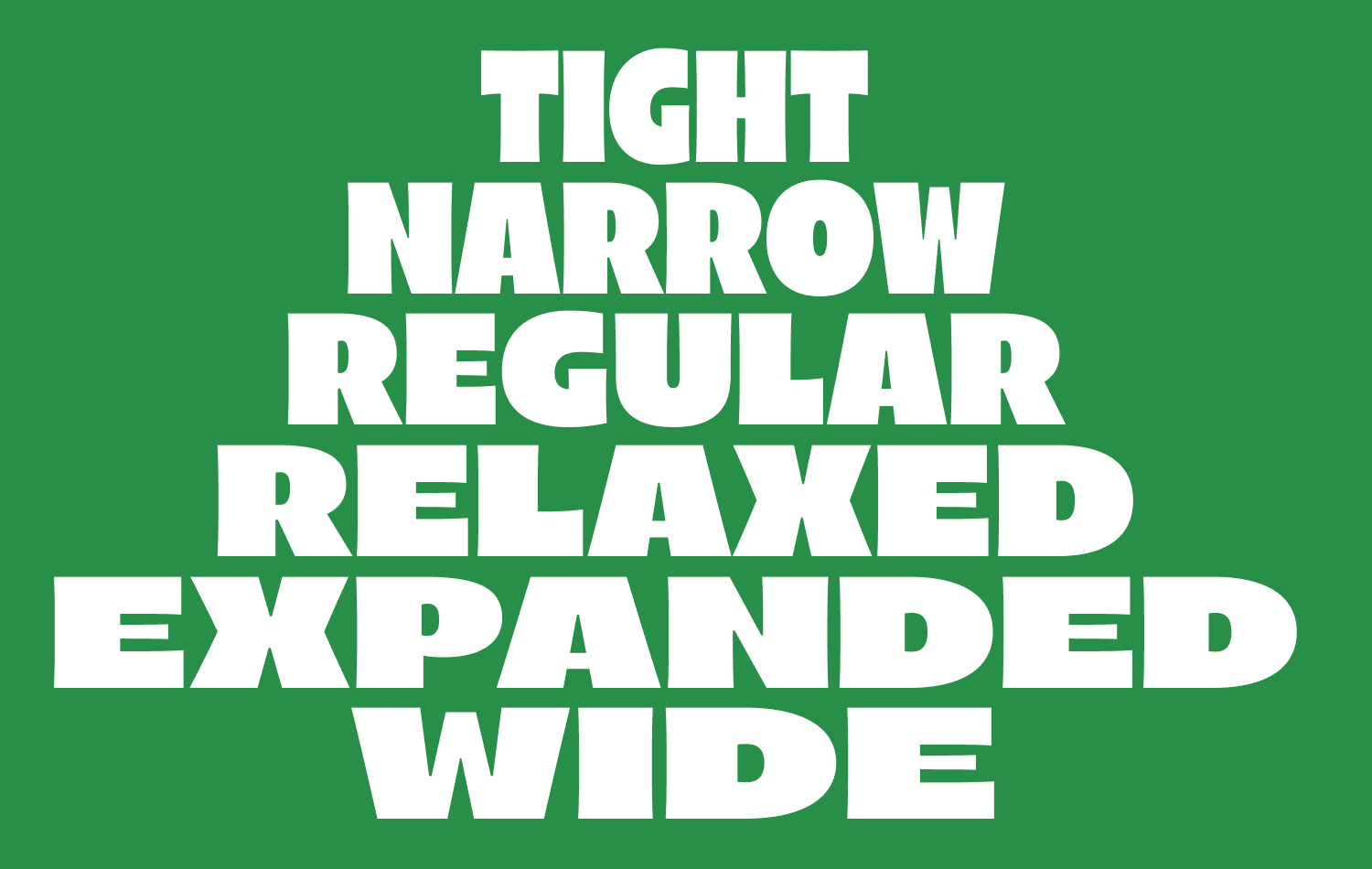
↑ Arlen, a variable font family in 36 styles
How to use variable fonts for branding?
Variable fonts are increasingly seen in responsive branding and web design, offering unparalleled flexibility. For example, the Arlen type family is a variable sans serif that offers a spectrum from narrow to wide styles in one font. A brand could use Arlen's compressed width for mobile web headers and its expansive width on billboards, all while keeping a cohesive look. Variable fonts like Arlen show how a single typeface can flex to different contexts – a narrow, tightly-spaced tagline on a small product label can smoothly expand into a bold, attention-grabbing headline on a poster without ever changing fonts. These typography examples highlight the adaptability of variable fonts across different mediums.
Tips for using variable fonts
When working with variable typefaces, identify which axes (e.g., weight, width, optical size) align with your brand needs. Start with a base style that reflects the brand's tone, then use slight adjustments along the axes for different applications – heavier for emphasis, broader or narrower for fit, etc. As one of the most influential typography trends, variable fonts offer flexibility while maintaining consistency, helping brands adapt their designs across different platforms. This avoids the pitfall of overusing gimmicky transitions and reinforces brand consistency.
2. Experimental Fonts: Breaking the Rules for Impact
Not all brands play it safe with clean sans-serifs or classic serifs. Experimental fonts are a rising design trend for companies looking to make a statement with avant-garde, rule-breaking typography.
This type trend is the opposite of minimalist typography, offering brands a fresh, bold alternative. Industries like fashion, music, and art use experimental fonts to convey creativity. Social media and packaging also leverage their visual impact. Even mainstream marketing is embracing funkier type in social media graphics and packaging to capture eyeballs – these wild styles can transform ordinary text into what feels like a custom font for branding.

↑ Noad Sans is an experimental sans serif with visualized Bezier points
How to use experimental fonts in brand identity?
A real-world typography example is Noad Sans, which blends Swiss style with quirky details, giving brands a distinctive yet professional look. Experimental fonts work best in logos, headlines, and campaigns where originality is key. Importantly, experimental fonts also tap into younger audiences' love for authenticity and character; a bit of weirdness or edge in typography can make a brand appear more human, creative, and trend-setting.
Tips for using experimental fonts
Designers should use experimental fonts strategically. Because these typefaces are often highly stylized, they work best in small doses – for a logo, a headline, or a splash graphic – rather than long paragraphs of text. As part of modern type trends, pairing these fonts with a simpler supporting typeface helps maintain readability (for instance, a wild display font for titles and a neutral sans serif for body copy). Consider the brand's values: the font should always resonate with the message.
3. Futuristic Fonts: Digital-Forward Aesthetics
As brands look toward the future, many adopt futuristic fonts for branding and web design to establish a cutting-edge, forward-thinking identity. In 2025 typography design trends, these fonts are characterized by high-tech typefaces with sleek geometric shapes, wide letter spacing, unconventional angles, and minimalist ultra-modern forms.
Several factors are driving the popularity of modern futuristic fonts. Culturally, we're in a tech-centric era – think of how often we hear about AI, space travel, or the metaverse. With the rise of AI-driven branding, metaverse design, and space-inspired typography, brands in technology, esports, electric vehicles, and other tech-related industries seek modern sans-serif fonts that align with innovation.
↑ Refrankt, a futuristic sans serif font family
How to use a futuristic font for branding
Typography example: Refrankt is an expanded sans serif that balances modernism with versatility. Brands use it for logos, apps, and packaging to create a future-ready identity. Futuristic fonts dominate esports, electric vehicles, and tech branding. Refrankt is an expanded sans-serif font that balances modernism and versatility. It's best used as a font for UI, web design, futuristic packaging design, and logo design for tech brands looking for a clean, contemporary font with a future-ready feel.
Tips for using futuristic fonts
Use futuristic fonts strategically in digital and large-scale applications to maintain readability. Use the font family's versatility—use multiple weights or a variable font option. For example, using a lightweight futuristic font for body text and a bold sci-fi font for key terms can enhance typographic hierarchy while maintaining a sleek, ultra-modern aesthetic. As a leading trend in contemporary typography, futuristic fonts infuse brands with innovation, energy, and a forward-thinking identity that resonates with today's tech-savvy audiences.
4. Neutral Fonts: Minimalist and Functional
On the opposite end of the spectrum from experimental fonts and futuristic typography lies the enduring trend of neutral fonts. These typefaces are designed to be invisible heroes—minimalistic, highly legible, and versatile in nearly any context. Often classified as neo-grotesque fonts or humanist sans-serifs, neutral fonts strip away decorative flourishes in favor of clean lines and balanced proportions.
Over the past decade, many brands have embraced neutral sans-serif fonts in rebranding efforts—think of global tech branding, fintech typography, and corporate identity design, where logos have shifted to plain sans-serif wordmarks set in Helvetica. This trend remains strong because a modern neutral typeface adapts to various brand aesthetics without clashing with other design elements. It's like the little black dress of typography—timeless, adaptable, and always appropriate. Additionally, the rise of minimalist branding, Swiss typography principles, and flat UI design trends has sustained the demand for clean, content-focused typography where the font enhances the message rather than overshadows it.

↑ Resist Sans is a neutral, Swiss-inspired sans serif type family
How to use neutral fonts in design?
Neutral fonts can be a powerful tool in branding design when used thoughtfully, considering their simplicity and versatility. Just because a font is neutral doesn't mean it lacks personality. Subtle design elements—such as x-height, letter spacing, and stroke curvature—shape a typeface's tone. One neutral sans serif may feel more friendly and open, while another feels stark and formal. As typography design trends in 2025 continue to emphasize minimalist type design and functional branding, selecting the right clean sans-serif typeface ensures alignment with a brand's identity.
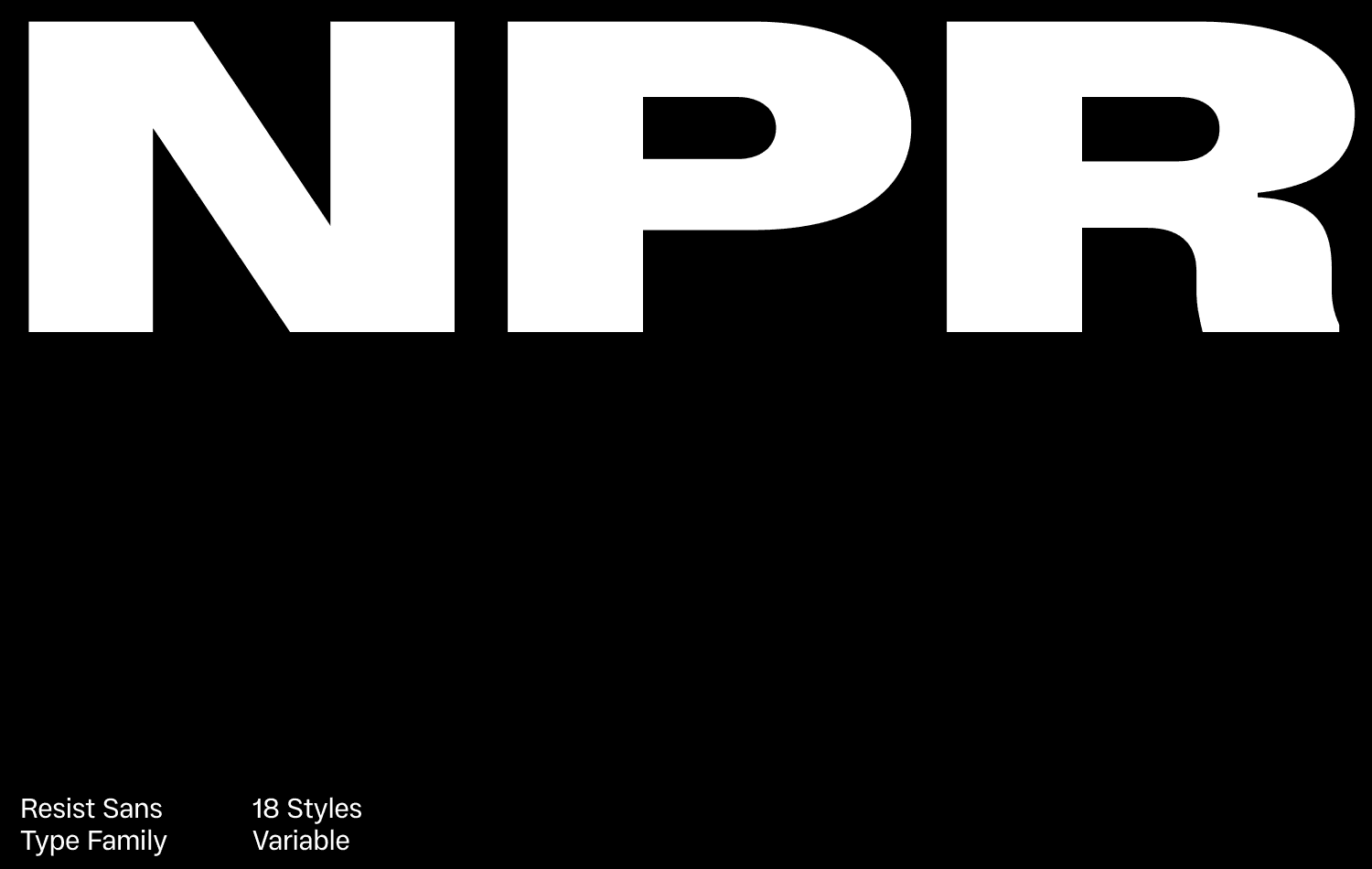
Using Resist Sans as a neutral workhorse type family
Resist Sans is a neo-grotesque typeface that embodies the modern neutral font trend with a contemporary twist. Inspired by classic Swiss fonts, its crisp, clean sans-serif letterforms are refined with details like ink traps for enhanced legibility at small sizes. In brand typography, a font like Resist Sans is a reliable workhorse, equally effective in app design and digital-first branding.
5. Display Fonts: Bold and Expressive Branding
When brands need to make a substantial impact at a glance, display fonts for branding are the go-to choice. Unlike neutral fonts or text typefaces, display fonts are designed to stand out and make a statement. Typically used in larger sizes—such as logos, headlines, posters, and packaging design—these fonts can be more ornate, dramatic, and expressive than fonts intended for body text. Following the latest type design trends in 2025, display typefaces increasingly incorporate bold, unconventional elements, allowing designers to experiment with new shapes and structures. This shift reflects a broader trend toward expressive typography, where the font becomes a central part of the brand's identity and message, adding character and personality to the design.

↑ Porte Neue is a display font family, developed with luxury branding in mind
How to use display fonts in 2025?
Many companies have refreshed their brand identities in recent years by introducing custom display typefaces for their wordmarks or advertising campaigns. We've seen a surge in the use of high-contrast serifs, quirky retro fonts, and artistic lettering by brands looking to stand out and appear more approachable and unique.
The current trend in display fonts moves away from ornate Victorian scripts, favoring clean, modern designs with a unique twist—offering enough originality to be distinct yet refined enough to maintain a professional appeal.
Tips for using display fonts
Typography examples: Porte Neue is a refined sans serif font with a timeless aesthetic, making it an excellent choice for luxury branding. In contrast, Bardamu is a slab serif font with reverse contrast, bringing a quirky and lively touch to designs. Both fonts are perfect for brand storytelling, enhancing the brand's visual identity and ensuring a strong presence across various platforms.
Use display fonts for high-impact applications—logos, headlines, or key marketing materials—and pair them with neutral fonts for balance. Ensure you're satisfied with the project's vibe and context to guarantee optimal performance across digital and print media.
Exploring Type Trends in 2025
Typography shapes brand identity beyond just aesthetics. From adaptable variable fonts to expressive display typefaces, today's brands mix and match typography trends for maximum impact. Aligning font choices with brand values ensures a distinctive, cohesive identity. The right fonts amplify a brand's voice, cutting through the noise and leaving a lasting impression. Thoughtful typography choices transform words into powerful brand storytelling tools, enhancing brand experience.


