Resist Mono
Monospaced Font for Coding
Resist Mono is a monospaced type family for coding. Designed as a perfect companion to the bestselling Resist Sans typeface, it maintains the core visual characteristics of its predecessor and offers a fresh, functional design tailored for modern projects. This monospaced font combines aesthetic appeal with exceptional usability, making it an excellent font for coding, branding, and editorial design. With its monospaced sans serif structure, Resist Mono balances clean, legible letterforms with distinctive features such as deep ink traps and true italics, ensuring outstanding readability across all applications. Whether used as a display font or as a monospaced font for code, Resist Mono adapts effortlessly to a variety of creative and functional design scenarios, making it a reliable tool for designers and developers alike.
Font Family
Thin
Thin
Thin Italic
Thin Italic
Light
Light
Light Italic
Light Italic
Book
Book
Book Italic
Book Italic
Regular
Regular
Regular Italic
Regular Italic
Medium
Medium
Medium Italic
Medium Italic
SemiBold
SemiBold
SemiBold Italic
SemiBold Italic
Bold
Bold
Bold Italic
Bold Italic
Type Testers
Text legibility is crucial for effective communication, whether on screens or paper. High contrast between text and background improves readability, especially for users with visual impairments. Choosing the right font size and spacing also enhances comprehension
Whitespace, or negative space, is an essential concept that enhances text readability. By providing breathing room around text, it helps prevent visual clutter. Proper use of whitespace improves focus, allowing readers to absorb content more comfortably.
Web design relies on clear alignment principles. Left-aligned text, used on over 90% of websites, provides a predictable reading experience. Centered text, while effective for headers, can reduce readability in longer passages and hint at a more creative layout.
Dynamic typography allows designers to create responsive, interactive text elements. Variable fonts, for example, enable real-time adjustments to weight, width, and style. This flexibility provides users with a more customized and engaging reading experience
Design trends in web typography emphasize flexibility. Variable fonts allow designers to adjust weight, width, and style dynamically. This versatility ensures optimal readability across devices and screen sizes, enhancing the user experience.
Character Set
Font Information
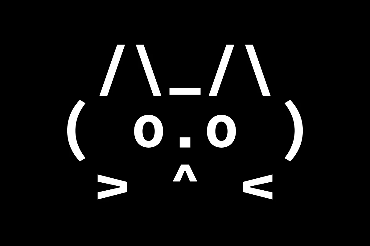
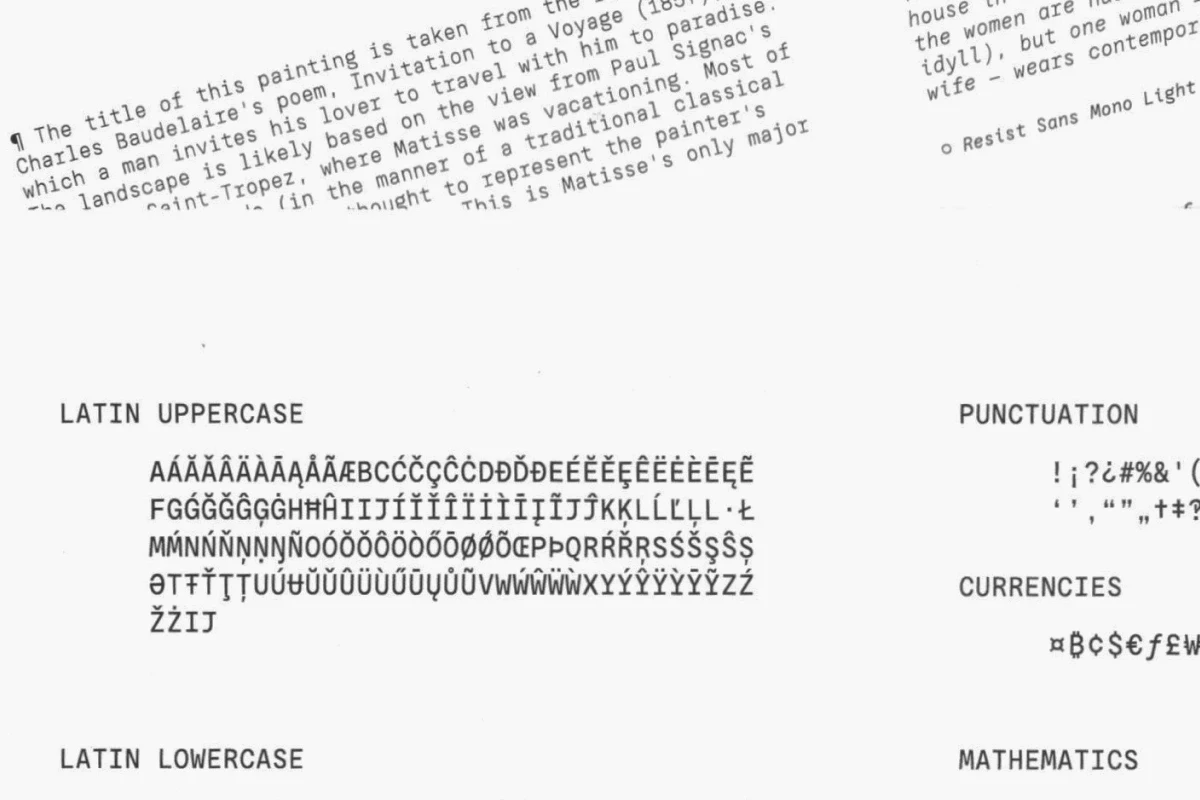
Resist Mono is a monospaced font family for coding. Drawing inspiration from the distinctive features of the original Resist Sans family, it features deep inktraps, angled terminals, and exceptional legibility. With its bold personality and style, Resist Mono ensures readability even at small sizes, making it an excellent font for coding as well as other modern design applications such as UX, web, and graphic design. Its monospaced sans serif design delivers both versatility and visual impact for a wide range of creative and technical projects.
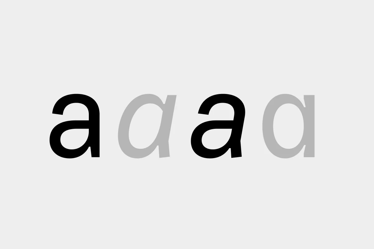
Meticulously crafted to prioritize functionality, Resist Mono offers unique features like true italics with a calligraphic influence, adding a refined touch to its design. For even more customization, users can access regular slanted letterforms through OpenType by selecting the corresponding stylistic set. Beyond coding, this monospaced branding typeface excels in product design, web design, publishing, and graphic design, offering wide selection of font styles that make it a versatile tool for designers. Whether used as a mono font for code or as a monospaced display font in branding and editorial contexts, Resist Mono combines functionality with a striking visual character.
Technical Info
Released
2022
2022
Version
1.00
1.00
Styles
14 Fonts
14 Fonts
Characters
1300+
1300+
Formats
.otf/.woff/.woff2
.otf/.woff/.woff2
Licenses
from
$35