Arlen: Funky 80s Typeface
Eugene Tantsurin
·
5 minute read
·
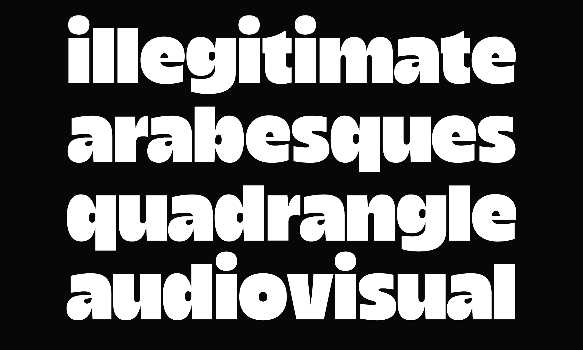
Loosely inspired by hand-painted signs and 80s typeface aesthetic, Arlen is a variable, indescribably charming, and funky type family in 36 styles. Originally conceived as a display font family, Arlen slowly developed into a versatile typeface with six widths (from Tight to Wide) and six weights (Light to Heavy). A variable font encompassing all these weights and widths is also part of the Arlen family.
Early Funky Font Sketches
It’s funny sometimes to think how new fonts come to life. You live your life blissfully, unaware that at any moment, an idea may come that will haunt you for months and perhaps years. Once you realize how inevitable this is, there comes a certain finality. Since there’s no way to evade these sudden jolts of inspiration, you can settle cozily into your work chair and start sketching these first inklings of what may or may not be a finished typeface.
The story of our latest typeface release, Arlen, began in August 2020. I was in between type design projects and not looking for anything serious to work on. Most days, I found myself drawing weird letters and sketches that would eventually end up on Instagram. It was the perfect work-away-from-work type of thing: I'd experiment with a few letters, whip up a poster or two, and forget all about it—no strings attached. And so–when I stumbled upon an idea that would later be developed into Arlen, I didn’t think much of it.
↑ First draft of Arlen font, inspired by 80s visual aesthetic (circa 2020)
If you compare the latest version of the Arlen type family with its original sketch, you’ll find more similarities than you imagine. First off, the x-height and ascenders/descenders ratio is spot on. Some letters are similar to the finished letterforms despite raw and messy outlines. However, one of the most prominent features of this early sketch is the very tight spacing preserved throughout the entire project. Overall, this early sketch was a perfect starting point for Arlen. A lot had to be done, and some things needed fixing, but it was a solid backbone on which the entire project could rely. It already had a unique funky character, which was later developed to the fullest in Arlen.
Once the general idea was more or less defined and we had a couple of 80s font styles to experiment with, we began testing the original concept with a few design projects we had at the time. We also couldn’t pass up the opportunity to showcase our latest project via social media. Here are some funky design concepts that utilize the very first version of Arlen.
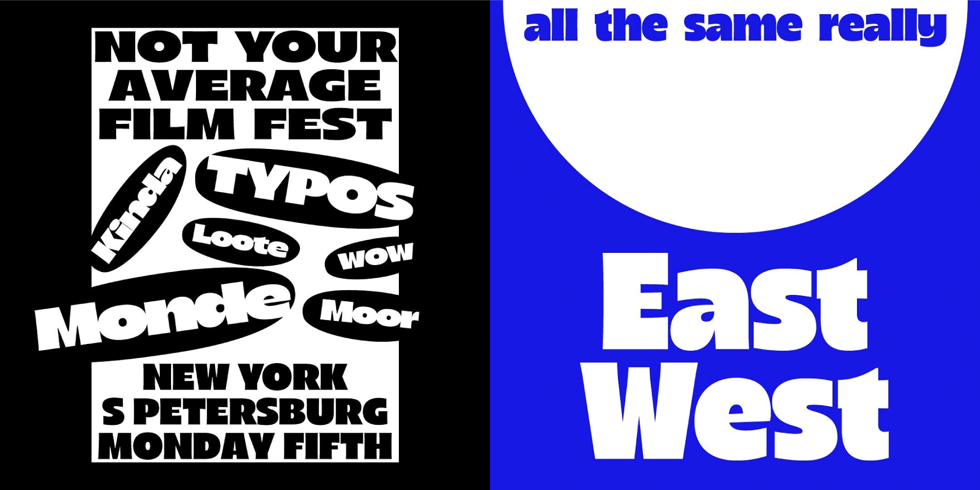
↑ Early designs for Arlen type family featuring 80s font aesthetic
Expanding Arlen Font Family
Whenever you're working on a new type family, it's essential to ask pertinent questions early on. For me, these questions were: How many styles should this funky type family have? What would a typical 80s font look like? What kind of real-life projects would utilize this typeface? What is a good 80s font?
When designing commercial and retail fonts, you’re always tempted to include as many font styles and characters as possible. The reasoning is simple: the more styles a typeface has, the more designers will notice it. This logic, however, is somewhat faulty because: a. It’s virtually impossible to retain the original idea across a wide array of styles. b. It’s probably not necessary to expand the character set beyond certain limits.
With Arlen, we wanted to preserve the tight spacing of the original sketch, bold and energetic letterforms, and dynamic terminals. After some testing, we noticed that all these features became more pronounced in bolder font styles, so we immediately decided to go for a rather unconventional family structure. The weight of the typeface would remain unchanged throughout the family–but the width of the letters would change from Narrow to Expanded. This way, we could preserve the visual quirks of the original sketch and have a funky variable type family as a result.

↑ Initial release of Arlen family
Initial Release of Arlen 80s Font Family
After a few months of work, Arlen began to take shape. We’d already settled on a 6-font family with 600 characters in each font. In short, nothing too exorbitant, but still enough to cover a large portion of Latin-based languages and have a worth of additional symbols and punctuation marks. We strove to preserve the fresh, funky feel of the first draft, ensuring the project we work on remains a friendly and funky 80s type family that we came to know and love at the studio.
Over the next few months, we worked long and hard to improve the Arlen type family and add new features and characters. Some ideas from the original sketch were discarded (it was inevitable), and some new ideas were adopted along the way. For example, when working on punctuation marks, we quickly realized that thinner, more contrasting punctuation worked better with bold letterforms–and decided to have thin punctuation as the default set in Arlen. The thicker, less contrasting alternates were added as an extra stylistic set. The same logic was applied for all diacritical marks, save for the default dot accent and dieresis.
By December 2021, Arlen was finished, including kerning, spacing, and hinting. A month later, in January 2022, it was released as a six-font (+1 Variable Font) type family.
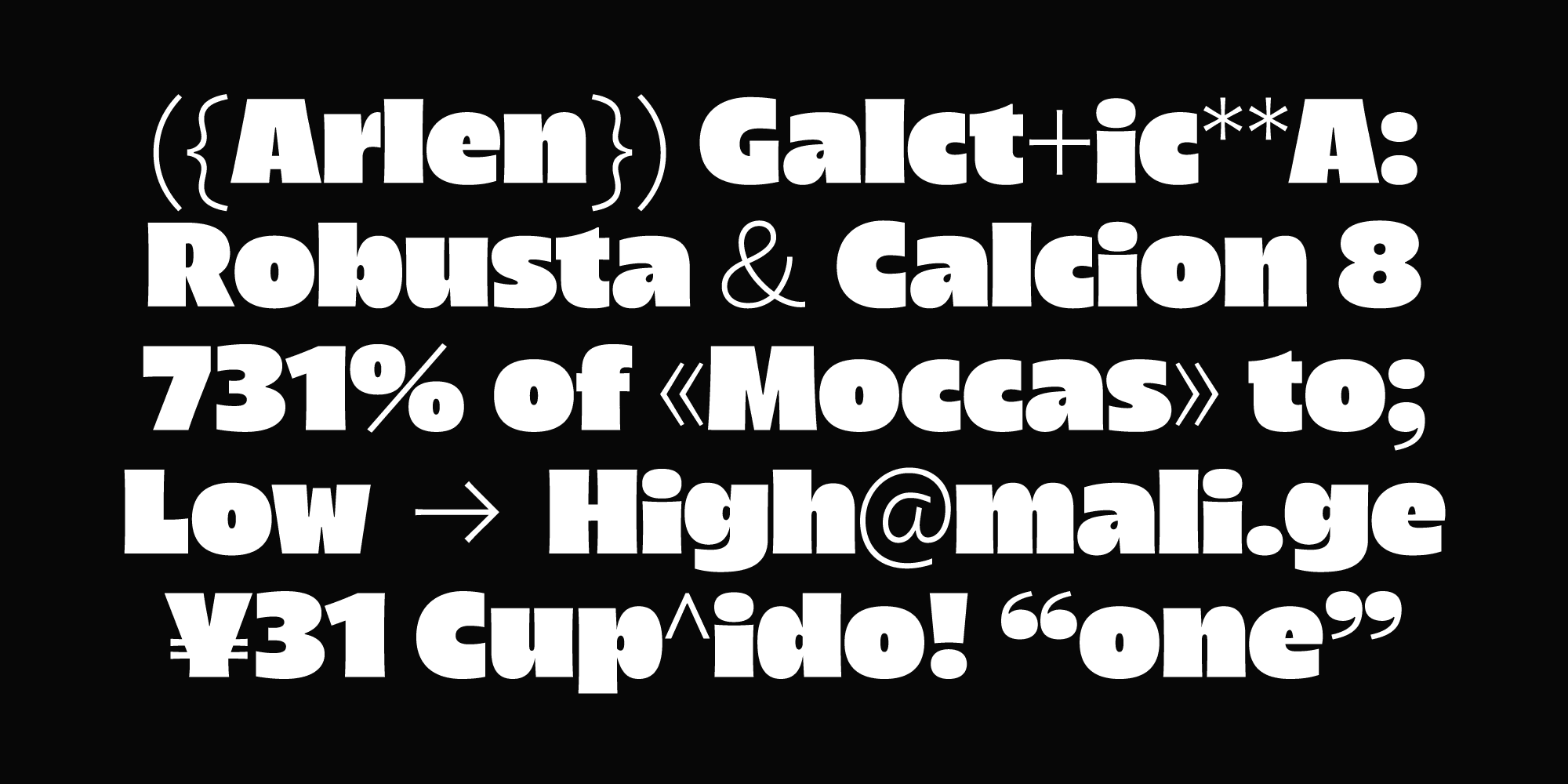
↑ Thin punctuation and symbols in Arlen
Arlen's Font Family Features
So, what makes Arlen, Arlen? Let's walk over the most prominent features of the Arlen type family to see how this funky 80s typeface can be used more effectively in your designs.
We start with Arlen's impressive variability. Although the variable font format is not new, we’ve worked on only a few projects that are as versatile as Arlen. Whether using static or variable fonts, it’s incredible how many different styles and looks you can achieve. Whether you’re working on branding or designing a website, we can bet at least a few styles can fit your project.
Arlen offers extensive support for OpenType Features. Whether you need stylistic alternates, case-sensitive punctuation, or anything else, Arlen has got you covered. We’re huge fans of OpenType features, and we feel more designers should be able to utilize these fantastic tools in their work. What better way to test them than in a funky typeface like Arlen?
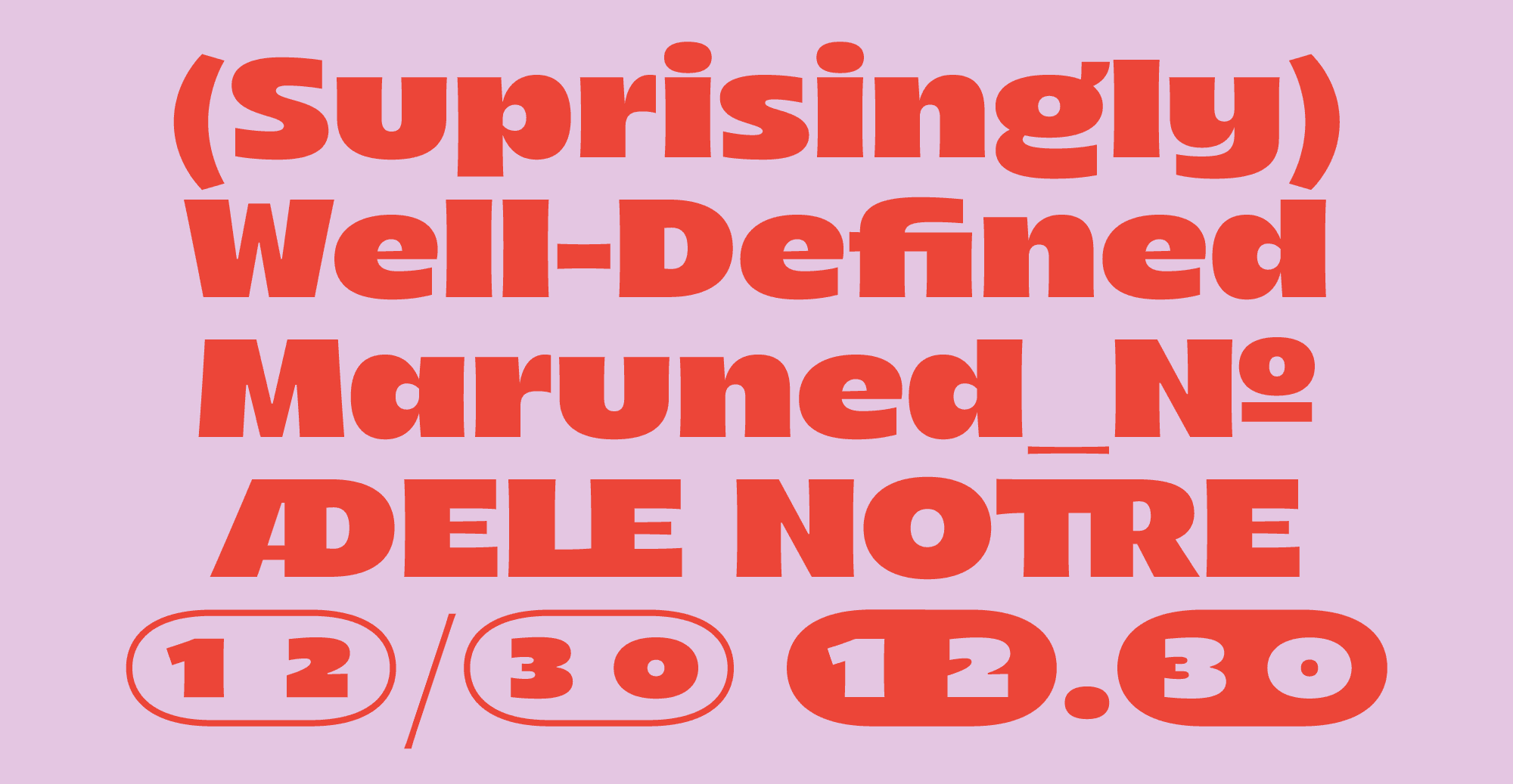
↑ Arlen OpenType Features
Changing between OpenType Features is easy in graphic design software and on the web, so you’d have little to no problems getting hold of this fantastic tool. And feel free to let us know what OT features you’d like to see in our upcoming projects. All Arlen font styles are available as free trial fonts that you can request from our website for testing and prototyping. You can test Arlen in your designs or propose it to a client before committing to getting a full license.
Featuring 80s Typeface Aesthetic
Overall, Arlen turned out to be exactly as we wanted it to. It retained it's unmistakeable 80s typeface vibe and featured unique and charismatic letterforms that made it a perfect font for branding. Arlen is groovy and funky, easily definable and yet open to interpretation. Arlen features free font trials, extended Latin support, and a large character set. For those looking for that one 80s font, Arlen is an excellent choice.
Get a free trial version of Arlen and purchase a license starting at $45.


