Hidden OpenType Features: Numbers and Figures
Introduction
Commercially available typefaces aren’t just tools for branding and design; they are sophisticated toolkits that type designers work on for months, ensuring the perfect combination of functionality and flair. However, most designers don’t know how to utilize their fonts’ full potential.
As someone who works with type every day, I decided to write a comprehensive guide to help you uncover the hidden capabilities of your fonts and become more familiar with the tools you use daily. In this first part, we’ll focus on figures and numbers and try to answer these questions:
Why are there multiple sets of figures in a font? How do you use these various figures? What makes them different? And, finally, why is this important?
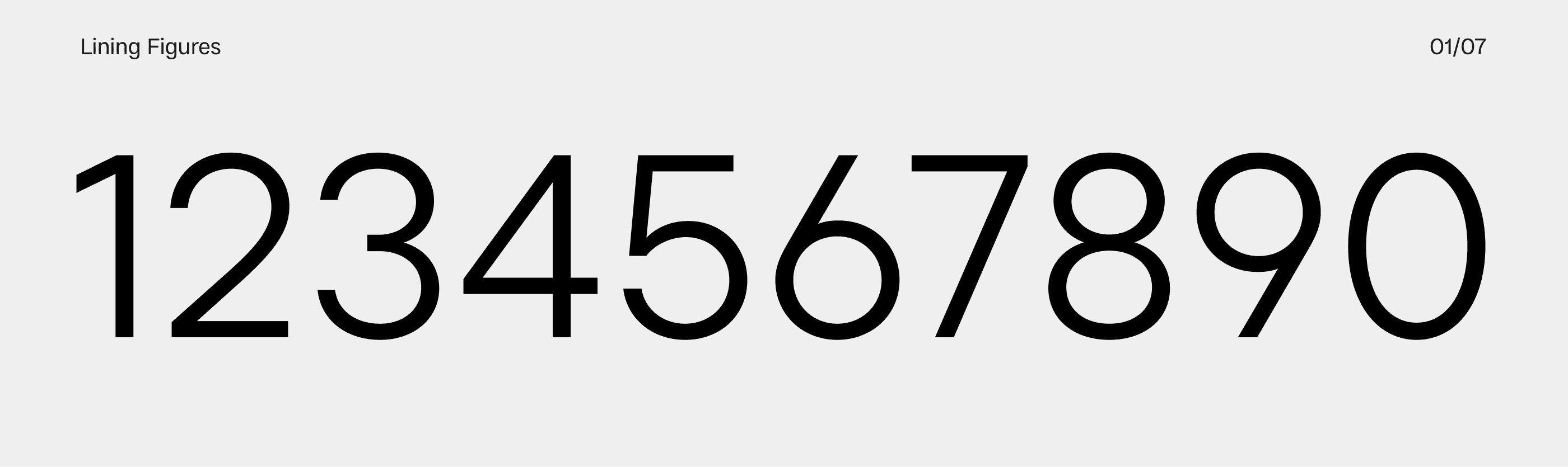
Lining Figures
Lining Figures are what most people think of as default figures. They closely resemble capital letters in height, proportion, and stroke width and can be used for a variety of scenarios, from data sets and prices to price tags and street signs.
Lining Figures are often the go-to choice for scenarios where clarity and uniformity are paramount. They are designed to align perfectly with the cap height of uppercase letters, ensuring a clean and consistent appearance across various applications.
↑ Lader Regular
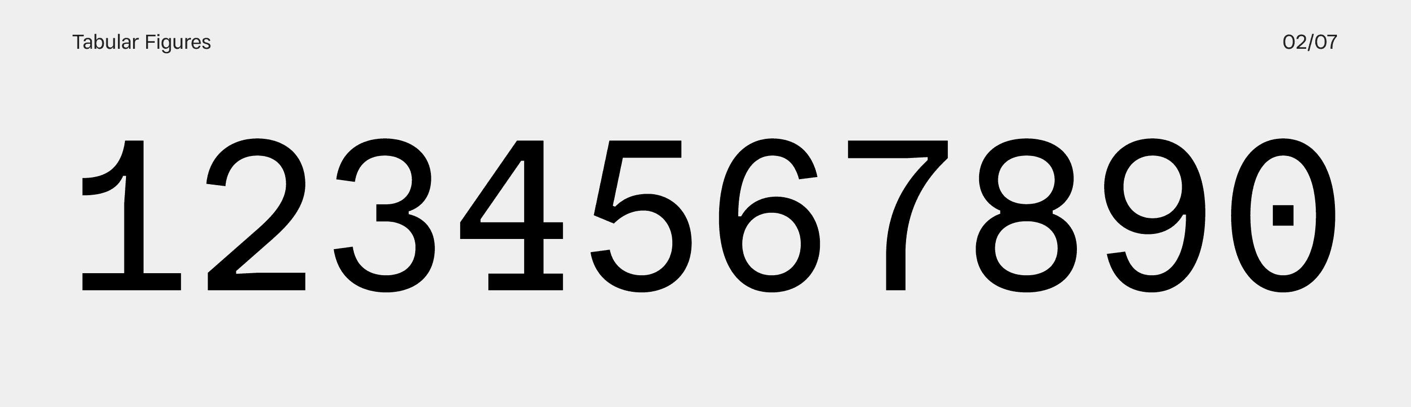
Tabular Figures
As the name suggests, tabular figures are used primarily in tables, schedules, price lists, and similar contexts. The main feature of tabular figures is that they all have the same width, making vertical alignment a piece of cake. Chances are, your boarding pass, train schedule, or most financial websites use tabular figures.
In the majority of contemporary graphic design apps, you can easily enable tabular figures by selecting your text frame and changing the Figure settings in the OpenType tab. For web designers, simply add “font-variant-numeric: tabular-nums;” in your CSS, and you’re good to go.
It’s not uncommon to include tabular versions of punctuation marks often used alongside figures, such as commas, periods, colons, and parentheses. While not particularly necessary for most designers, it’s still a cool feature to have in your typeface.
↑ Resist Mono Regular
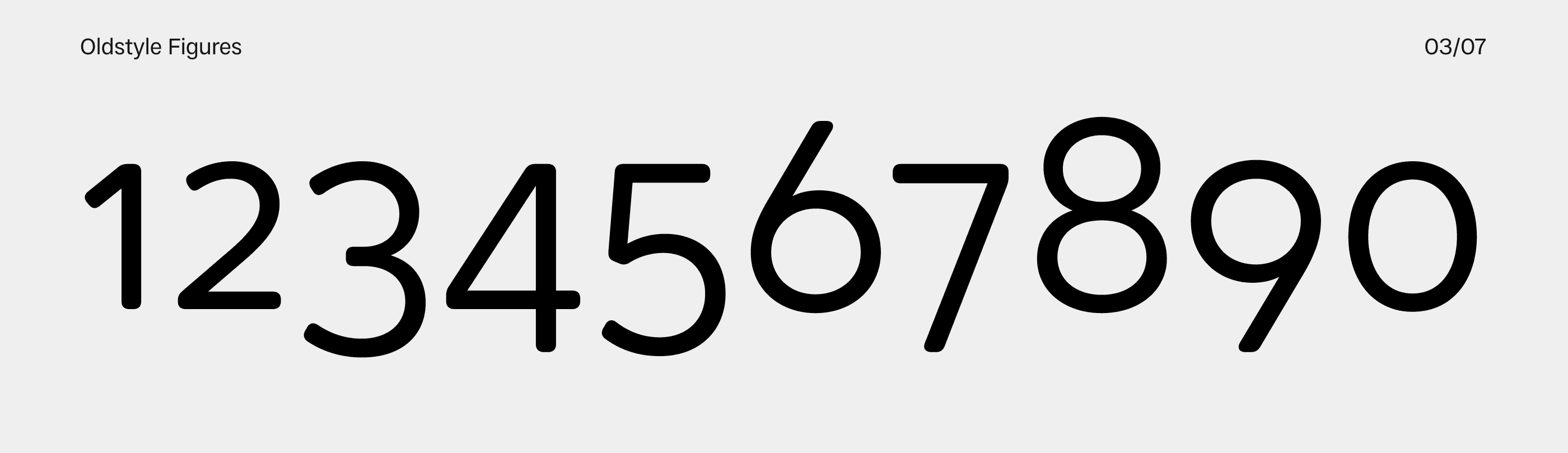
Oldstyle Figures
You’ve likely encountered oldstyle figures more often than you realize, but their natural feel often means they go unnoticed. Oldstyle figures are now used primarily in running text because they seem less obtrusive than the default figure set. The positioning of oldstyle figures is quite varied, with 0, 1, 6, and 8 resting on the baseline, and 3, 4, 5, 7, and 9 extending below it. Additionally, some of the figures are much lower than the rest (notice the tiny 2, for instance).
Interestingly, despite generally being used alongside lowercase letters, oldstyle figures are typically taller than the x-height.
Adobe apps let you quickly switch between default and oldstyle figures sets in the OpenType tab. If you want to use oldstyle figures on the web, add “font-variant-numeric: oldstyle-nums;” to your CSS. However, keep in mind that you may not want all numbers on your website to turn into oldstyle figures, so be mindful when implementing this.
↑ Oktah Round Book
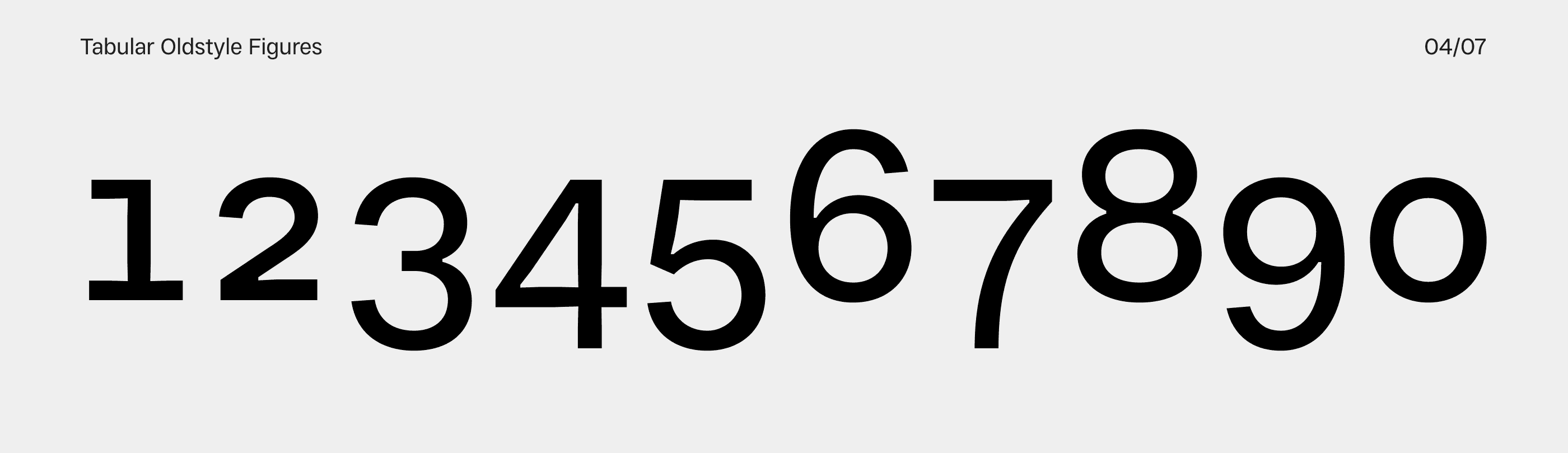
Tabular Oldstyle Figures
While this set may be a bit more obscure and less common, it’s rather easy to design and can come in handy if you’re using many tables in your layout. Since all tabular figures have the same width, your numerical data will never look messy.
Despite their old-fashioned appearance, each numeral maintains a uniform width, ensuring columns of numbers line up perfectly. This meticulous alignment is crucial for maintaining clarity and preventing misinterpretation in data-heavy documents.
↑ Resist Mono Regular
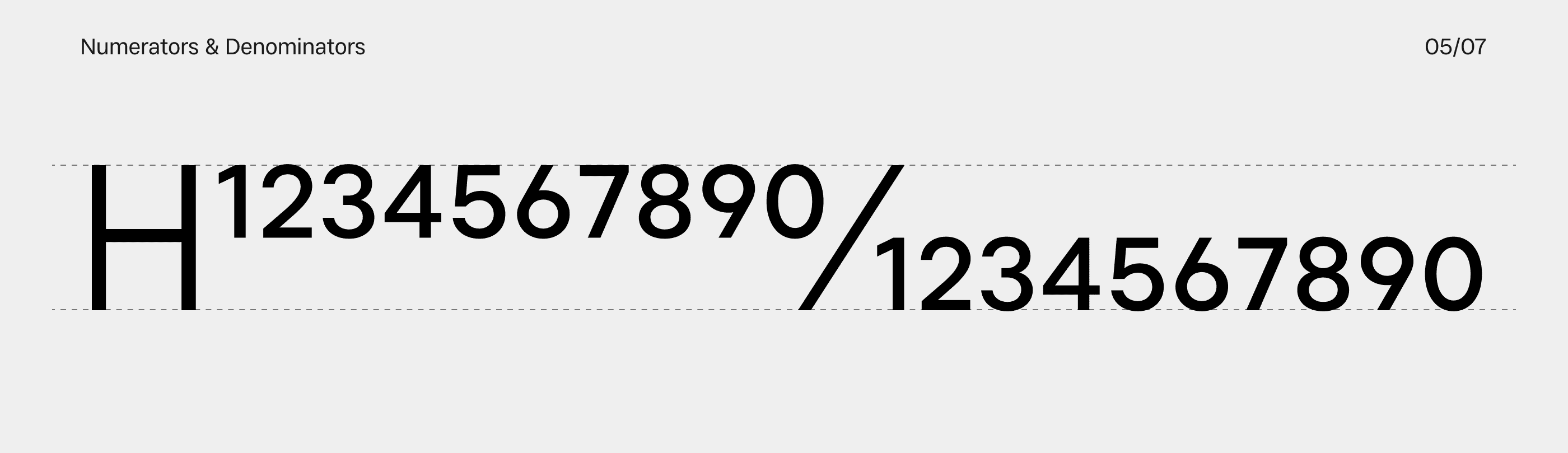
Numerators and Denominators
If this sounds like something from your high school algebra class, it’s because it is. Numerators are the upper (and leftmost) part of any fraction you encounter, while the denominator is the base (bottom) number. While most fonts include a number of pre-built fractions with separate Unicode values, you can easily write fractions in just a few clicks if you know how to operate this feature effectively.
Fractions (the height of the numerator plus the denominator) ideally have the same height as capital letters. Numerators are aligned to the cap height, with overshoots generally smaller than those of default figures. Denominators rest on the baseline with overshoots identical to those of the numerators.
The size of small figures isn’t strictly regulated because it may vary greatly based on the style of the typeface and its visual characteristics. Most typefaces in our type library have small figures at 50% of the default figure size, which seems a very viable solution for most usages.
↑ Lader Regular
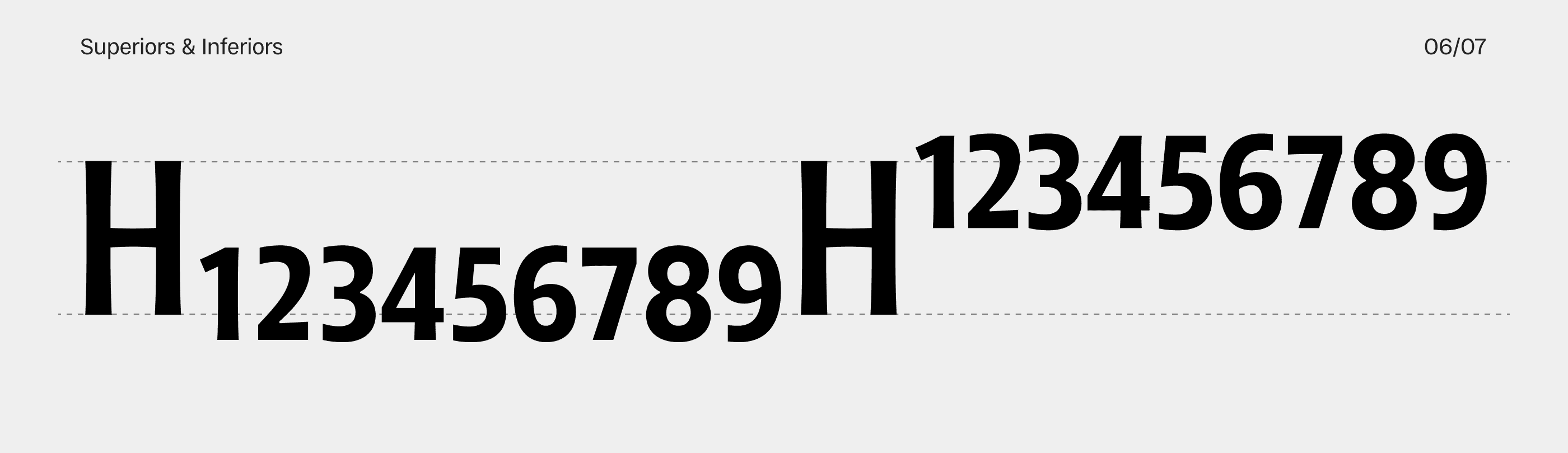
Superiors and Inferiors
These little numbers may look a lot like numerators and denominators but not only do they have a different function, their placement is also slightly different. Inferiors (subscript figures) and superiors (superscript figures) are used for various formulas, both chemical and mathematical, among other things. Inferiors are placed a little lower than the baseline, and the superiors are positioned higher than capital letters.
With just a few clicks, you can avoid writing “two to the power of four” (or even 2^4) and easily type 2⁴. The best part is that most commercially available fonts have these figures included, so there’s no reason for you not to use them. As for the size of these figures, they are often just copies of fraction figures with an adjusted height.
When designing small figures, it’s important to adjust their weight proportionally. Simply resizing existing figures would result in super skinny small figures that wouldn’t be very readable.
↑ Arlen Narrow Light
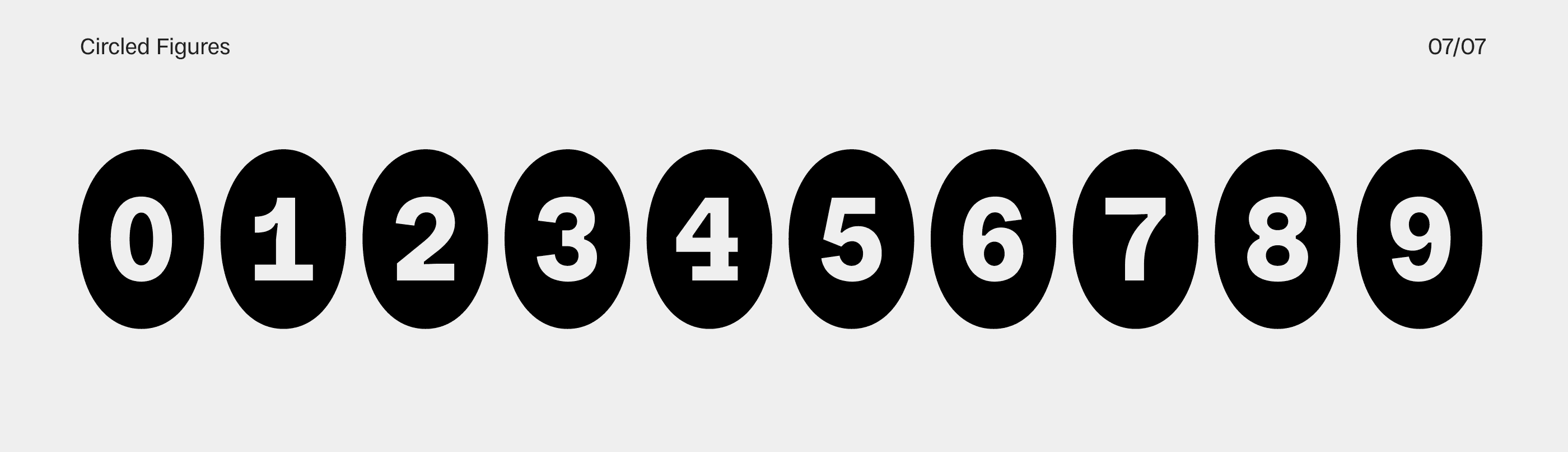
Circled Figures
As someone who develops typefaces as a job, I simply adore designing symbols that bear no true significance on the project but are seen as nice additions to the whole. Circular figures are just such characters. While you’re still bound by the overall look of the typeface as a whole, there’s a degree of freedom in how you want these numerals to look.
Both black and white circled figures have their own dedicated Unicodes, however, some designers find it easier to have them in separate stylistic sets — this way you can easily turn them on and off in Figma and other apps, without needing to look for them in the Glyphs panel.
↑ Resist Mono Regular
All fonts in the Groteskly Yours library come equipped with a variety of numbers and figures. Explore our font collection and specimens to see the full character set of each font.