Developing a Variable Type Family for Just Creative
I. Intro
In 2022, I received a message from Jacob Cass asking if we'd be interested in designing a type family for his branding agency and blog, JUST Creative. Without hesitation, I agreed.
One of the peculiar things about being a type designer is that you always have a bunch of great, fun, and awesome ideas floating around in your mind. The only problem is finding enough time to properly sketch them out and turn them into finished typefaces. So, you find yourself pitching these undeveloped ideas to clients, hoping that one of them will perfectly match your client's vision.
So, when Jacob and I started discussing the concept for JUST Sans, I remembered working on a little sketch that I hadn't given much thought to at the time. However, as soon as I revisited that file, I realized that this sketch had the potential to evolve into JUST Sans. That's when the real work truly kicked off.
↑ Just Sans First Draft
II. Just Sans Development
When it comes to working on a custom font, one thing I can't emphasize enough is the importance of gathering information from the client. I always try to obtain as much detail as possible, including their font preferences, fonts they believe could be a good fit for the project, and the specific mood or style they envision for the custom typeface. Having this valuable insight, I can better understand the client's needs and vision.
When I finally sat down to create the initial draft for JUST Sans, I had a clear vision in mind. I wanted to design a friendly sans serif typeface that struck a balance between more neutral neo-grotesques and humanist sans serifs. It was a refreshing break from the constraints of a single style. As a type designer, breaking free and embracing a bit of creative exploration is always a welcome experience.
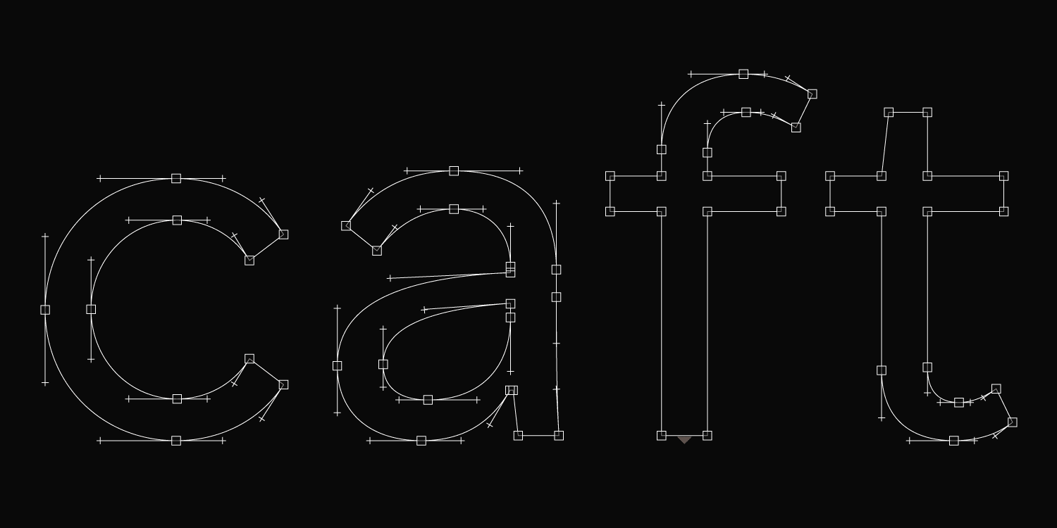
↑ Just Sans Draft Outlines
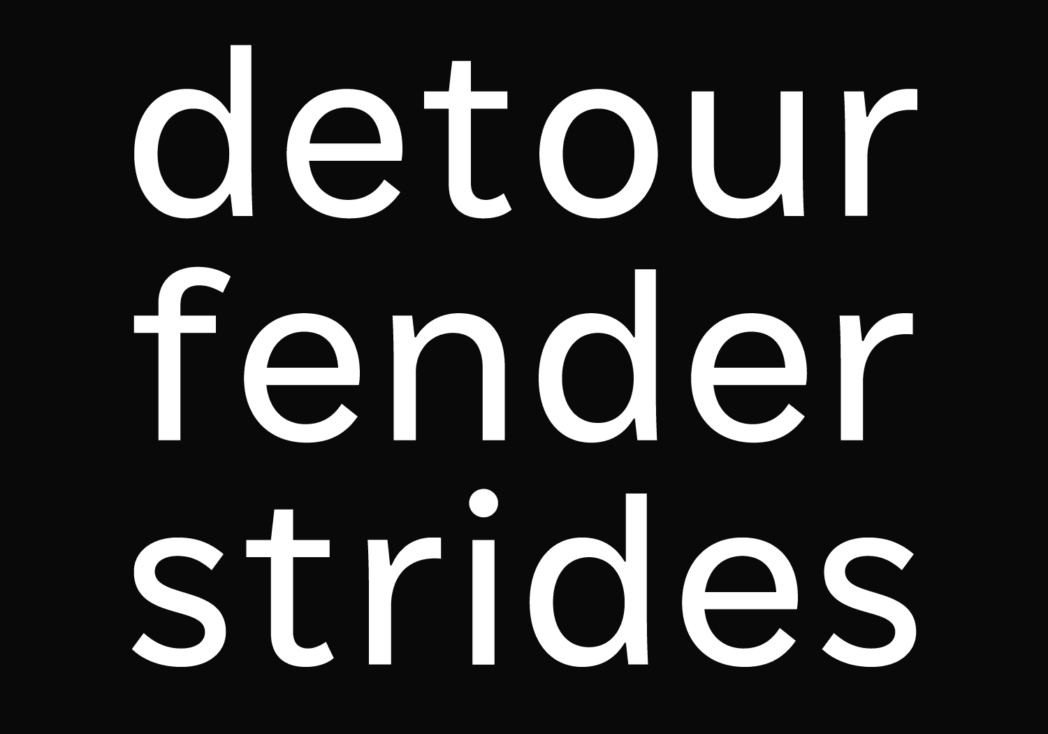
In the initial draft of JUST Sans, the standout feature was the terminals of letters 't', 'f', and 'j'. They had elongated shapes and rather unique proportions, giving them a supple and flexible look that flowed into the rest of the characters. This same sense of flexibility was also present in the slightly flaring strokes of 'n' and 'u', as well as the more delicate terminals of 'C' and 'S'. These design elements brought a dynamic and intriguing quality to the typeface.
What I found really liked about the initial sketch was its compact and playful nature. The typeface appeared friendly, yet carried a subtle touch of seriousness. It possessed a softness, yet appeared solid. The counters in the circular glyphs were comfortably spacious, striking a balance between geometry and organic forms.
To ensure screen and print readability, we made the decision to incorporate subtle inktraps in some of the tighter areas, such as the connection between the shoulder and stem of 'n', as well as the vertices of 'w' and 'v'. These adjustments added an extra level of clarity and visual harmony to Just Sans.
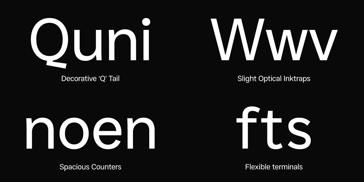
↑ Just Sans Features, October 2022
However, as we delved deeper into the project, we began to see that the first draft wasn't without its flaws. Its defining feature—the flexible terminals—turned out to be its weakest point. Consequently, we made the decision to opt for shorter and sturdier terminals, which better suited the overall vision for the project. Nonetheless, when reflecting on the development of JUST Sans, it's remarkable to see how many features from the initial sketch ultimately made their way into the final version.
Over the course of the next few months, Jacob and I engaged in a back-and-forth exchange of font files. While in many cases, clients simply provide feedback when necessary, working with Jacob on JUST Sans was a truly collaborative endeavour. By the time I finished working on the project, the JUST Sans family had expanded to include 7 styles, ranging from Extra Light to Extra Bold, along with 1 Variable Font. Each font boasted an extensive 700+ glyphs character set, supporting a wide range of Latin-based languages, multiple figure sets, punctuation, and additional symbols.
↑ Just Sans OpenType Features Overview
III. Just Sans Features
Initially, the plan for JUST Sans was to create a much smaller family of fonts. However, as the project evolved, it became apparent that expanding the weight options would enhance its versatility. It's no secret that larger type families offer more flexibility, so after careful consideration, we decided to include 7 static font styles. From a purely technical standpoint, the file architecture only required 3 masters: Extra Light, Extra Bold, and Regular. These masters controlled the interpolation process, guaranteeing that all styles maintained a clean and sharp appearance.
Later on, it was decided to include a variable font option for JUST Sans. With a variable font, the entire font family can be accessed and adjusted using a single slider, eliminating the need for multiple separate files.
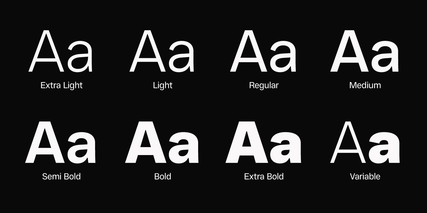
↑ Just Sans Type Family Overview
Stylistic Alternates
It often happens that when you're engrossed in the design process, you end up with more letters than you actually need. It's an awkward position to say the least. Some of these extra characters are scrapped as the project moves on, some morph into something else. And there are those that you just can't let go off. These 'extras' are stored in separate stylistic sets within your typeface.
Any modern font design software allows you to create a handful stylistic sets. The sets can be turned on and off in the OpenType settings to modify the look of the typeface and create more distinction between various characters. In JUST Sans we settled on 5 stylistic sets: single-storey 'a', flat terminals, symmetrical 'u', alternate 'J', and alternate 'l'. Enabling each stylistic set in JUST Sans would also have an impact on related glyphs. For instance, turning on the single-storey 'a' would also apply this style to other accented letters.
Alternate glyphs are super convenient when you want to change some aspects of your typeface but don't want to change each letter individually. Simply toggle on one of the sets (or all of the sets at once if you're feeling it) and enjoy the brand new look of your typeface.
OpenType Features
I find OpenType features to be one of the most overlooked aspects of type design. At Groteskly Yours Studio, we prioritize incorporating a range of essential features in all our typefaces—both bespoke and retail.
One important feature we utilize is Case Sensitive Punctuation, which ensures that punctuation marks align properly with uppercase letters. While default punctuation works well in longer texts, it can appear slightly incongruous in headlines. To address this, we incorporate a variety of alternate glyphs with a ".case" suffix. The "case" feature automatically substitutes the default characters with the corresponding ".case" characters. In JUST Sans, we included case-sensitive variations for parentheses, hyphens, dashes, colons, number signs, and other select characters.
Localization is an essential feature that can have a significant impact on the legibility and accuracy of typefaces. Different languages often require unique characters that can't be found in most typefaces. For instance, in Catalan, a punt volat is used to differentiate between 'LL' and 'L·L.' By default, using a 'periodcentered' glyph can result in excessive white space. Manually kerning the 'L' and '·' each time is time-consuming. To address this issue in JUST Sans, the 'Ldot' character was added, which included a perfectly centered period between the stems of the two 'L's. Additionally, we incorporated support for other languages such as Dutch, Turkish, and Romanian within this OpenType feature.
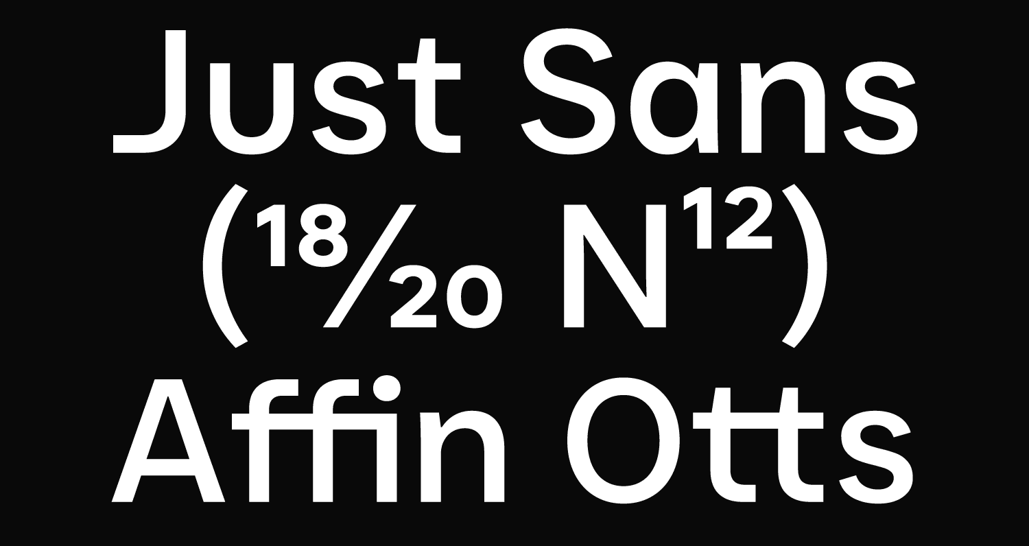
JUST Sans encompasses several additional OpenType features to enhance its versatility and functionality. These include Ligatures (both Standard and Discretionary). The type family also offers support for Fractions, allowing for seamless rendering of fractional numerals, as well as Sub- and Superscript options are available for scientific and mathematical applications. Tabular Figures ensure consistent spacing in numerical columns. Additionally, JUST Sans offers multiple Stylistic Sets.
Multilingual Support
As we worked on JUST Sans, we wanted to ensure that the typeface could be used effectively in different languages. To achieve this, we made sure to include a wide range of characters in each font. With approximately 600 characters per font, including diacritical marks, symbols, alternate glyphs, and additional symbols, JUST Sans is equipped to work well in multilingual settings. We wanted to make sure that the typeface was versatile and accommodating for users around the world.
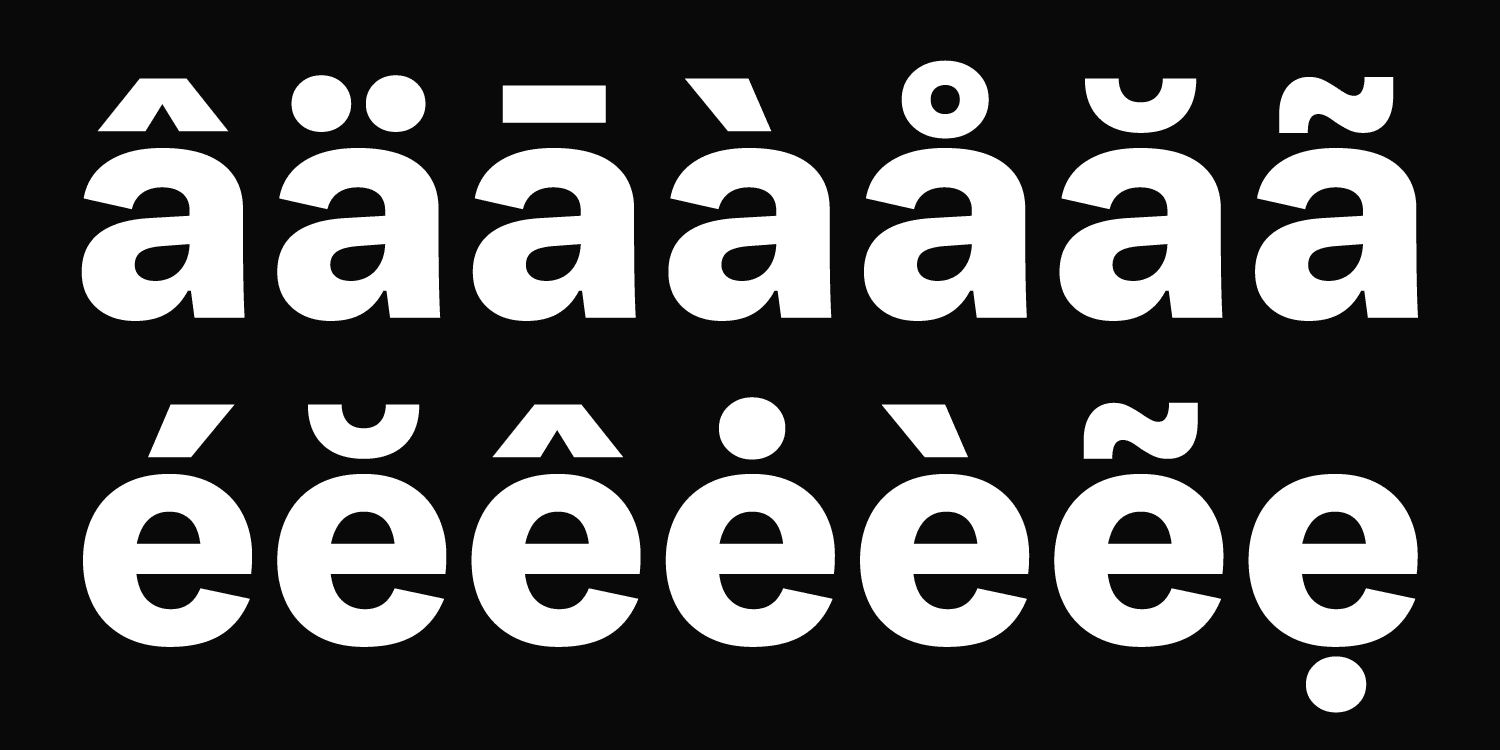
↑ Just Sans type multilingual support
III. Just Sans Release
Despite the extensive scope of the JUST Sans family and the large number of characters per font, we managed to complete the project relatively quickly. The final presentation of the project was skillfully designed by the talented Alena Linnask, who seamlessly integrated the colors and branding elements of JUST Creative into the presentation. Alena's expertise brought an extra layer of visual appeal to JUST Sans, capturing its unique character and aesthetic appeal.
JUST Creative's official website offers the opportunity to download two styles completely free of charge. These styles provide a glimpse into the versatility and quality of the complete JUST Sans family. For those interested in exploring the full range of styles, links to the entire family can be easily accessed on the website.