Riveting Typography from Alfold Magazine
Last year, we came across a copy of Alfold magazine, printed in the city of Subotica, Serbia, in 1936. There are a few fascinating things about it: from the fact that it was found in my father's house attic, to the fact that it has a whole spread on the latest Hindenburg zeppelin — before its crash a year later.
Above all, the typography of that time was fascinating. When it was printed in 1936, metal type was already cheap and affordable, so magazine pages became battlefields on which local businesses competed for the readers attention using, well, nothing more and nothing less than fonts. There's something endearing about pre-war typography, especially in publications that weren't large or international: there's your local businesses on one page and snake oil salesmen on the next. Throw in all sorts of ornamental borders, vignettes, worn off metal type, and wonky layouts — and you get the typography experience of Alfold.
Here are a few spreads from the magazine that we feel best describe the typographic mood of that time. Mind you, despite the versatility of its layout and stylistic choices, it's a rather small magazine printed in town that a population of around 50,000 in 1936. We cherish this find at the studio and are looking for opportunities to do a faithful revivals of some of these fonts.
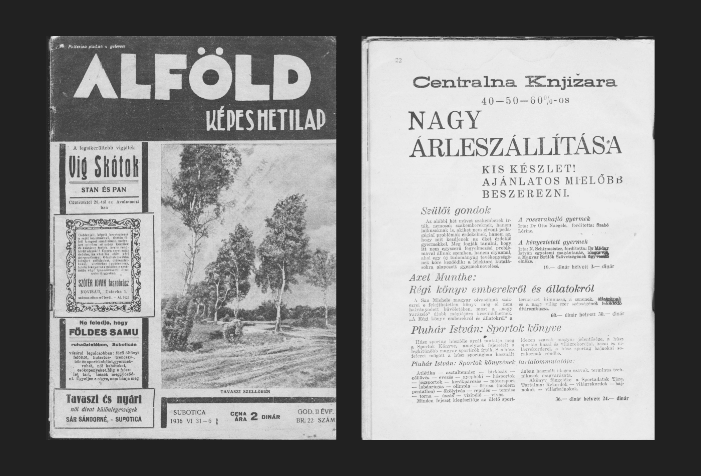
↑ Alfold, June 1936
↗ Ad for Centralna Knjižara (Central Bookstore)
↑ Advertising spreads from Alfold magazine
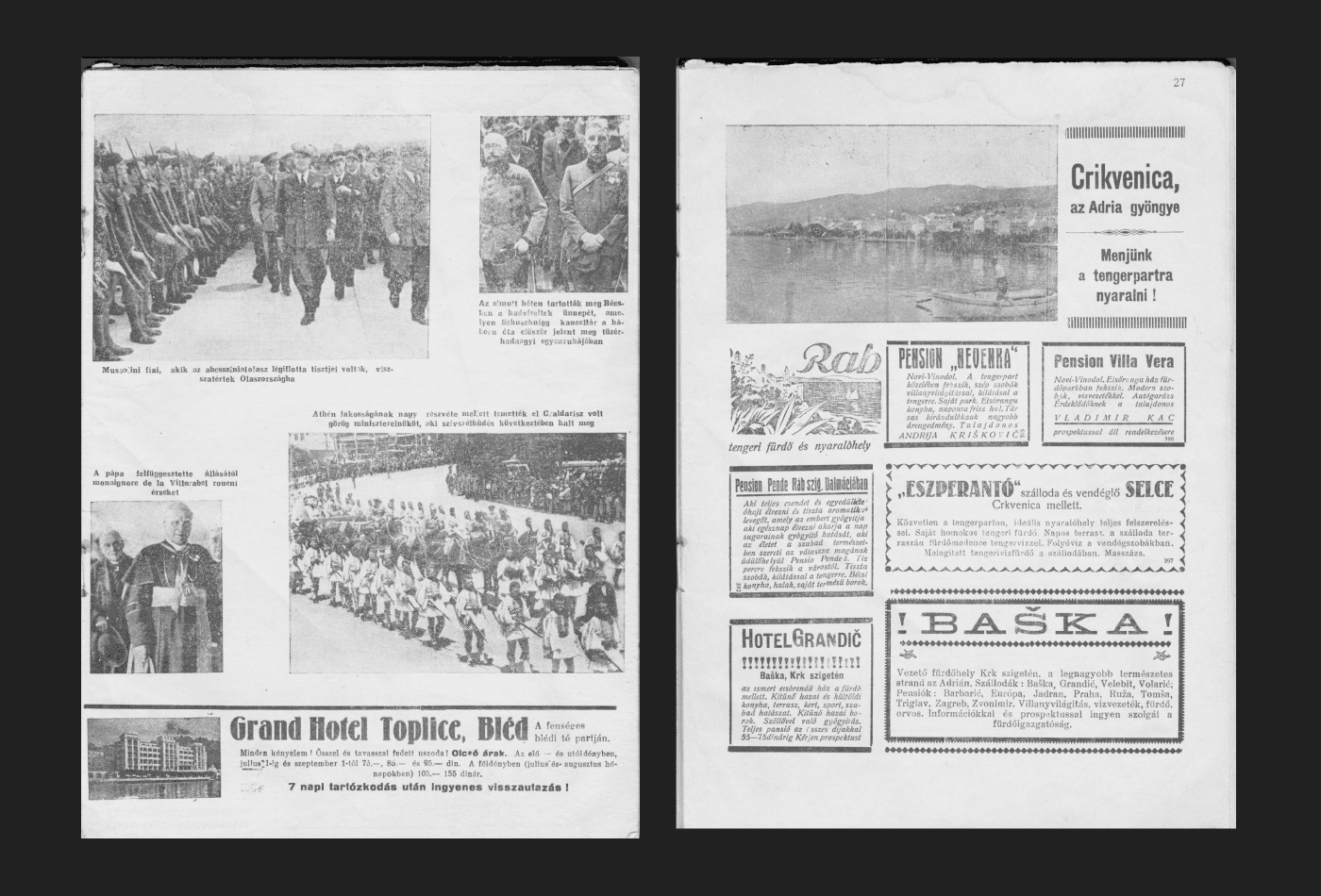
↑ News story with photographs
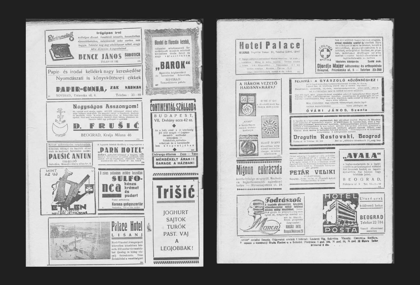
↑ Advertising spread from Alfold magazine
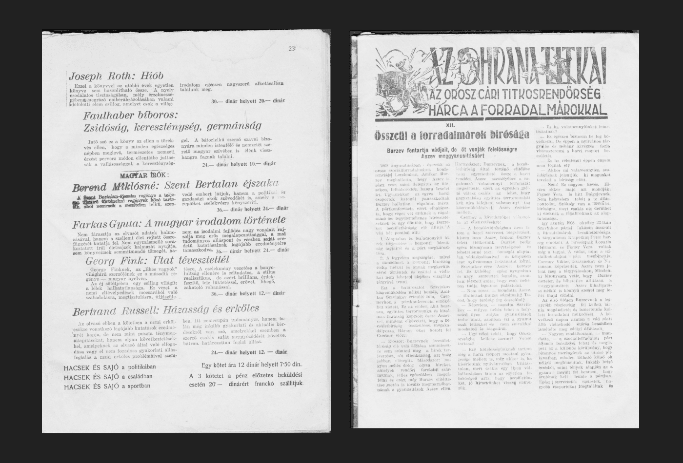
↑ Ad for Centralna Knjižara (Central Bookstore)
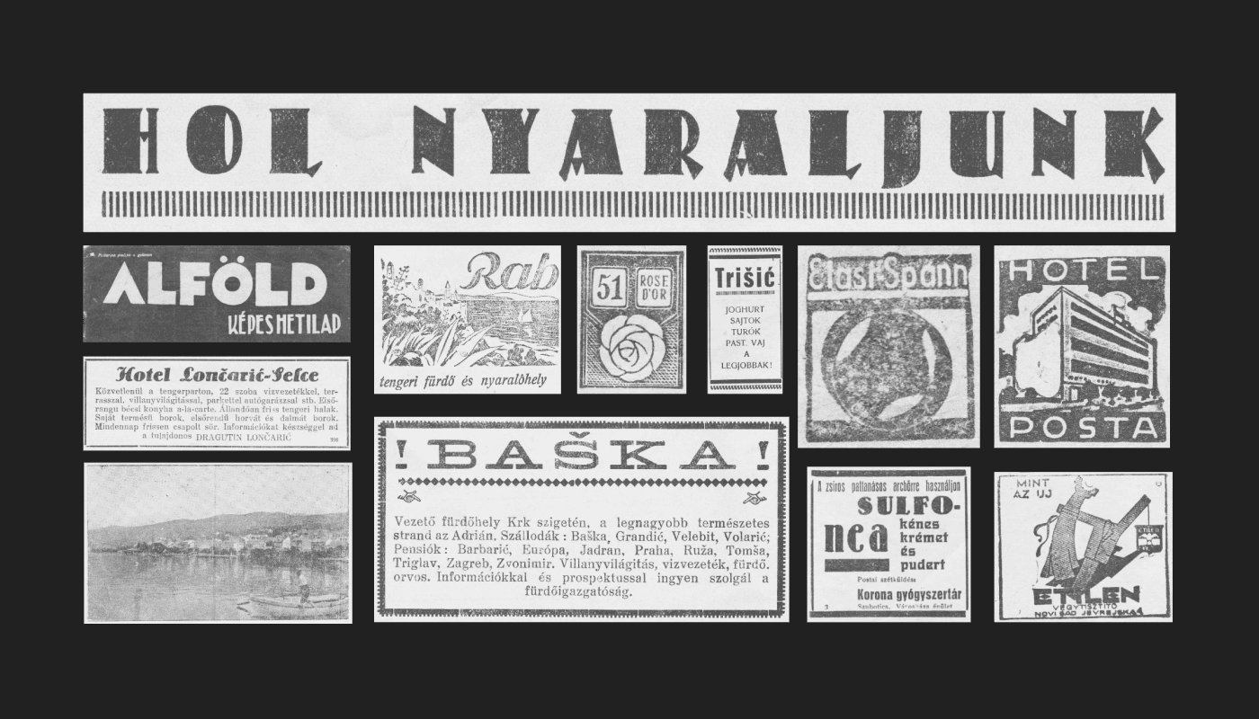
↑ Selection of Ads and Letterings
We, however, are more excited about the versatility of vintage fonts found in Alfold. This selection of clippings above has it all: commercial fonts, hand painted letterings, idiosyncratic typesetting and unique layouts. We hope to be able to draw from these references in the future and add a couple of Alfold-inspired typefaces to our type library.