Designing an Expanded and Futuristic Type Family
Overview
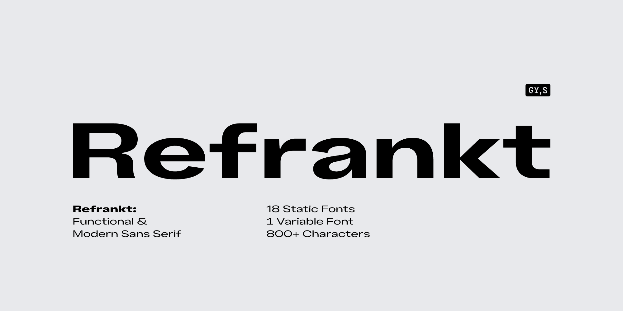
Refrankt is a futuristic sans serif family in 18 styles, characterized by expanded proportions and wide letterforms. Designed to be a versatile tool for designers, Refrankt offers an extensive character set and a wide variety of styles. Refrankt's lighter styles are more neutral and ideal for larger texts, while the bolder weights shine in headers and headlines. Those seeking maximum versatility would be pleased with a variable font that incorporates all upright and italic style into one compact file.
First Sketches
As a project nears its release, it is essential to revisit our initial sketches to not only rediscover the project's inspiration but also explore the earliest versions of each letterform. By comparing the first sketch with the final family, we can confidently determine if we achieved our intended goals..
One of the most notable features in the early drafts is the unmistakable resemblance to a monospaced font, particularly the serifs on the letter "I," which make it a wider presence in any body of text. The original structure of the letter "r", too, was dropped in later versions.
Apart from these minor details, the final version remains rather faithful to the original. You'd also notice that all early sketches were designed with the Regular weight in mind. It's only later that we began working on other styles and weights
↑ Early draft versions of Refrankt
Futuristic: Too Much or Not Enough
Our work on Refrankt began in February 2023. The initial file, which later evolved into Refrankt, was titled "2023_02_04_Futuristic," containing the first hints of Refrankt's DNA that would endure countless revisions and carry over to the final version. By far the most challenging aspect of the design process was finding the right balance between futuristic elements and versatility. It is easy to succumb to obvious visual features and shortcuts.
Throughout the early stages of development, we grappled with questions like, "Is monospaced design futuristic? What does a sans-serif font of the future look like? Are slanted terminals outdated? Will a two-storey 'a' be part of the future?"
For every project we work on, there's that crucial moment when creative freedom takes center stage. It's only once you can address all these hypothetical questions that the real work begins.
Family Structure
Determining the appropriate size of a font family is a challenging early decision in its development. Display typefaces work well with smaller families featuring fewer styles, while more neutral type families require a broader range of styles and weights to be truly versatile. In type design, form follows function, so establishing the family structure depends on understanding the intended use of the typeface.
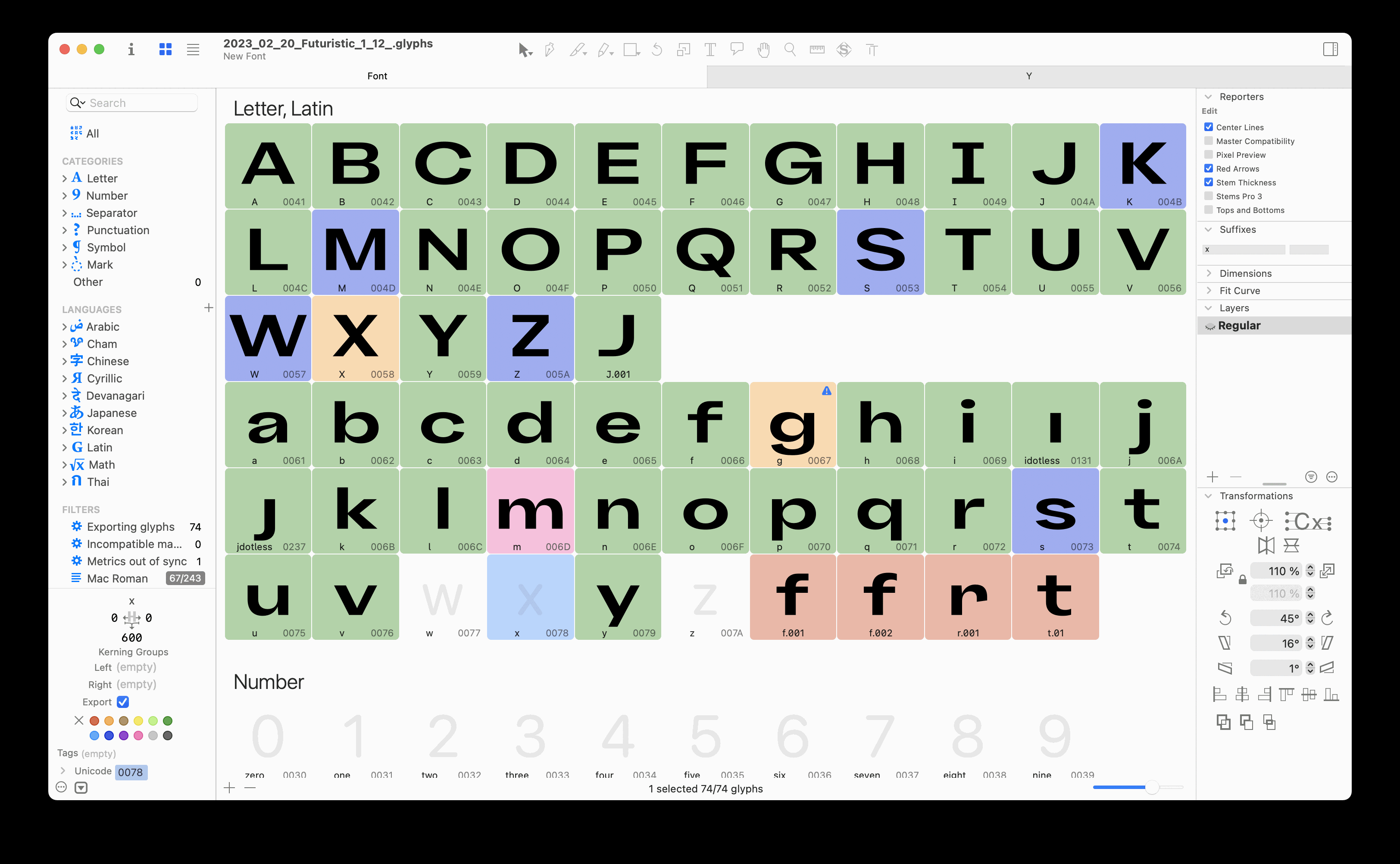
After careful consideration, we settled on 9 styles (Thin to Black), three of which (Thin, Bold, and Black) had to be drawn manually to ensure smooth interpolation. The same structure was maintained for slanted styles, resulting in a total of 18 styles and one fully variable font. The standard stem in the thinnest instance is 60 units, while the fattest (Black) measures a substantial 300 units.
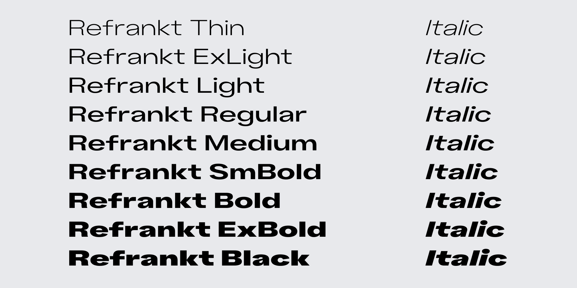
↑ Final Refrankt family structure
Flat Terminals
From the outset, we decided to keep all terminals flat, which in time became the defining feature of the entire family. The transition from the stem to the terminal became a recurring feature throughout the project. Additionally, the flat terminals create a striking contrast with the curved bowls and counters, accentuating the expanded proportions of the typeface.
Notice also how this component is repeated throughout the typeface. Despite being a rather small detail, the repetition makes it an element on which the look of the entire family is largely based. It finds its way into multiple glyphs, sometimes quite unexpectedly.
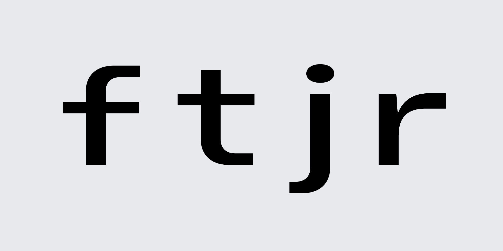
↑ Flat terminals throughout the family
Vertical Metrics
To emphasize Refrankt's expanded proportions further, we chose to align ascenders with uppercase characters. This decision allowed us to compact vertical metrics, reducing line height. Shorter ascenders create a uniform rhythm within body text. Given the wider proportions, we aimed to ensure Refrankt was as consistent as possible in all aspects.
It's also important to note that setting vertical metrics can be quite tricky, mainly because different apps, systems, and even browsers handle typefaces differently. Essentially, you're forced to go with the approach that seems more applicable to a particular project. For Refrankt, the metrics are set up so that the webfont is displayed as uniformly as possible across all devices, and Typo metrics are used whenever possible.
If you're confused about vertical metrics and why they can be tricky, this article from the GlyphsApp tutorial page does a great job of explaining it.
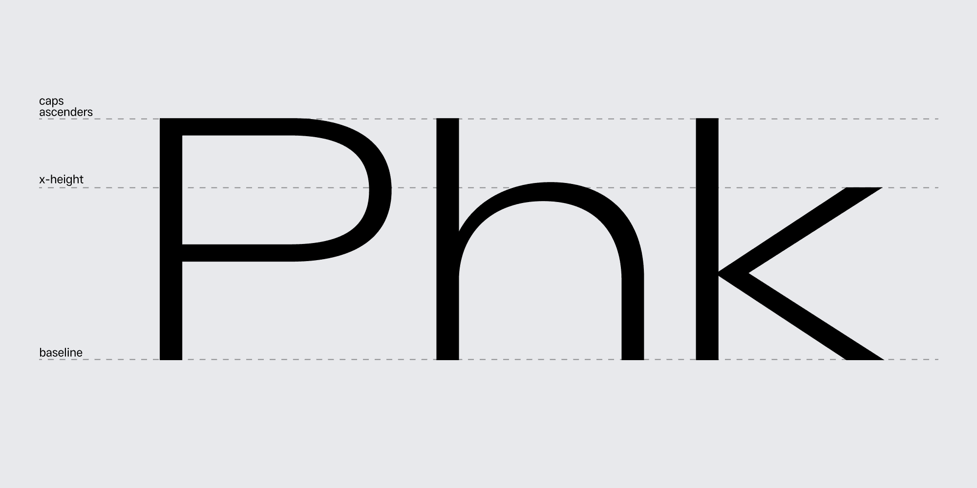
↑ Ascenders on level with cap height
Alternate Characters
During the development of a new project, it is not uncommon to discover a letterform that works well but may not suit everyone's taste. This is especially true for retail projects, where the end product should be as approachable and usable as possible. In Refrankt, you will find up to 7 stylistic sets, each modifying specific letters or groups of letters. By combining these sets, you can create a unique look that suits your project.
To quickly switch between multiple stylistic sets, you can turn them on and off in the OpenType tab in any graphic design software you're using or add custom CSS parameters to toggle specific stylistic sets.
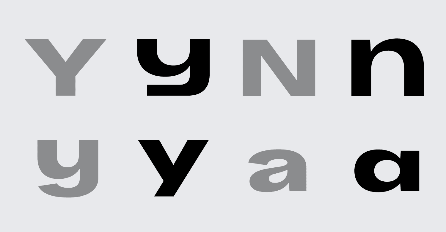
↑ Preview of alternate characters in Refrankt
OpenType Features
Incorporating extensive OpenType features has become a standard practice for us at Groteskly Yours Studio. Refrankt offers a wide range of features, including Case Sensitive Punctuation, Stylistic Alternates, Standard and Discretionary Ligatures, Fractions, Sub- and Superscripts, and many others.
OpenType features enable designers to quickly modify the appearance of individual characters or groups of characters directly in their design software. We've said it before, and we'll say it again: OpenType is a kind of magic.
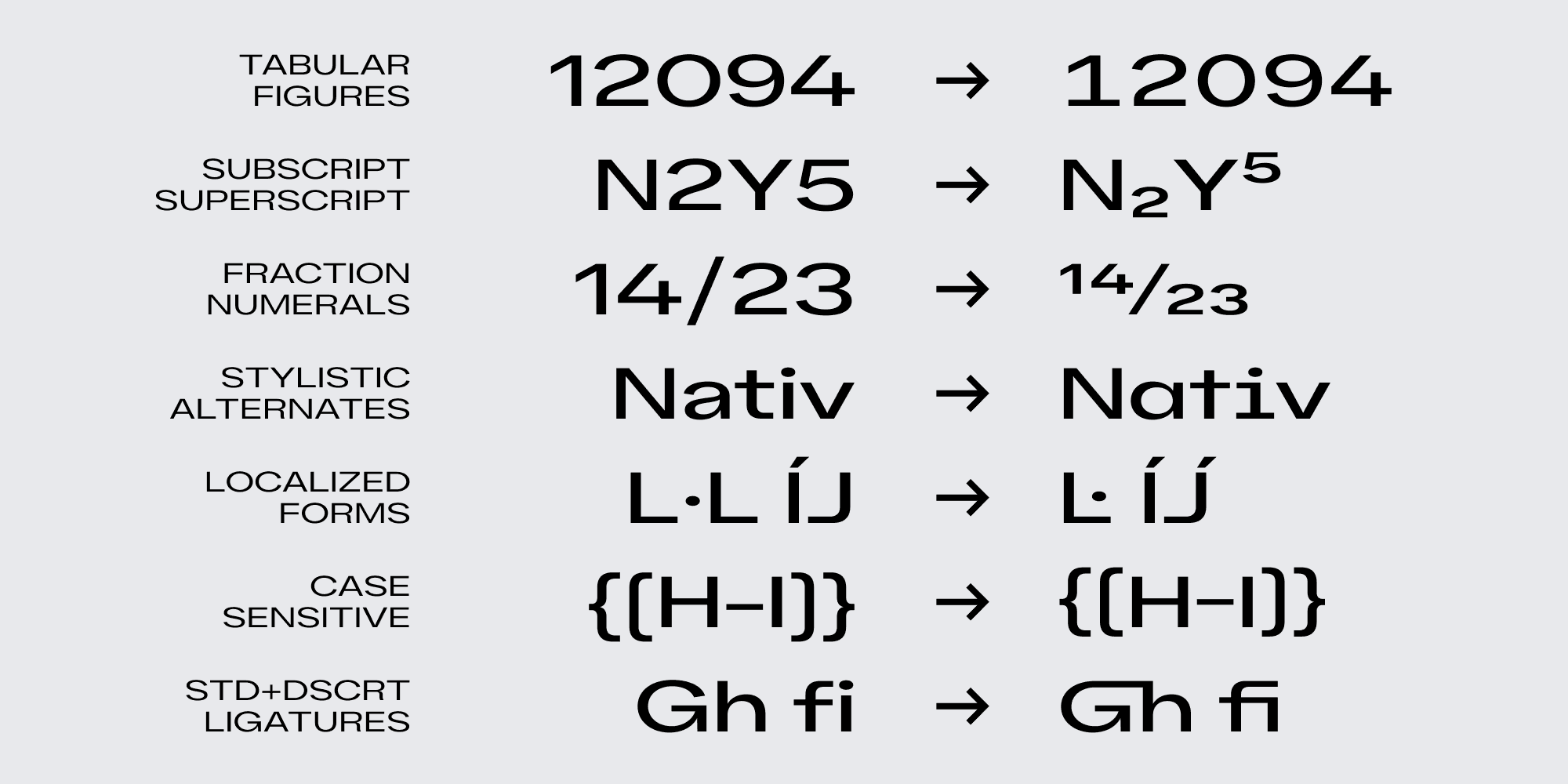
↑ Overview of Refrankt OpenType features
Afterword
To us at Groteskly Yours Studio, Refrankt is a reflection of our passion for design and our commitment to providing creative solutions to the design community. We hope that Refrankt will find its place in your creative endeavors, helping you bring your design visions to life.
Thank you for joining us on this journey, and we look forward to witnessing the remarkable designs you'll create with Refrankt.
To see all styles and features, explore Refrankt Specimen ↗