Hessel: Where Type Design and Flânerie Meet
I. Intro
In 2020, during the peak of the pandemic, my daily routine mainly consisted of tiredly tending to my island in Animal Crossing and watching awful TV shows. During those months of total lockdown, I found very little meaning in type, typography, and work in general. Life itself seemed suspended and uneventful. It had been months since I'd last seen my friends or engaged in any social activities. I was down with lockdown doldrums, and there was no escaping it. It was during that time that I received a message from Dima Dewinn from Future Perfect collective, inviting me to collaborate on a new project. Without any hesitation, I agreed.
Immediately, I was puzzled by two things. Firstly, by the time we had a call to discuss the project, it was already nearing its completion, meaning that the custom type was somewhat of an afterthought. This, in turn, had a direct consequence: I had to work swiftly to make sure everything was done on time. Initially, this time constraint made me feel uneasy as type designers typically relish the opportunity to dedicate ample time to meticulously design, proof, and refine each letter, often editing the same glyph repeatedly. However, the more I delved into the subject, the more I realized the significance of suddenness and un-preparedness for this particular project.
II. Flânerie
The project, titled Derive in Berlin, served as a contemporary homage to Franz Hessel's renowned book, Walking in Berlin (Spazieren in Berlin). Franz Hessel, often recognised only for his translations of Marcel Proust's magnum opus, A la recherche du temps perdu, was a fascinating individual in his own right.
Franz Hessel stood out as one of the first Germans to embrace the concept of flanerie, a French term describing the act of leisurely wandering and observing one's surroundings. In the early 20th century when the world was swiftly changing, a considerable number of men and women found themselves unable to keep up with the rapidly changing world around them, thus taking to the vibrant streets of European cities as mere spectators, aimlessly drifting through life through unfamiliar surroundings. Hessel's fascination with flanerie with, along a new way of experiencing life that came along with it, became the driving force behind his own flaneur manifesto, Walking in Berlin.
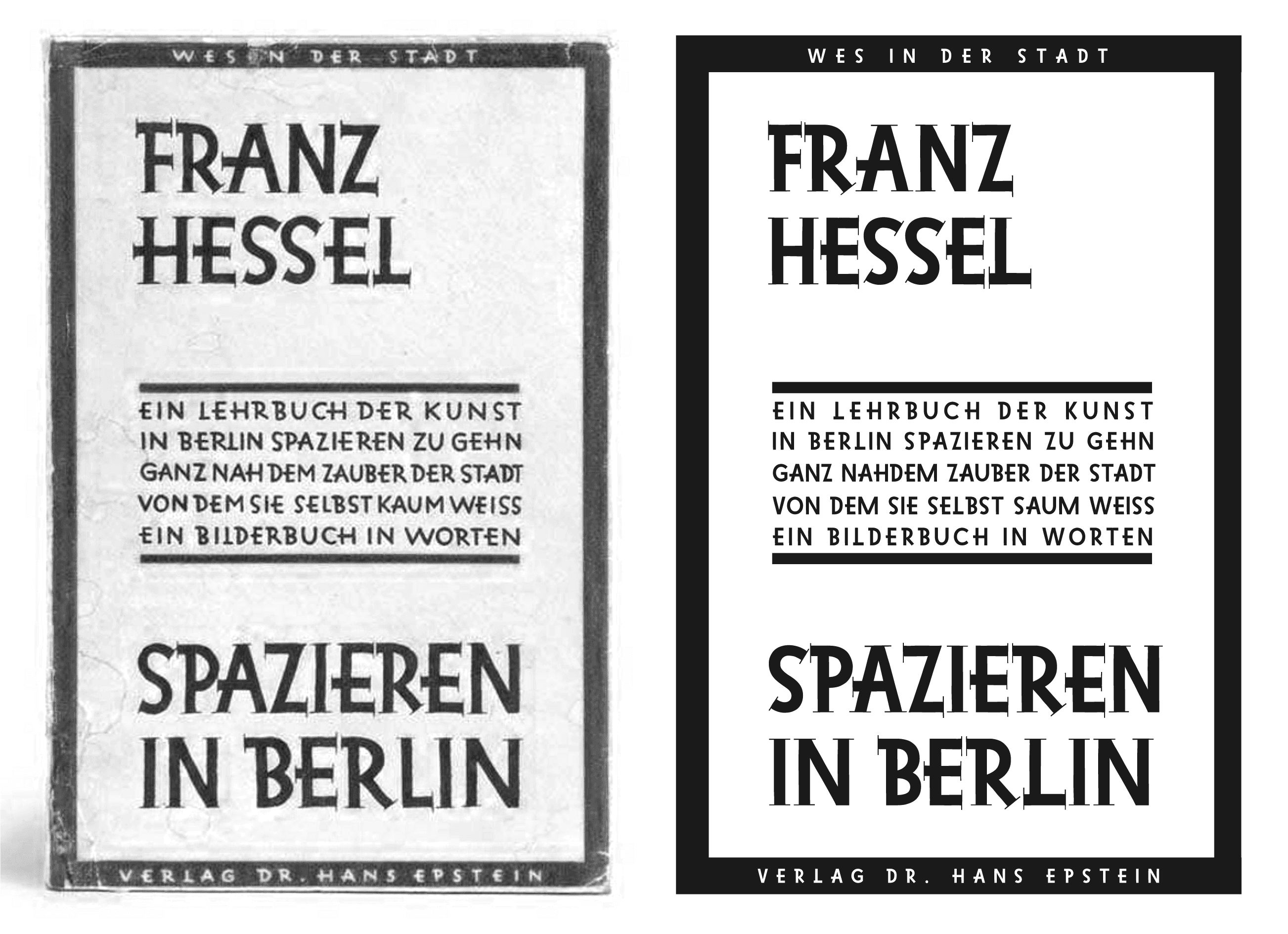
↑ Hessel, Franz. Spazieren in Berlin. Leipzig und Wien, H. Epstein, 1929
↗ Cover redesign using Hessel typeface
III. Serif Subfamily
As a type designer, I prioritize working on projects that deeply resonate with me. In my experience, typefaces tend to lack creativity and inspiration when there is no genuine interest invested in the project. By the time I finished my research on Hessel and his work, I couldn't help but start working on the project right away. Not only did I genuinely liked the idea of a contemporary tribute to Hessel's work, but I also had a well-defined plan that seamlessly aligned with the concept of flâneurism.
During our initial call, it was agreed to use the lettering from the cover of Spazieren in Berlin as a point of reference. However, the responsibility of transforming these nearly century-old letters into a fitting component for the project fell squarely on my shoulders. It was my task to determine the most suitable approach to process and adapt them, ensuring they seamlessly integrated with the intended vision of the project.
First off, I needed a basic set of letterforms to work with, so I began by designing a pixel-perfect recreation of the original lettering, striving to make minimal changes and only addressing minor imperfections. As I expected, the resulting set of uppercase letters fell short of the original lettering. They appeared rigid, lacking vibrancy. Overall, this was not the desired impact.
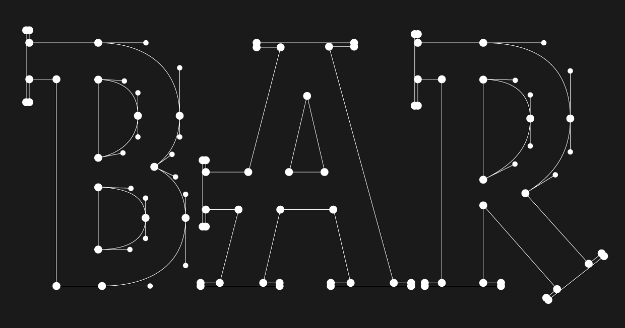
↑ Manual Outline Tracing vs. Original Outlines
Once this refined, mathematically accurate character set was completed, I took a deep breath and prepared for the next step. I created masks for all the outlines to be displayed in the background – and proceeded to delete every individual node, curve, and Bezier curve. As a result, my Glyphs file appeared just as empty as it did on the first day. Armed with my Wacom tablet, I then started manually tracing the masked outlines, ensuring that each serif, stem, and bowl possessed a distinctive and imperfect charm. This was the most fun I've even had in all my years working with type.
This approach successfully imparted a hand-drawn signage aesthetic to the resulting typeface, evoking a nostalgic feel of aged craftsmanship. While I was working, I began to notice that serifs and stems formed a subtle map, my own personal depiction of the city I was in the midst of creating. It dawned on me that, in essence, type designers are akin to flâneurs. Our role involves observing letters used by other designers; it involves iterating and retracing familiar letterforms until they become ingrained in our consciousness. It is through this continuous exploration that we strive to perfect our craft, much like flâneurs who turned their peregrinations into an art form.

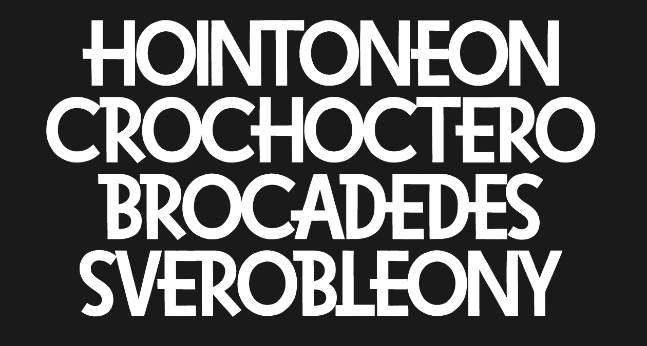
↑ Hessel Serif Stylistic Alternates ss01-ss10
After a few days, the Latin set was completed and I proceeded to work on the Cyrillic characters, as the project required bilingual support. During this phase, I also delved into experimenting with stylistic alternates and introducing an element of randomness to the overall design.
Typically, when designing retail typefaces, it's my preference to limit the number of alternate glyphs included in each typeface. This approach helps avoid confusion for customers who may not be familiar with multiple versions of each letter and may not utilise OpenType features. However, with Hessel, I decided to take a more adventurous approach and added a wide range of glyphs, sometimes even incorporating serifs onto the capital 'O'. Using a simple OpenType code, I implemented a loop that automatically selects glyphs from various stylistic sets. As a result, each occurrence of a letter would display a distinct form. However, due to technical limitations, we were not able to implement this feature on the web.

↑ Hessel Serif & Hessel Sans Subfamilies
IV. Sans Serif Subfamily
In addition to the serif set, we decided to create a sans serif version specifically for sub-headers. The main references for this sans serif set were the book cover and the existing serif version. The sans serif style was used as a display font for different neighborhoods in Berlin, which were part of the project.
The sans serif version turned out to be more understated, yet it had its own unique characteristics. The main difference between the two versions, apart from the obvious absence of serifs, was the number of alternative glyphs. Some letterforms that worked well in the serif style looked strange and out of place in the sans serif version, so I chose to remove them. I also had to adjust the spacing to account for the lack of serifs.
Instead of releasing the two subfamilies separately, we decided to combine them into one font file for the project's convenience. The uppercase set was assigned to the serif subfamily, while the lowercase set was reserved for the sans serif version. This custom grouping allowed designers to easily switch between the two styles as needed.
↑ Hessel Sans Subfamily Specimen Image
V. Final Thoughts
Derive in Berlin was undeniably one of the most exciting custom type projects I've had the pleasure of working on. It presented a rare opportunity to revive an old lettering style that may have otherwise remained unnoticed, and it allowed me to infuse a distinct and personal touch into the entire project.
The project was completed within a timeframe of approximately 2-3 weeks. The resulting font file, aptly named Hessel after Franz Hessel, consisted of over 270 glyphs encompassing two styles: sans and serif. Notably, nearly half of the glyphs included alternate versions of the basic glyphs, providing a diverse range of visual possibilities through seamless alternation between stylistic sets.
Derive in Berlin was officially launched in 2020 and received an Honourable Mention from Awwwards in March 2021. Two years after the project was released, we find ourselves exploring the possibilities of reworking the Hessel family and making it available through our foundry. Although the idea of revisiting and further developing Hessel is enticing, it will take some time before it is ready for its official release under GY,S.